
Adaptive vs. Responsive Web Design
February 7, 2022
Words by Sandra De Grandis

Coke vs. Pepsi. The Beatles vs. The Rolling Stones. Superman vs. Batman. It seems as though we’re always making comparisons to figure out which is the best, whether it’s soda, musicians, superheroes, cars, sports teams, etc.
It’s not any different when it comes to best practices in web design. Every designer wants the content they’re putting out to resonate with users and create an overall positive experience, no matter how or where it’s consumed. But how do you know which design approach is better?


The Difference Between Responsive and Adaptive Web Design
Let’s start by figuring out how they differ from each other.
The term “adaptive design” first popped up in 2011, thanks to a book written by Aaron Gustafson called, Adaptive Web Design: Crafting Rich Experiences with Progressive Enhancement.
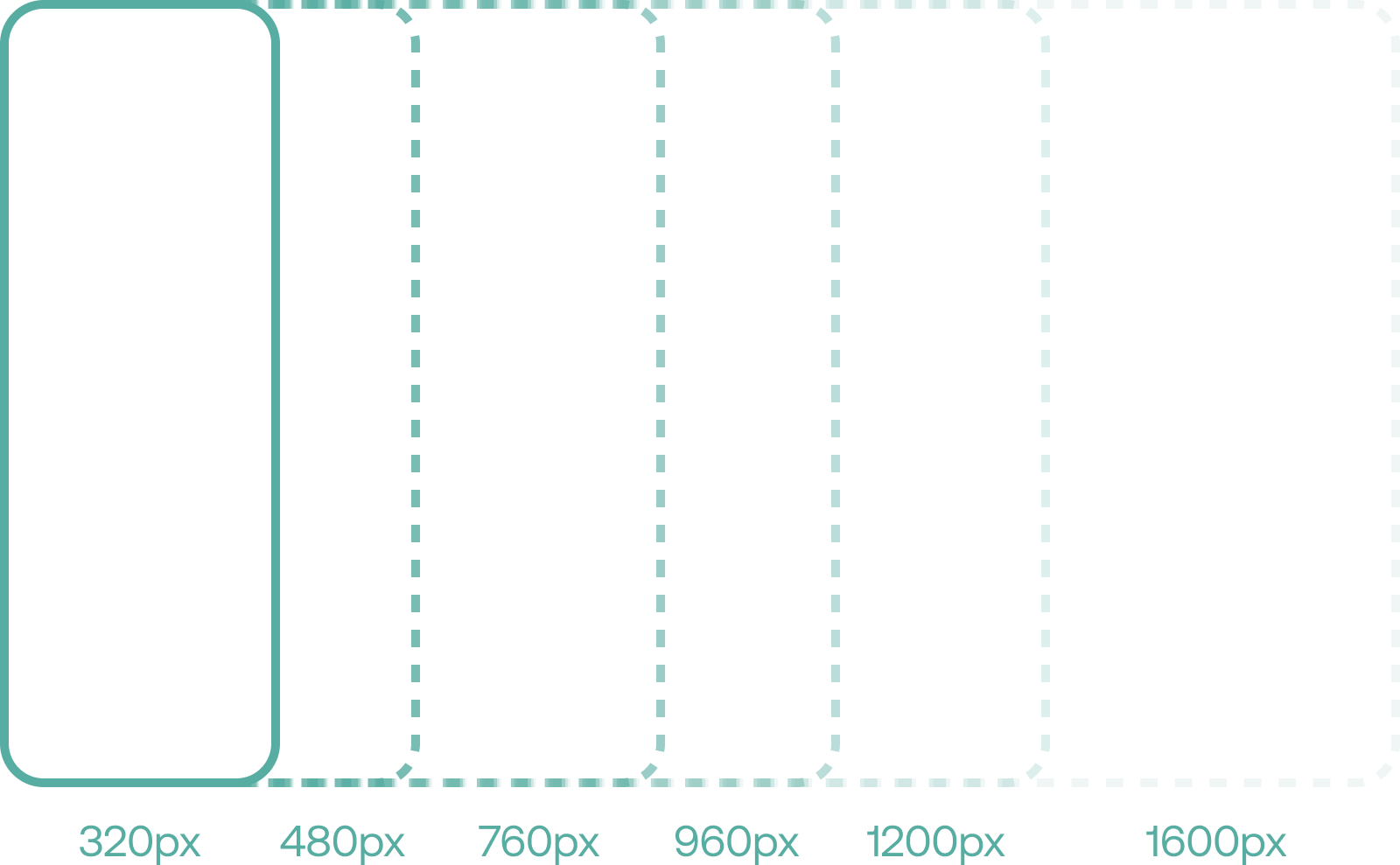
Adaptive design uses multiple fixed or static layouts that “adapt” to each device and their corresponding screen size. In other words, this method uses static layouts in multiple sizes and determines which one to use according to the user’s device, whether it be a desktop, laptop, tablet or mobile screen.
There are 6 common screen sizes associated with adaptive design:
320px, 480px, 760px, 960px, 1200px and 1600px.

[image/graphic relating to above]
So, imagine using your laptop to browse for new furniture or do some daily banking. If the website is built using adaptive web design, then it will detect your device and screen size, and load the right layout, aka the one suitable for laptops. If, like most people, you’re glued to your phone and prefer to do your shopping and banking in the palm of your hand, then the mobile layout is loaded to give you a better overall experience.
The nomenclature “responsive design” first made an appearance back in 2010 - almost twelve years ago - and was created by Ethan Marcotte. He also released the eponymous book Responsive Web Design a year later.
What makes responsive design different from adaptive is that it uses one layout format that reconfigures content and all page elements so it fits different device screens. Instead of utilizing multiple layouts, websites built using responsive web design principles will automatically change the appearance of a landing page so it adjusts to different devices and resolutions, giving the user a more fluid experience. In essence, it “responds” to a user’s device and screen size.
What makes responsive design different from adaptive is that it uses one layout format that reconfigures content and all page elements so it fits different device screens.

[image/graphic relating to above]
The dynamic design layout of this approach means, in theory, that all page elements will fit regardless of browser or screen size. There is no need to build multiple layouts because the content is rearranged according to which device is used.
Let’s take the previous example and apply it to responsive design. It won’t matter if you do your daily banking or furniture shopping on your desktop, tablet or mobile device. Thanks to responsive design, the website will reconfigure to fit the browser space regardless of screen size or resolution. This means you will get a consistent user experience on any device you use.
The Pros and Cons of Adaptive and Responsive Design
Now that we’ve defined that makes adaptive sites different from responsive sites, let’s compare the two.
Pros of Adaptive Design
- Better User Experience: Since there are multiple layouts created, each user will get a more customized experience according to the device they use. The websites they browse will be able to pick up on which device they’re on and use the appropriate layout without having to rearrange or adjust the content and other elements, which can cause distortion or delays.
- Increased Loading Time: Because the layout has already been created beforehand, users can expect a faster load time when browsing since there is no second-guessing what content features are relevant to their device. A fast loading time is also beneficial for conversion rates. According to a study done by Portent, website conversion rates drop by an average of 4.42% with each additional second of load time (between 0-5 seconds).
- Increased Advertisement Revenue: Advertisements can be optimized according to each user interface. Just like the websites themselves they are designed to fit specific screen sizes, so are the ads. That means you won’t have to worry about readjusting banners and images, or dealing with out-of-place elements.
Cons of Adaptive Design
- More Labour Intensive: Creating multiple layouts involves more time and effort when you consider all the different screen sizes you need to account for (up to 6). The various layouts also require individual planning and execution, as well as different types of coding.
- Additional Maintenance Involved: If you need to make a change or fix something, you can’t just make adjustments on one layout. It needs to be done on every layout to ensure a consistent user experience across all devices. That means more work for designers. Depending on how many designers you have on your team, you may even need to spend more on outsourcing the labour to ensure updates are completed in a timely manner, which can increase expenses.
- New Devices to Consider: At the moment, adaptive design has 6 common screen sizes. But technology is constantly evolving. We see that in how screen sizes are always changing in mobile devices, as well as desktops, laptops and tablets. Your layout design may be good for a few years, but if a new device is released that doesn’t adhere to the standard sizes, then you will have to create a new layout from scratch to ensure users aren’t left in the dust.

[image/graphic relating to above]
Pros of Responsive Design
- Easier to Build and Maintain: Since you only need one layout for multiple devices, creating websites using responsive design is faster and requires less work. This translates into less overall maintenance, as well as a decrease in expenses because you will only need to make changes on one layout as opposed to multiple layouts.
- Accommodates Multiple Screen Sizes: A fluid design layout can easily adapt to multiple screen sizes. Since new devices are constantly being released every couple years, you won’t have to worry about creating another layout for a tablet or mobile phone that doesn’t fit a standard size. This also means a flawless and uniform user experience no matter what device you use.
- Higher SEO Rankings: Having a responsive design website increases search engine rankings, which is something that Google likes. It also makes your site more mobile-friendly, which is a good thing, since the majority of web traffic now comes from people browsing on their phones.
Cons of Responsive Design
- Slower Download Time: Not every device has the same download speed. Larger images or design elements may download faster on a desktop or laptop as opposed to a mobile device. Plus, in responsive design all elements are loaded, not just the relevant ones. This can cause them to shift around and not be where they’re supposed to be, which can inhibit user readability.
- Less Design Control: Because you’re creating one layout, you lose a little bit of control over the design process, whereas adaptive design gives you the ability to build for every screen size that exists.
- Not Optimized for Advertisements: It may be tricky trying to optimize ads for responsive sites. The website will reconfigure accordingly based on the device screen size. But the ad itself may not properly adjust to that space, causing the webpage to look distorted or out of order.

[image/graphic relating to above]
How to decide between the two?
Both adaptive and responsive design have their own merits, and trying to figure out which one to use can be quite the conundrum. You may be considering going the responsive route thinking it will save you money in the long run while being more SEO friendly. Or perhaps you like the idea of having more control through adaptive design, along with providing your audience with a more tailored user experience.
That brings us to our next point. An important subject to always consider before taking the plunge is your audience. Ask yourself these questions: Who is the user? What devices are they most likely to browse on? How can I best reach them? How can I provide them with a positive experience so they keep coming back? What do they want? In order to figure out the answers, you’ll definitely need to conduct some user research before making a firm decision. Once you have that all figured out, you’ll see the light at the end of the tunnel and be able to make a more informed choice.
Besides the user, it’s always a good idea to think about your needs. What do you hope to achieve? What are your short term and long term goals? Money is always a touchy subject, but you should have a budget in mind. Also, are you starting from scratch or working with a legacy website?
Ultimately, deciding which approach is best varies from person to person. If there’s one thing that we can all maybe agree on is that people have been quick to adapt to the constant changes in technology. Things that weren’t fathomable a mere 5 or 10 years ago are now mainstream or hitting the market. Folding cell phones anyone? What about smart fridges and other household appliances? With that in mind, it’s always best to remain on your toes. Staying on top of evolving tech and user trends will help you make the right adjustments as they come along, regardless of whether your website is built with responsive or adaptive design.