Organism, Font

Best Google Font Combinations for Your Next Web Project

April 1, 2022

Words by Lewis Bowen

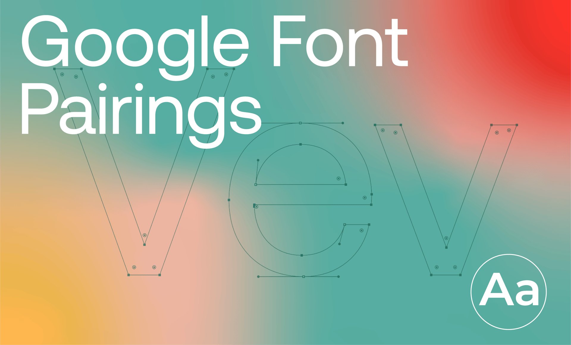
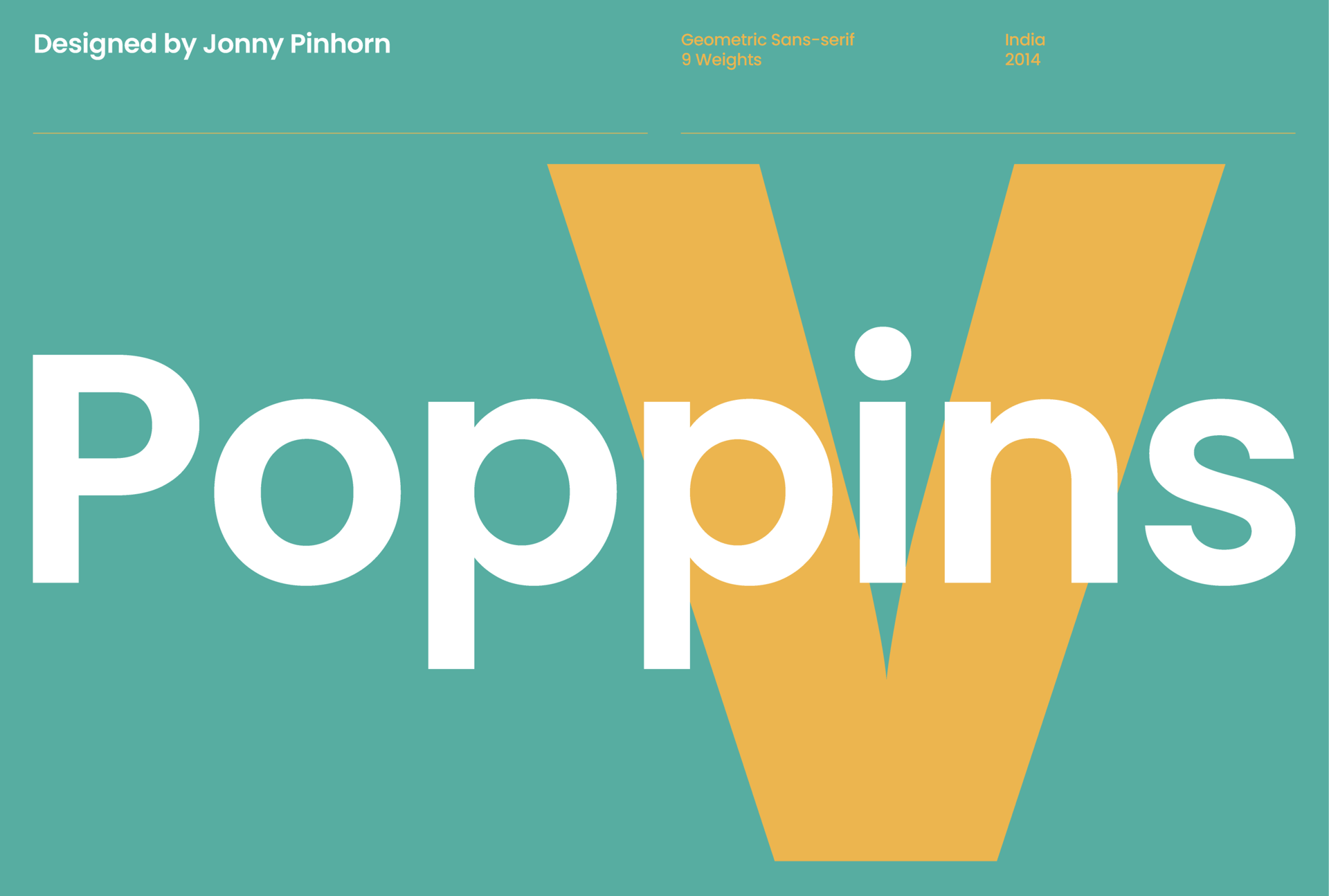
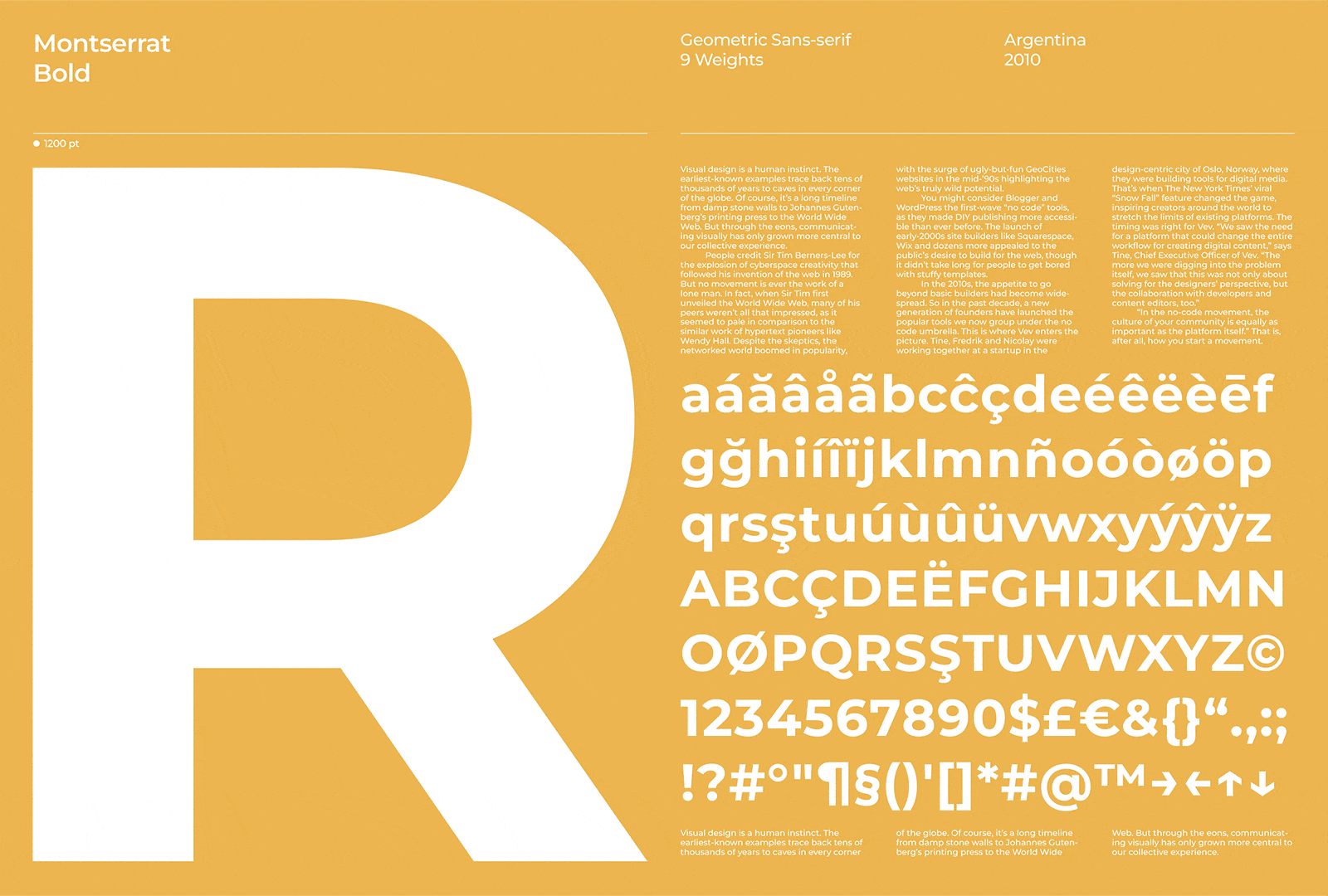
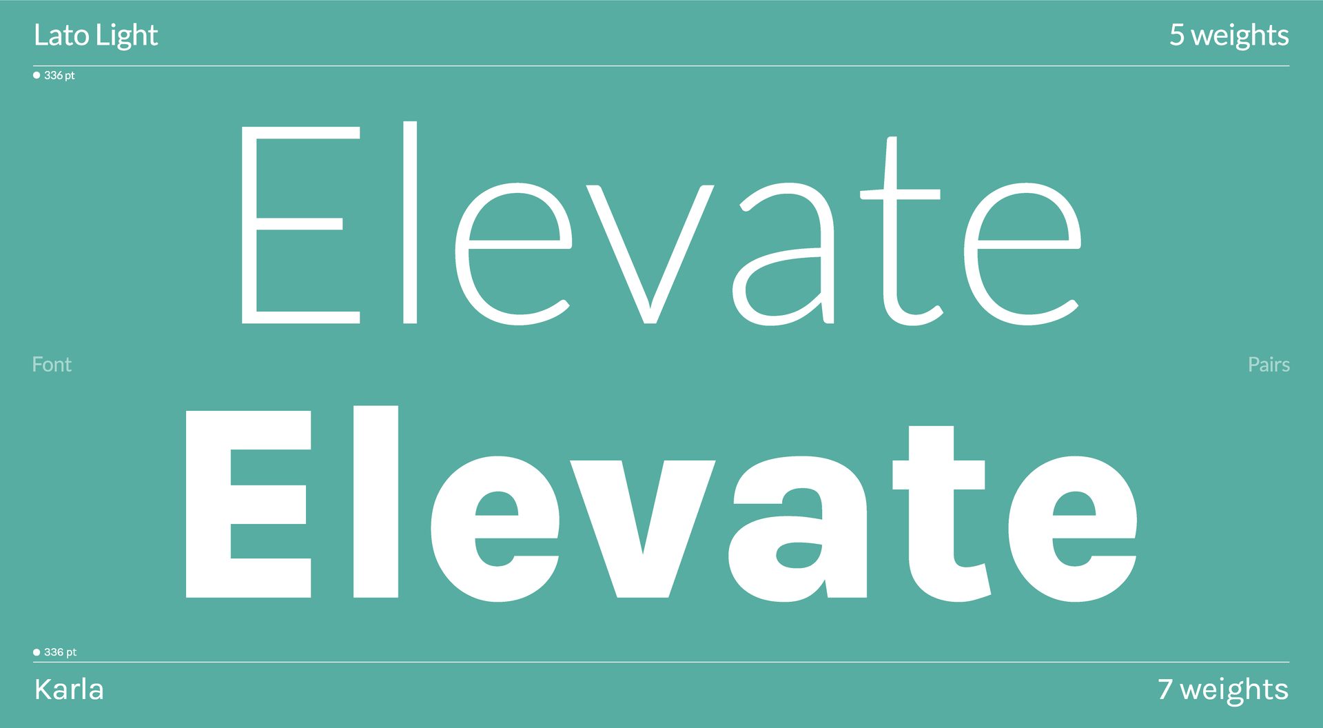
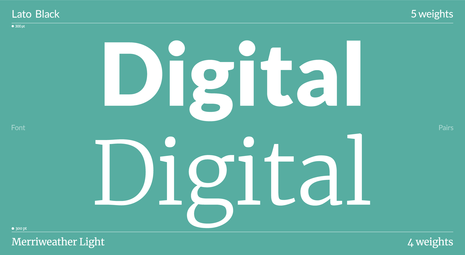
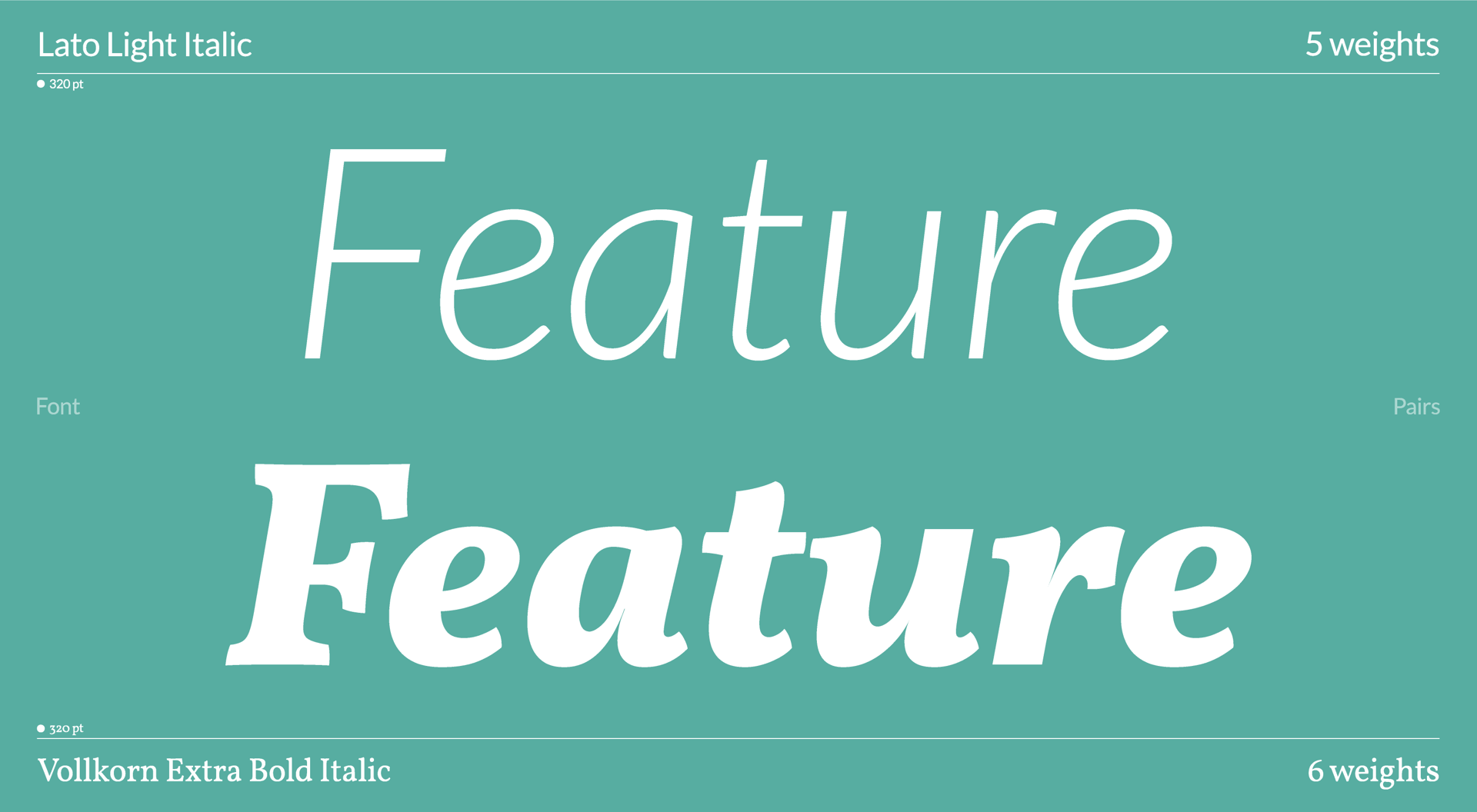
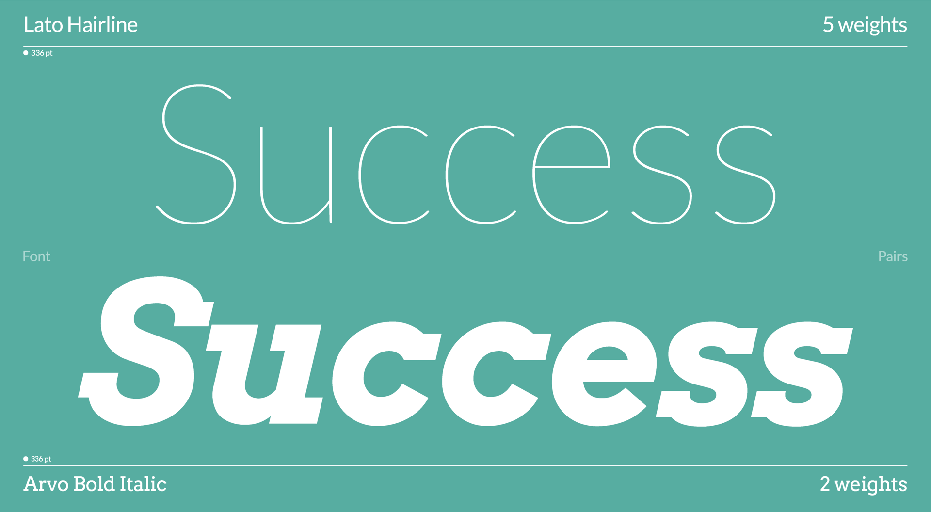
Google Fonts is a fantastic platform, giving everyone access to a library of high-quality fonts to elevate their web projects completely for free. Spanning 915 fonts total, there's a lot to play with. We've pulled together a few of our favorite Google Font combinations you might want to try in your next project.


What are font combinations?

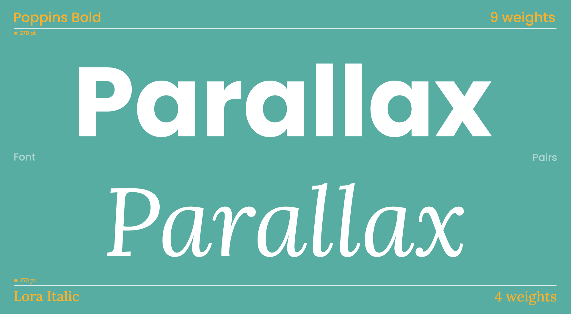
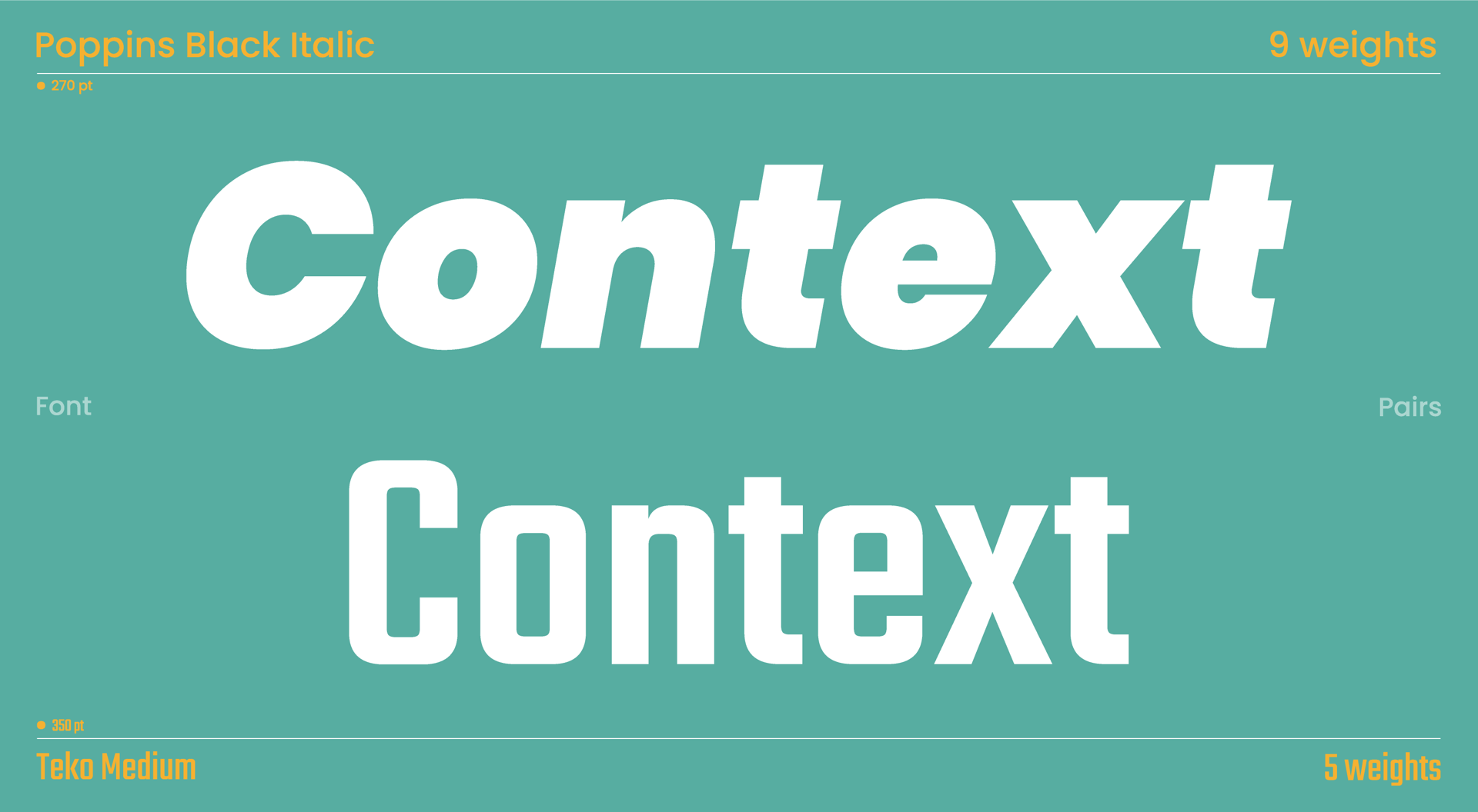
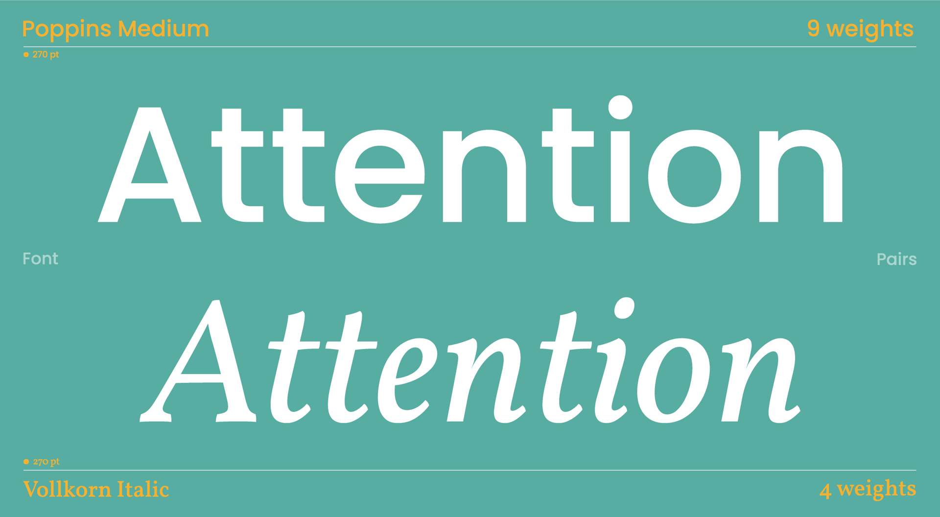
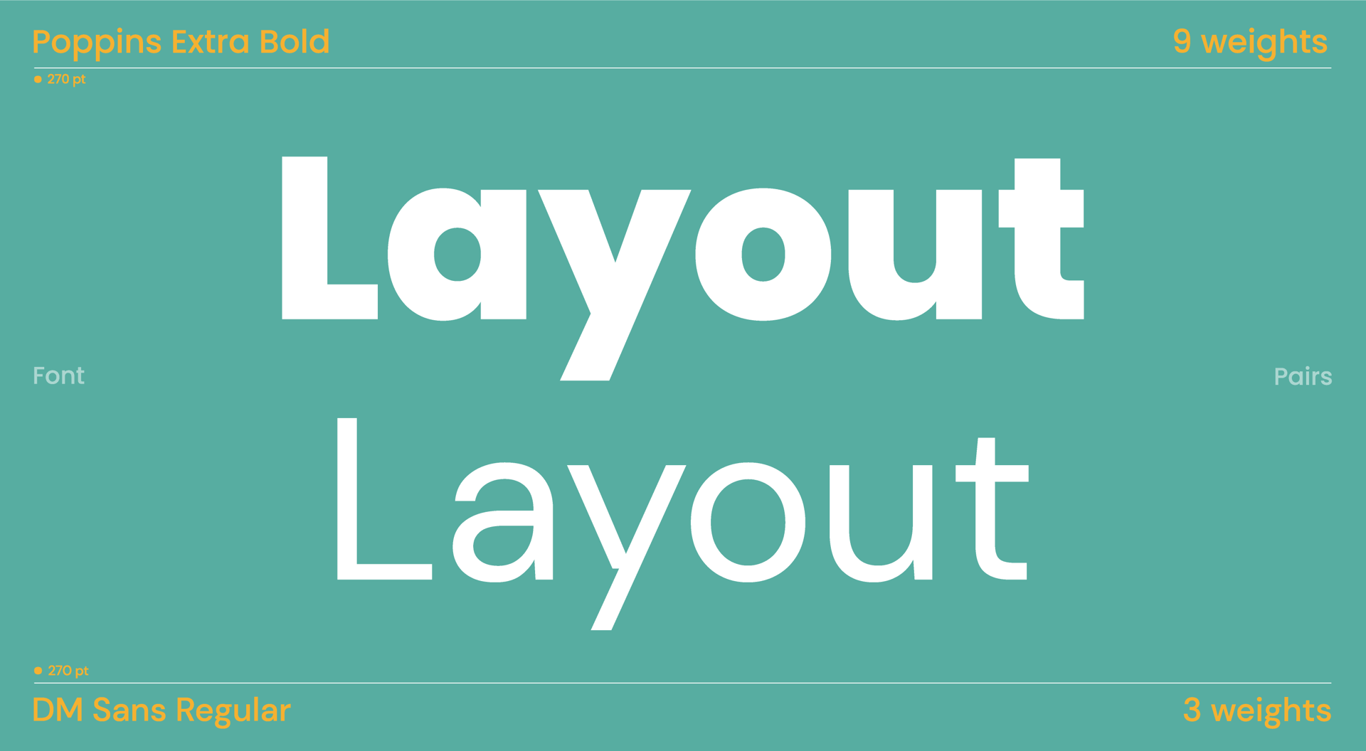
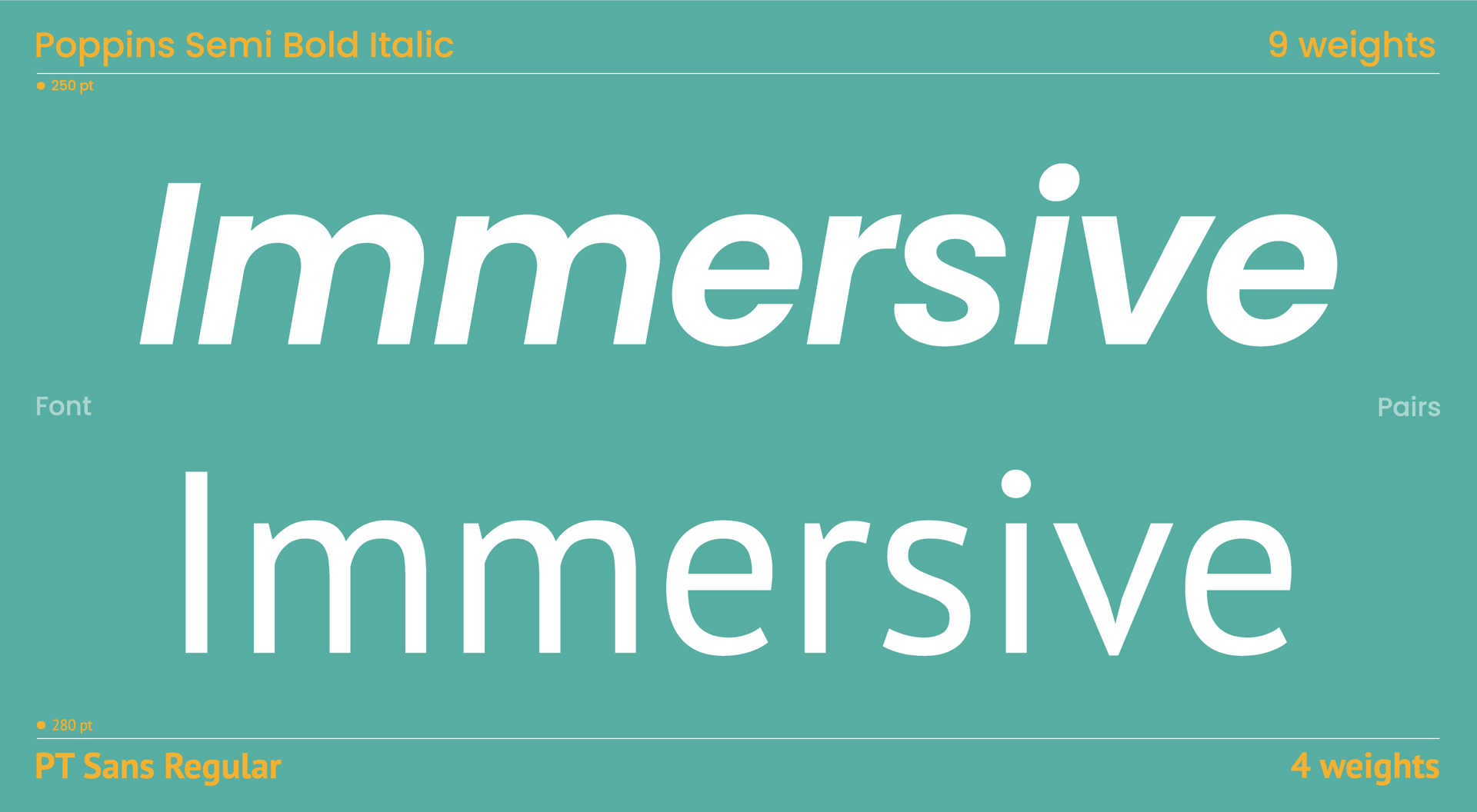
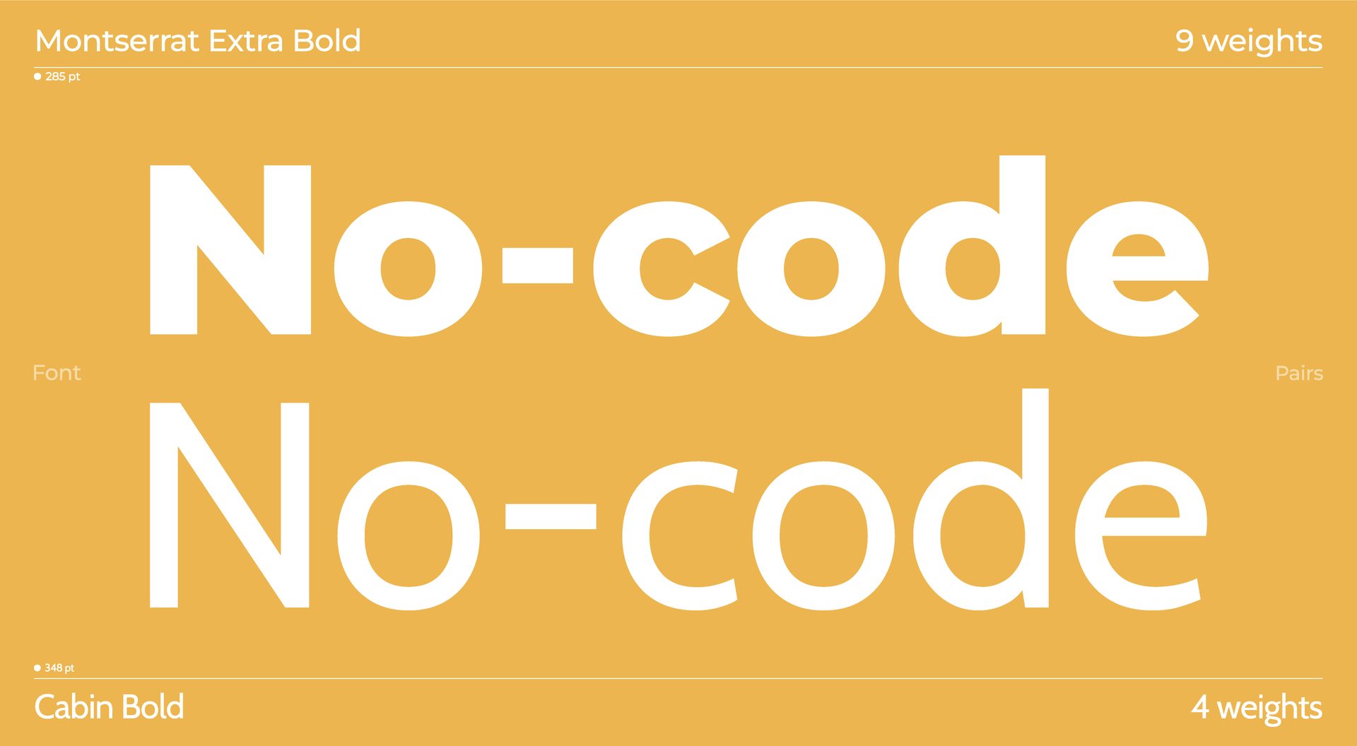
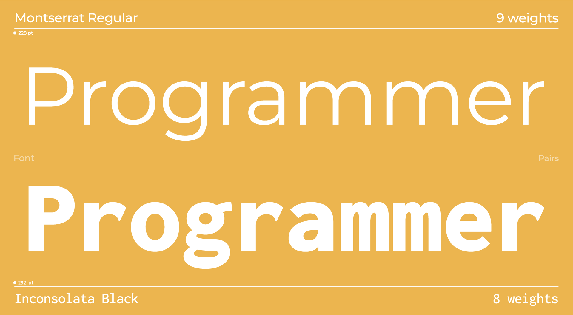
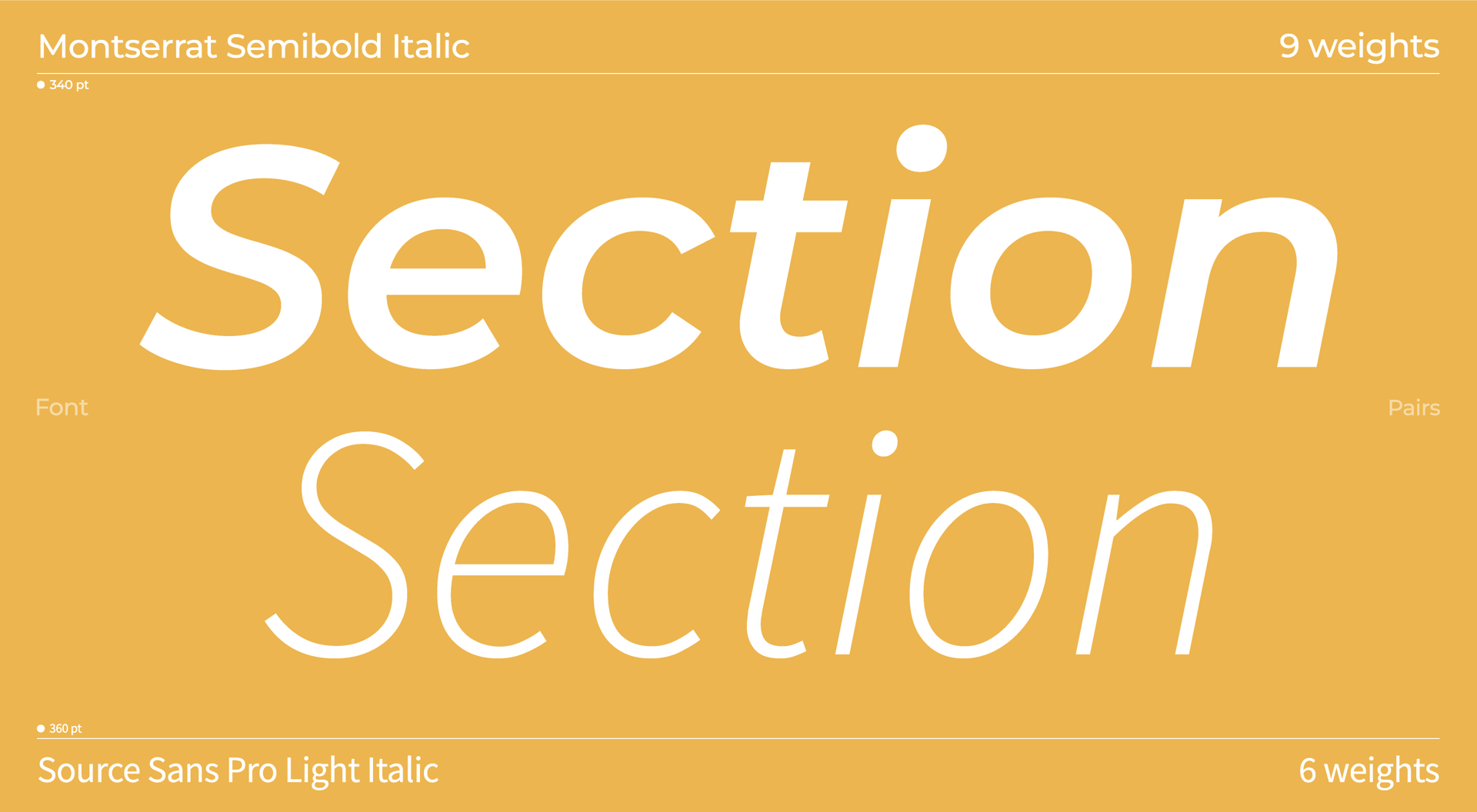
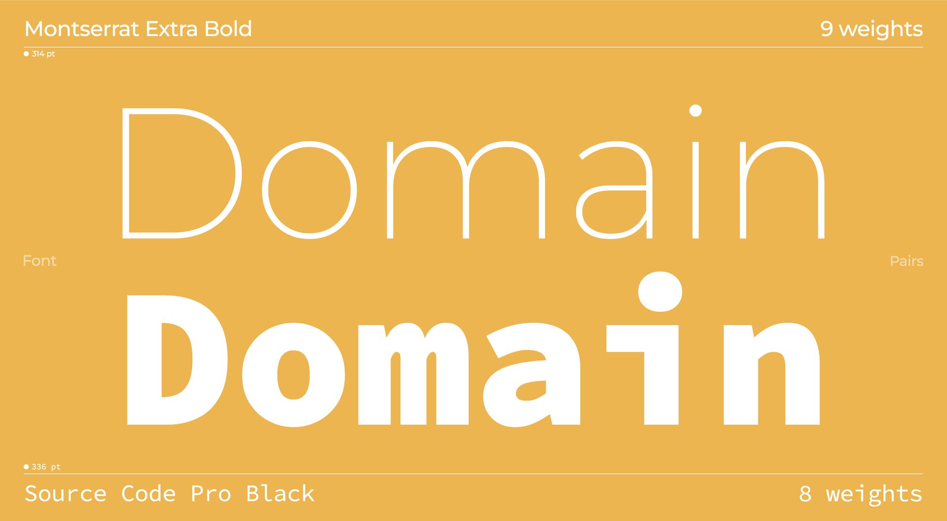
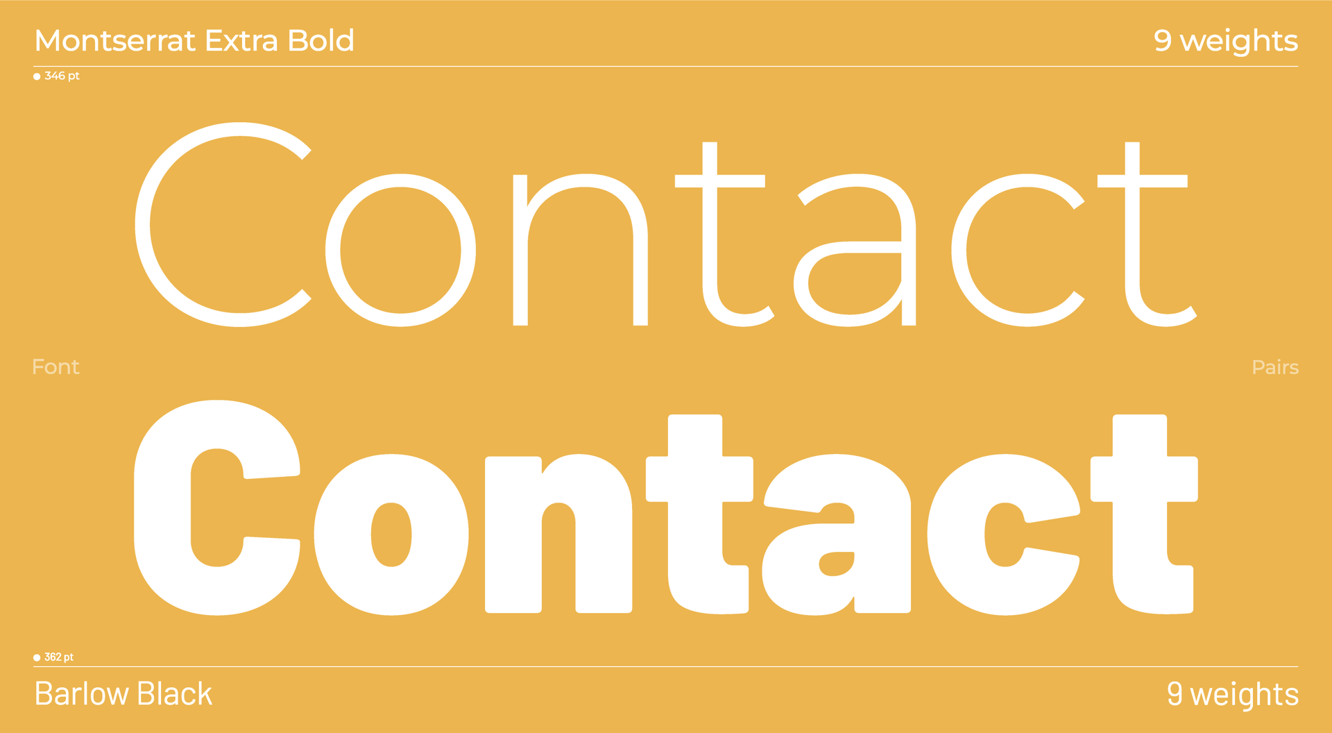
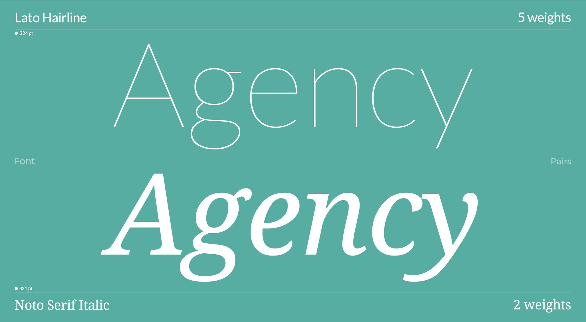
Font combinations are a design concept where two different typefaces are used to complement one another. Used well, this technique can lend your web design project a distinct look and feel—whether that’s communicating a certain brand personality, or playing with emphasis in a headline.

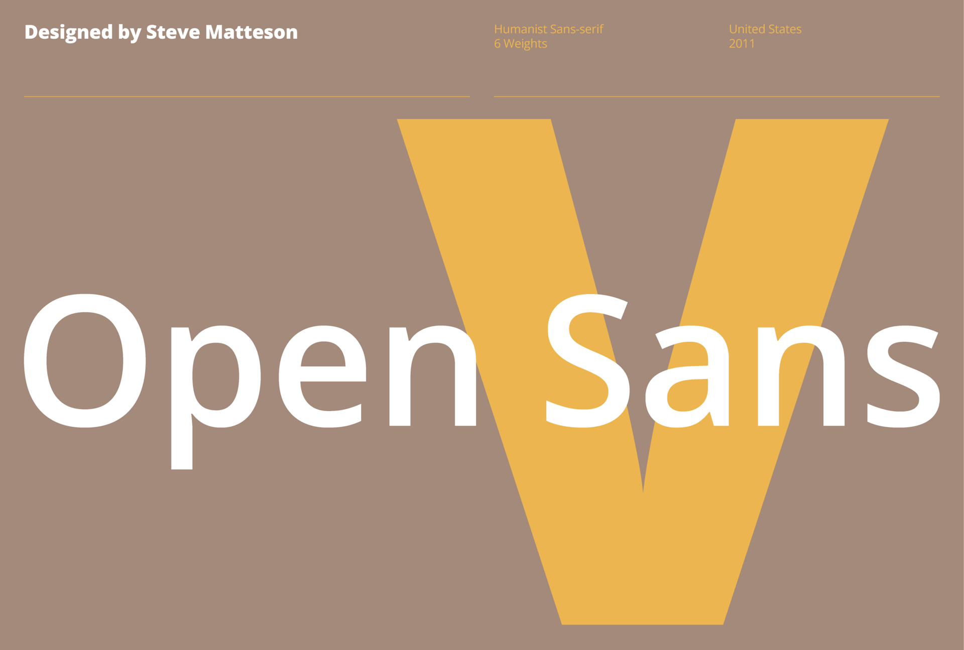
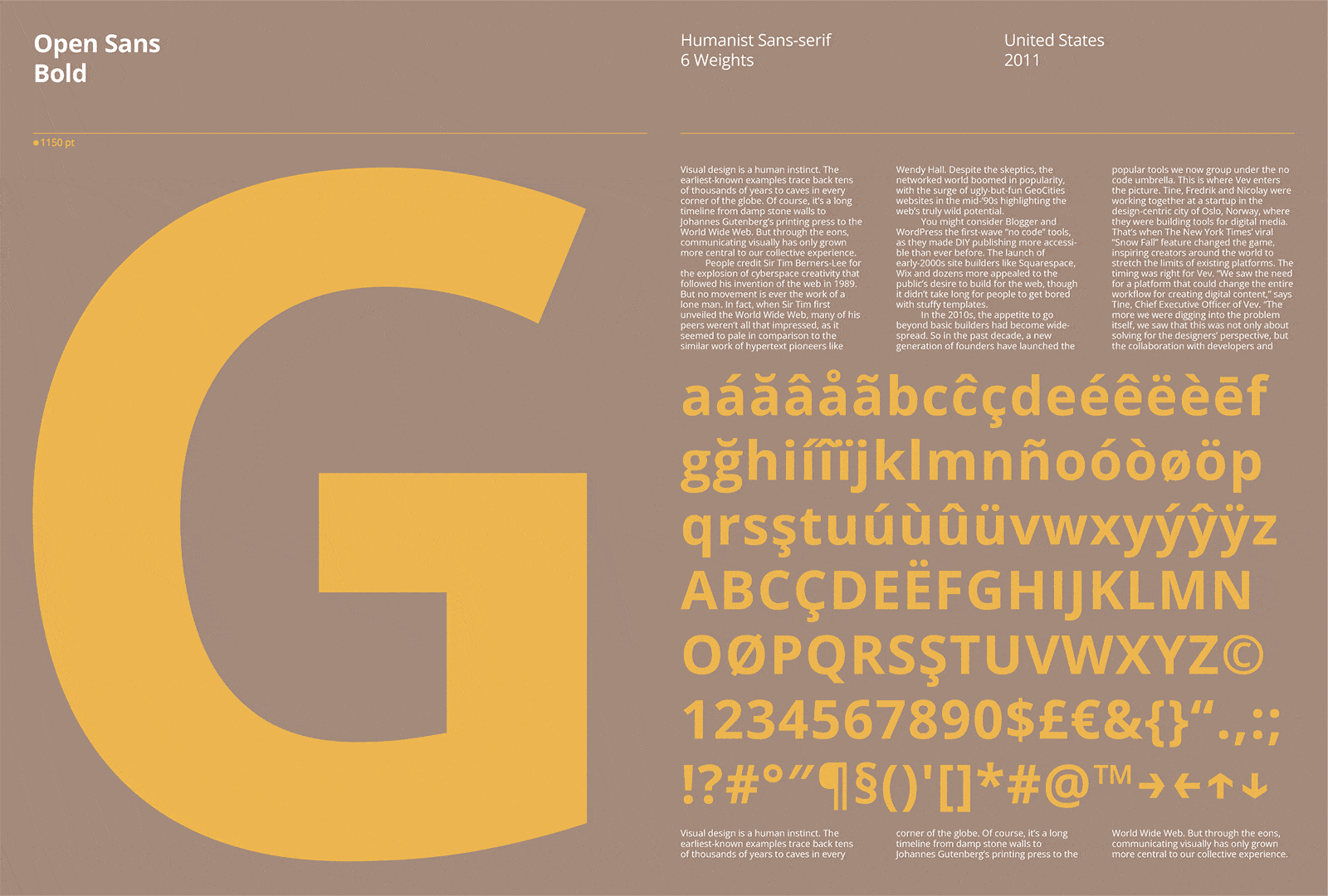
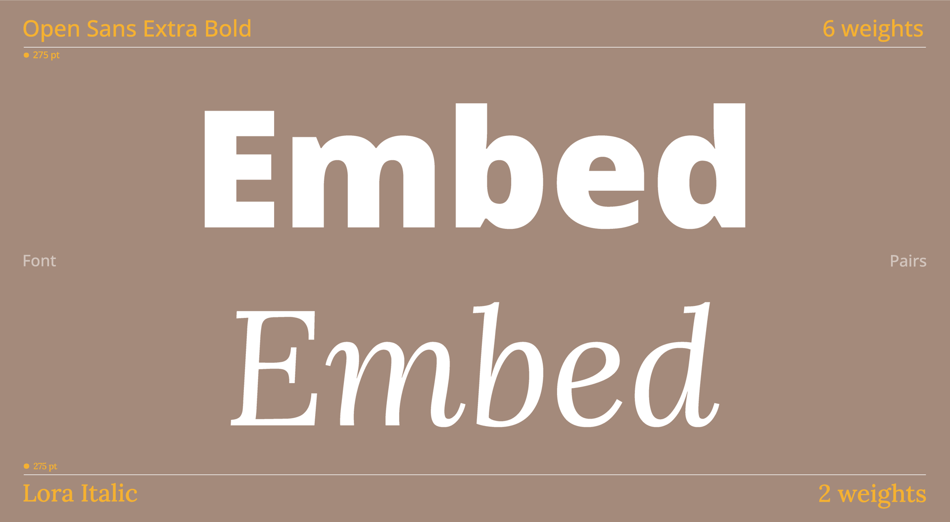
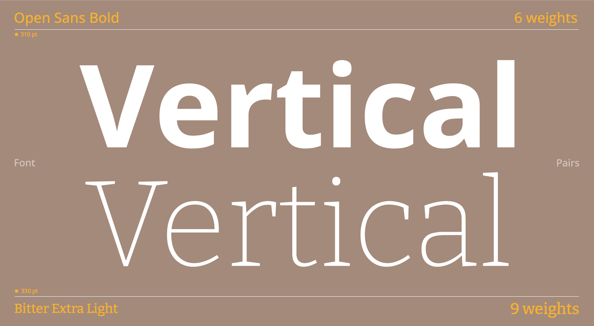
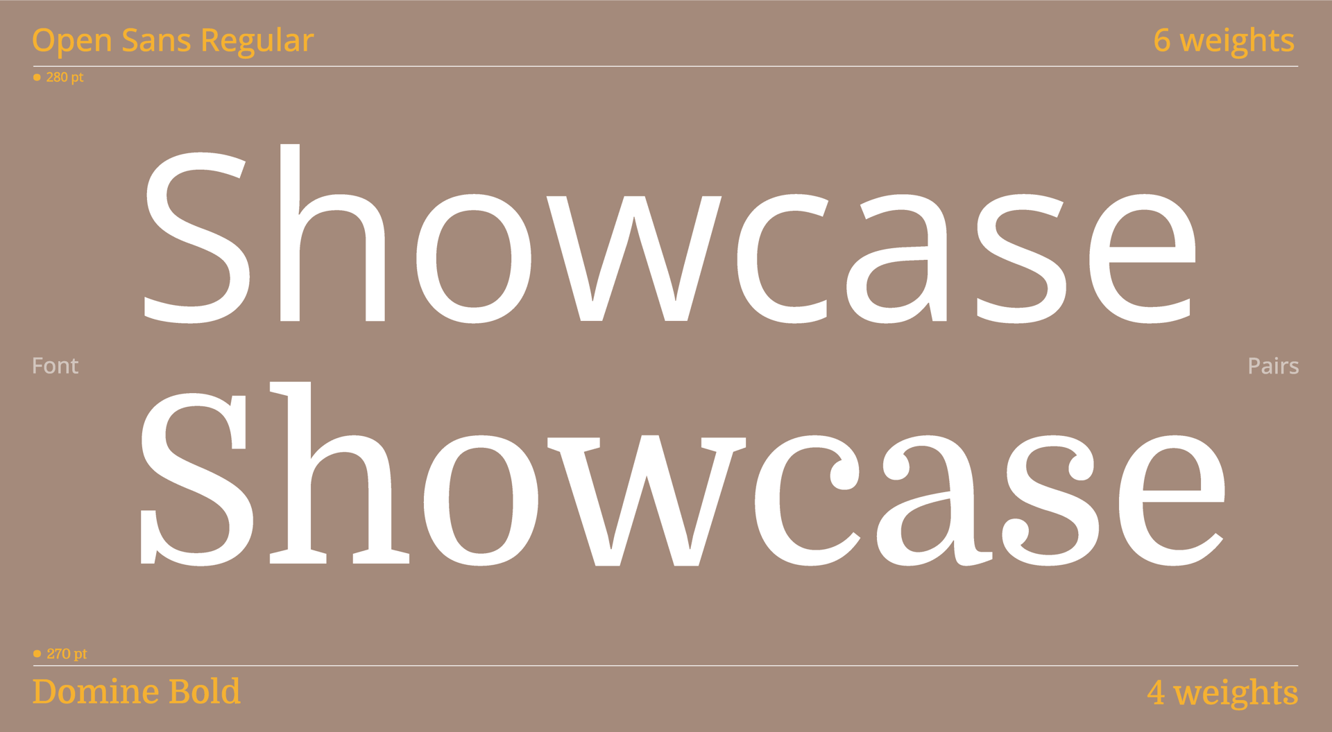
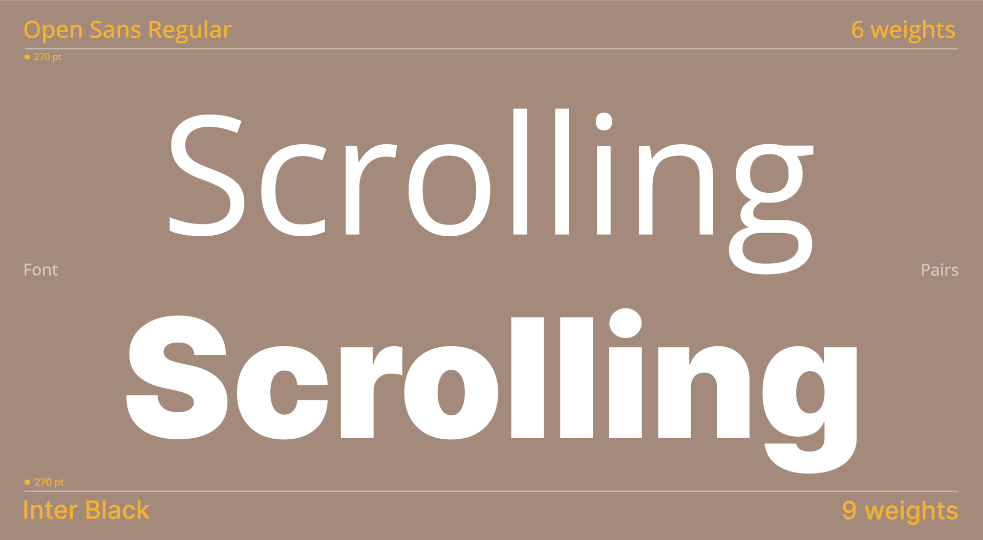
Yet, you can’t just combine any two fonts together. A typeface that delivers a bold, striking header can be really hard to read when used for body copy, leading to a poor user experience. You need to think carefully about your font combinations and pick complementary styles, otherwise your design may look out of place. At Vev, we have put together some stunning Google font combinations to get you started.


How to use Google Font combinations

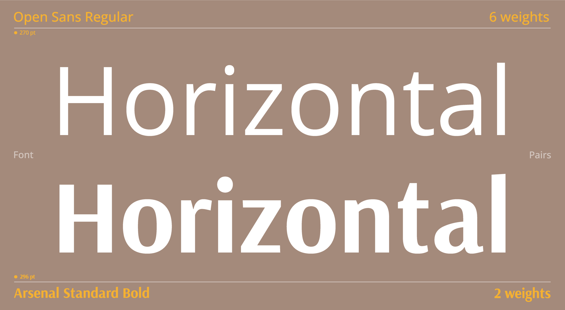
This can vary from design to design. However, a good rule of thumb is to have a set “header” typeface for your H1, H2 and even H3 tags. This should catch the reader’s attention and signpost sections of text.

Your second typeface will mainly be used for body copy, or potentially for smaller heading tags such as H4 and H5. That means you’ll want the font to be easy to read when used in smaller sizes—which is especially important if you are designing an article or blog.

Lorem ipsum this text is missing, so might put in another header to the text right hurr!!

Open Sans Font Pairings

Designed by: Steve Matteson

Open Sans is a humanist sans serif typeface designed to have a neutral, yet friendly appearance. Specifically optimized to tick all the boxes for your design, whether it’s print, web, or mobile interfaces. Open Sans is an excellent option to ensure that your content is easy to read, and with an 897 characters it can be used in a variety of different languages.

Font

Open Sans + Arsenal Standard

Arsenal is a semi-grotesque sans serif front from Ukrainian designer Andrij Shevchenko. This typeface was primarily designed to be used for body text and intended for use in professional communication. Arsenal’s design features narrow proportions, these create a design that is notably neutrality, clear, and swift.

Open Sans + Lora

Lora is a contemporary serif typeface with roots in calligraphy. With its moderate contrast, this is another font well suited for body text. The overall typographic voice of Lora is perfect in projects with a modern-day story, or an artistic flair.

Open Sans + Bitter

Designed by Sol Matas and motivated by their love for the pixel, Bitter was born. A contemporary slab serif typeface designed specifically to be read off of any computer screen, from mobile to Desktop.

Open Sans + Domine

Another font designed to be used on computer screens. Domine’s design processes was designed, tested and optimized for body text on the web from the very smart. Because of this, it performs well at 14 and 16 px and can even be used as small as 11, 12 or 13px.

Open Sans + Inter

From Swedish designer Rasmus Andersson, Inter is yet another variable font family carefully crafted & designed for computer screens. However, this font in particular performs well for web pages that need increased usability due to its tall x-height.

Poppins Font Pairings

Designed by: Jonny Pinhorn

Yet another typeface from the talented Jonny Pinhorn; Poppins, a geometric sans serif typeface is a popular companion to designers all over the world due to its support for the Devanagari and Latin writing systems.

Product, Azure, Font, Aqua
Font

Poppins + Lora

Lora makes another appearance, we previously paired this with Open Sans but is a great all rounder for a lot of font pair applications.

Poppins + Teko

Teko is a striking compact sans-serif font. Featuring letterforms with low stroke contrast, squared proportions and a structure that appears visually simple, Teko also pairs well with Poppins due to its support for the Devanagari and Latin writing systems.

Poppins + Vollkorn

We’ve also previously paired Vollkorn up with Lato. Due to the style contrast between the serif and sans serif typefaces Vollkorn visually pairs well with Poppins in all applications. Whether it’s a header or body copy.

Poppins + DM Sans

DM Sans is a low-contrast geometric sans serif design, intended for use at smaller text sizes, meaning it pairs perfectly as body copy. It was designed by Colophon Foundry, which was born from the Latin portion of Poppins, so you can be confident that it will pair well due to the similarities it draws from Poppins.

Poppins + PT Sans

PT Sans was developed for the project "Public Types of Russian Federation," a project dedicated to the 300 year anniversary of the civil type invented by Peter the Great in 1708–1710. It was given financial support from the Russian Federal Agency for Press and Mass Communications.

Montserrat Font Pairings

Designed by: Julieta Ulanovsky

We’ll start by introducing our first font family, Montserrat. This strong sans-serif font is available in an outstanding 18 different font styles. It also has two sister families, Alternates and Subrayada, so you are really spoiled for choice. In this article, we’re going to concentrate on the original Montserrat font family and show you what combinations work best with this diverse typeface.

Brown, Amber, Orange, Font
Font

Montserrat + Cabin

Cabin is a humanist sans-serif font that combines nicely with the Montserrat family. Humanist sans-serif typefaces get their name from emulating the characterized presence of the hand, whilst staying structured and modern. Overall, they hold a more organic structure than traditional sans-serif typefaces.

Montserrat + Inconsolata

Inconsolata is a monospace font, designed to be legible for printed code listings. This typeface takes inspiration from ‘programmer fonts.’ Designed to be legible for screens, rest assured that this typeface will be easy-to-read on your webpage.

Montserrat + Source Sans Pro

Adobe's first open-source typeface family, Source Sans Pro, is a sans-serif typeface designed for specific use in user interfaces.

Montserrat + Source Code Pro

Another variation of Adobe’s Source typefaces, Source Code Pro was adapted from the Source design to complement Source Sans Pro. The font was specifically adapted to a monospace font to be used for coding applications, hence its name.

Montserrat + Barlow

Barlow is a slightly rounded, sans-serif typeface perfect for giving your design a softer feel. Drawing inspiration from the visual style of California, Barlow shares qualities with the state's car plates, highway signs, busses and trains.

Lato Font Pairings

Designed by: Łukasz Dziedzic

Our next font family, Lato, is another sans-serif font that is available with a selection of 10 font weights. Created by Polish designer Łukasz Dziedzic, Lato made its debut in 2010 and has been increasing in popularity ever since. The typeface was originally created as a set of corporate fonts for a large client who decided to go in a different stylistic direction. To everyone else’s benefit, the font family became available for public release.

Azure, Font, Aqua
Product, Font, Line, Aqua

Lato + Karla

Karla is a grotesque sans-serif family. When we say ‘grotesque’, we don’t mean that the font is ugly; it actually refers to the set of sans serif fonts produced around 1815. In this case, the typeface is a modernized take on fonts from this time period. Karla is a typeface designed by Jonny Pinhorn, the same designer who created Shrikhand, one of the fonts we combined up in our Top 10 Google Font Pairings.

Lato + Merriweather

Introducing a serif font into the mix, Merriweather was designed to be a text face that is pleasant to read on screens. It features a very large x height, so when combined with Lato, it can work very well as a header or even as body text with its easy-to-read design.

Lato + Vollkorn

With the intention to be quiet and modest, Vollkorn is a high-quality serif text face ready for use in all aspects of design. Meaning, it can be used in body copy, or just as well for headlines and titles. From German designer Friedrich Althausen, Vollkorn (pronounced “Follkorn”) was first published in 2005. Hitting the ground running, the typeface was downloaded thousands of times and used in all kinds of web and print projects.

Lato + Arvo

Now for something completely different, Arvo is a geometric slab-serif typeface family suited for screen and print. Slab-serif fonts have strong, thick, block-like serifs. Historically, slab-serif fonts were used for small print, such as printing with typewriters. The thick serifs allow the user to easily read the detail of the lettering in smaller sizes.

Lato + Noto Serif

Noto is a global font collection for writing in all modern and ancient languages. Available in a variety of different styles, we’ll be combining the Noto Serif style specifically with Lato due to the contrast that a serif and sans-serif font can bring to your design.

Smart font combinations can make all the difference

Font combinations are probably the last thing many people may think of when they hear “web design”, but the fonts you apply to your web project are just as important as layout and imagery. The most visually stunning design can be completely undermined if the font choice is illegible.

So, when approaching web design in the future, take an extra minute to consider your font choices:

  • Is the header eye-catching enough?
  • Is the body copy easy to read?
  • Do the font styles pair well together, or do they clash?
  • Are they too visually similar to have any real impact?

If you are still unsure, you can always refer back to suggestions in this article to help elevate your next web project.

Experiment with Google Font pairings

Vev comes pre-loaded with all 915 Google Fonts, so you can find your own combinations without any extra legwork. Use our library of advanced components and animations—including scrollytelling, 3D objects, video backgrounds, and horizontal scrolling—to design cutting-edge interactive websites without writing a line of code.

Atmosphere, Dishware

Get our monthly newsletter straight to your inbox.
You can always unsubscribe at any time.
Privacy Policy

Material property, Dishware, Serveware

Want More Inspo?