
How to Create an Effective Landing Page using UX Principles
October 25, 2021
Words by Tiril Uggerud
Even though Vev lets you build and design whatever your heart desires, there is still some know-how you have to bring to the table.
At the end of the day, the purpose of a landing page is to convert and eventually grow your business. Therefore, we have collected the must know UX (user experience) principles that any good designer and marketer should have up their sleeves in order to make highly effective landing pages they can be proud of.

The True Landing Page
Let us have a proper look at what a true landing page really is. A landing page is not only a destination page or link which you send your visitors after they have clicked an ad — it is a dedicated (dedicated to the offer in the ad), standalone (not connected to your website’s main navigation) page that guides your visitors down the funnel that leads to your business’ growth, as well as solves the visitor’s needs quickly!
A landing page should serve a single purpose, which is the defined purpose of the campaign. If you start building without a clear idea of what your objective is, then you have failed before you’ve even started.
A user will have a positive experience if a landing page is relevant and dedicated with a single message. This forms the base of a conversion-centered design (CCD), a design aimed at achieving this conversion. So before you start creating, make sure you have asked yourself these questions:
- What is the objective of this landing page (drive signups, purchases, downloads )?
- What is my audience’s specific objective once they land on the page?
- What part of the customer journey does this landing page come in?
- What do they need to evaluate the offer as easily as possible?
- How do we enable them to claim our offer in a simple manner?
- Do they need any more information at this stage?
- What concerns do they have?
Once you’ve been able to answer these questions, then it’s your job to make sure every single element on the landing page contributes to this goal/target/metric/objective/KPI (pick the buzzword you use).
The fewer the distractions, the better the results.
Be Clear and Persuasive
The fewer the distractions, the better the results. Your offer should be easy to understand. That sounds like a no-brainer but is easier said than done. Communication is more than just words, it is how it’s presented, in which order, and its surroundings.

Hold Attention
A true landing page should have a 1:1 attention ratio. In this context, the attention ratio is the ratio of actions a visitor can do to the number of actions the visitor should do. And as I have stressed many times already, a true landing page should always have only one action! Let us look at the UX theories that back this principle up making it explaining why less is more:
Hick’s Law
Hick's Law predicts that the time and the effort it takes to make a decision increases with the number of options. The more choices, the more time visitors take to make their decisions.
Cognitive Load
Cognitive load is the total amount of mental effort that is required to complete a task. You can think of it as the processing power needed by the visitor to interact with a landing page. If the information that needs to be processed exceeds the visitor’s ability to handle it, the cognitive load is too high.
Keep It Simple with One CTA
With this information in mind, make sure to have only one (yes, I mean 1!) Call To Action (CTA). Your CTA is the only action you want visitors to take on your page and is your primary conversion target. The famous saying goes like this: If you have two CTAs, you have zero.
Landing pages are based on a single purpose and should have a focused user experience. This will greatly help in reducing the distractions on the page. It’s even considered best practice to remove any secondary links and even navigation links to prevent them from getting lost on the target and making sure you are not wasting money on the ad click.
Visual Hierarchy
Know that people usually don’t read, people scan information. Visual Hierarchy is used to rank design elements and influence in the order you want your visitors to view them. By using principles like contrast, scale, balance and, more, you can help establish each element in its rightful place and help the most important elements stand out allowing visitors to reach the goal as fast as possible. Learn how you can create beautiful designs while reaching your accessibility requirements.
The Importance of Your Headline
First of all, the headline should be positioned at the upper half of a landing page so it is visible without the need to scroll down the page, and it should be the most distinct piece of copy on your landing page.
Why should visitors accept your call to action? The headline copy should convey the exact point of the campaign and deliver on the promise of the ad they clicked to get to the landing page. Remember, the visitor was intrigued to click the ad in the first place, so make sure the copy on the landing page is consistent with the promise, and persuade with further information that makes sense with the offering.
The Law of Proximity
Elements close to each other on the same page, are usually considered to be related. So make sure that the headline and the CTA are close enough to each other to trigger this effect, making sure the obvious next step is nearby.
External Trigger
After you have created a CTA that is recognizable and close to the headline, you have won half the battle. But let us not forget the other half, which is letting visitors know what will happen once they click your button. To win the whole battle, you have to consider your offer.
An external trigger is embedded with some sort of information, which tells a user what to do next. Often, the desired action is made explicitly clear. So make sure your CTAs speak! Make the copy on your CTA a bit more interesting than “Submit”. A clear CTA button should let visitors know what happens after they click and should keep them interesting to pursue the next step.
Social Proof
As humans, we are social creatures, and what others do means a lot to us when we make a decision. Social proof — testimonials, client logos, reviews — can be a fast and effective way to build trust and credibility. Visitors are much more likely to convert on your landing page if they believe that others have done it before them and have been happy with the results.
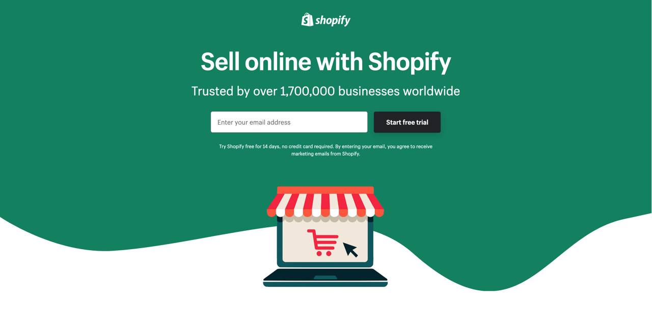
Source: Shopify
The headline is super descriptive of the offerings of Shopify, social proof in the subtitle, and the Start Free Trial button is right below making it clear what the next step is.
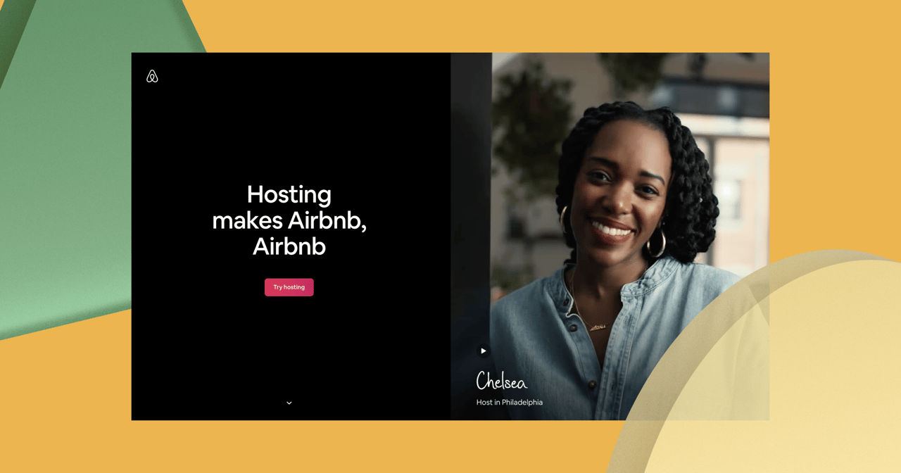
The Hero Shot
As previously mentioned, communication is more than words, imagery is equally important to tell the full story. This takes us to the primary imagery, or also known as the hero shot. You have one chance of making a good first impression so make sure you make it captivating. Show your product or service in the context of use. Demonstrate how it works, or show the emotion or value your visitors will get by using your product/service.
It might be easy to get hung up on images and illustrations, but using video as your hero is a highly effective way to engage visitors and increase conversion. In fact, according to Unbounce, adding moving pictures to your design can increase conversions by as much as 80%.
Source: Athletic greens
Quick cuts and with relevant images captures the attention of the visitor, adding emotion and story to the offering.
Optimize Your Landing Page
Especially when having videos and heavy imagery as your hero it is vital that your content loads quickly since it is the first thing the visitor sees! The speed at which the content loads has a huge impact on how long it takes your visitors to decide whether they want more information from your business. Optimizing your landing pages with lazy loads and other best practices is important to keep your visitors on the page, decreasing the possibility of them leaving your site even before the page loads.
As a marketer or a designer, many of these principles and precautions might already be a part of your toolbox when designing a landing page. If not, here you go, make good use of them and see how your conversion rates will increase. Wishing you many happy landings!