
How to Create Trendy Gradients in Vev
October 25, 2021
Words by Parker Tinsley
By using just a touch of color, your entire design can change.
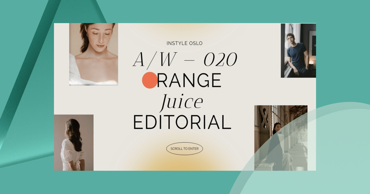
In this demo, we will show you how to quickly create a gradient shape that can act as a ray of sunlight in your otherwise bland background.
Setting Our Structure and Design
First things first, we need establish our structure that we will using in our design. For this demo, we want to create a fullscreen immersive effect with the section.
How to set a fullscreen section
We will add a section to our canvas and set it to be fullscreen with the following sizing.
- Height: 100%,
- Min-height: 900px
This will ensure that our section is 100% of the viewport height on any browser with a fallback of a 900px.
Adding and styling a circle element
Now, feel free to add images and text like the full demo but today we will focus on adding a circle element and customizing it to be a gradient that extends from the element itself.
For this, we will add a circle from the Add Menuor using the Shape quick tool on the top-bar. We can then, select a circle and add to our canvas.
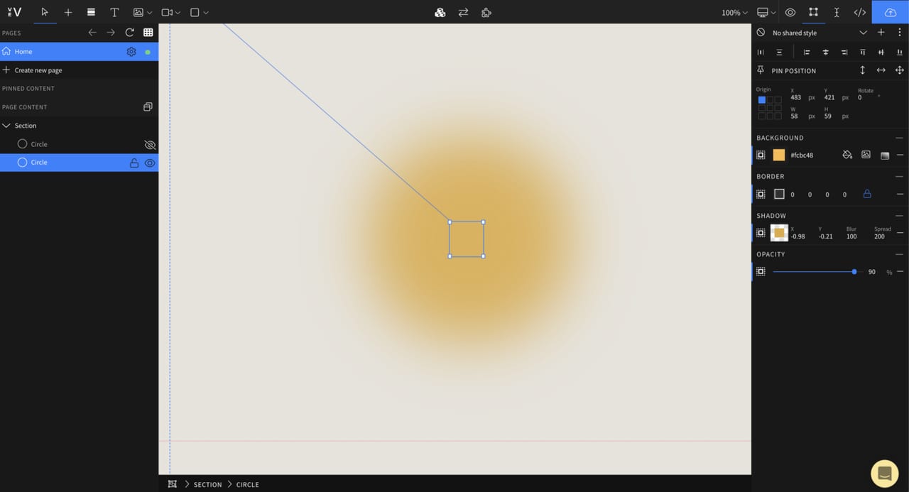
For sizing, we will want it to be 60 pixels by 60 pixels. For styling, we will make the circle color #FCBC48.
Adding the Trendy Gradient
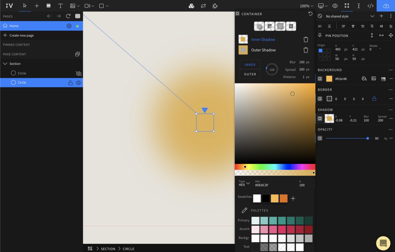
To do this, we will be utilizing a few effects in our toolkit mainly the use of an inner & outer shadow.
You can skip ahead and use the parameters in the image above but you might learn a thing or two with the full breakdown.
Styling the Outer Shadow
The outer shadow will give the circle that sunbeam ray extending past the 60x60 container. We have set the styling set to:
- Outer: 0 degrees
- Blur: 100px
- Spread: 150px
- Distance: 5px
- Color:
#DEAC3F - You’ll notice we are using a deeper orange than the color of the actual circle, this is to create that spread-out effect.
- You should start seeing something like this now. The circle itself is still visible so we need to add an inner shadow to start blending that in.
Adding the Inner Shadow
The purpose of the inner shadow is to blend the circle completely so it appears as a radial gradient. To do this, we need to add a new inner shadow using the shadow tool, then set the styling to be:
- Inner: -135 degrees
- Blur: 100px
- Spread: 200px
- Distance: 1px
- Color:
#DEAC3F
Wrapping Up
With that, you've created a circle element with a inner & outer shadow that work as a trendy gradient. The next step is to add images and text to relay your message and make it truly original.