
Meet the New Style Panel and Layout Features
November 8, 2021
Words by Parker Tinsley


We’re making major changes to the Style Panel. See what will change, why, and our plan for the future.
On November 19th, we will release a brand new Style Panel and a ton of layout features to make responsive building easier. Our team has tested internally for months and we are excited to roll it out and take you through what will change and why.
Why the Change?
Preparing for the Future of No-Code
Since we've ended support for Internet Explorer, we knew we could significantly improve the experience creatives have in the platform and the content they produce. To that end, we’ve actually rewritten the code of not just the Style Panel but the entire Design Editor.
Our focus was to rework the CSS output of content made in Vev, improve the speed and performance of the editors, and prepare the platform for more advanced features in the future.
Introducing Silke, Vev's Design System
In September, we started the process of implementing our new design system, Silke, into the platform. At first, this meant little things like color changes and some UI enhancements but now with the release, we've completely redone the Style Panel.
Silke is inspired by IBM’s Carbon Design System and the heart of the UI/UX of Vev. The system focuses on improving the accessibility of the platform. Accessibility, overall, is a priority for our team not only in the platform but also in helping to ensure your own content that you create in Vev meets accessibility standards.
Build Responsive Designs Faster
Along with the code overhaul, we wanted to answer user feedback. Most creators found that building fully responsive designs felt time-consuming and tedious. With this release, we are introducing new layout features like constraints and automatic sizing to significantly decrease the time it takes to make a fully responsive build.
New Features
We've brought a ton of new layout features to help you design a responsive experience and we are only getting started.
Constraints
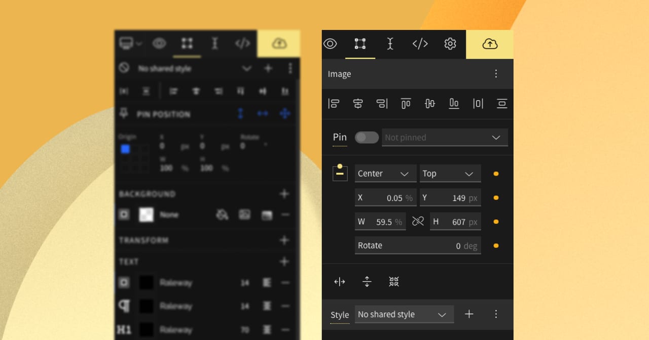
We knew to improve how you build a fully responsive design, we would need to rework the origin tool to be less manual, more automatic. What came out of that sprint was a completely new layout feature — constraints.
What you need to know:
- Constraints decide how an object should behave when the parent container changes in size. This gives you full control of the object’s positioning across all breakpoints.
- Constraints are automatic. Meaning that most of the work is done for you. Simply move an element on your canvas and the constraints will automatically update. You can manually change it as well but we recommend sticking with the automatic way.
What you need to know:
By specifying elements or sections to be
autoheight or width, the element will automatically size based on what’s inside of them.Automatic sizing will allow text boxes and sections to grow in height as more content is added. Content Editors rejoice 🙌.
- Minimum height will be the new standard. We’ve removed height as the standard since our user testing found that a common issue with Vev content breaking was due to the minimum height of sections set as undefined. As a solution, minimum height is the new (and only) value for height.
Automatic Sizing
Finally! This one will come as a relief to all designer and content editor duos. We’ve introduced a new auto value for sizing alongside pixels and percentages.
What you need to know:
- Default style (Grey) = Indicated by a grey circle, this means the element is set to the default style of the editor
- Custom style (Yellow) = Indicated by a yellow circle, this means the element is set to a custom style to that specific device or breakpoint
- Inherited style (blue) = A blue circle, this means that the style originates from the main layout or device (for ex. Desktop)
Style Indicator
The style indicator tool lets you see which styles are applied to an element: default, custom, or inherited [from the main layout]. By utilizing this tool, you can decrease the number of responsive adjustments needed and work closer to a truly responsive design based on a single layout.
Lock Size & Aspect Ratio
Ever had trouble getting the right size for a Youtube embed? Now you can ensure that elements like images and videos retain the same aspect ratio on any breakpoint. Simply, click on the lock aspect ratio icon or use the shortcut ↑ + L
You can also right-click to reveal a menu of popular aspect ratios.
Clip Content
You can now clip any element within a frame to avoid it extending outside its container. We recommend still sizing elements to be responsive within a frame but clip content will allow you to achieve more custom designs.
Default Relative Sizing (%)
When you first add an element to your canvas the position and width will be set to a percentage. This is to prompt best practice, responsive building from the start. You will be able to to manually switch back to a fixed value like pixels (px).
New Safe Zone Design
You may have noticed the safe zone also got a makeover. With the light green background, you’ll be able to see the boundaries even more clearly as you build your responsive layout.
Remapping of Style Tools
We’ve completely redesigned the Style panel and remapped where certain tools are based on user tests. Don't worry, no tools have been removed but you may notice them in a different order now.
Improved Frame Padding
Now you can set spacing options like padding to frames!
Distance Indicator
We've introduced a new guide tool that will show you the exact pixel value when you position elements. This will help to ensure you have pixel-perfect designs.
Improvements
Frequently Asked Questions
What will happen to my content build in the old Style Panel and Design Editor?
All Vev projects will be automatically adapted to the new Style Panel and Editor. If you experience any issues with a project, please reach out to support directly on the platform.
Will I have access to the previous style panel?
Since we are making way for the future, we are officially deprecating the old Style Panel. We realize depending on your process this may be a minor or major change but we plan to produce additional education material to make this a smooth transition.
I’ve found a bug, where can I send more info?
Found a bug, great! Please send a detailed report to us on the platform by sending us a message and selecting 'Report a bug'.
Let Us Know What You Think
We realize that depending on how you build this could be a minor or major change to you personally. In our months of testing, we made sure to constantly test against our most common use cases so that no matter which way you build, these changes should feel like a welcomed improvement.
If you do run into any issues or unexpected behavior, please let us know by using the platform support.