
Design Like a Pro: The Top Web Design Trends of 2025
June 19, 2025
Words by Jeff Cardello
In 2025 people don’t want to interact with websites in the same ways that they might with an ATM or microwave. Usability still matters, but so do experiences that tap into our needs for authenticity, connection, and surprise. The trends pushing design forward in 2025 are those that go beyond practicality, making the web a more imaginative and personable place.
We’re going to take a look at nine different web design trends. From the glacial slowness of meditative design to the hyperactive overdrive of brain rot, we’re going to explore the wonderful paradoxes of modern design where perfection and realism are as important as chaos and experimentation.
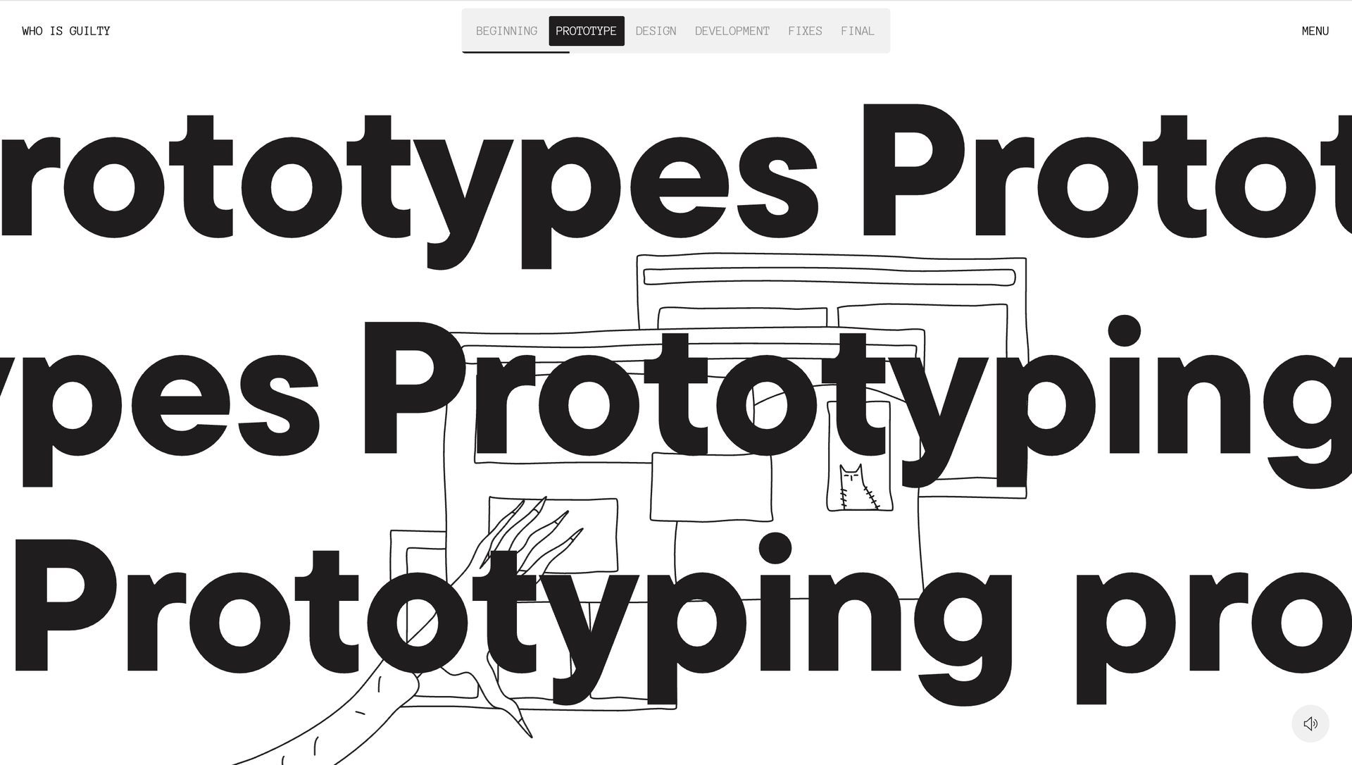
1. Analog-digital hybridization
We’re used to seeing the web in HD. Every color, vibrant. Each curve, smooth. And sharp lines set with unbroken symmetry. Our eyes are tuned to precision and clarity.
But sometimes, all that is perfect is a bit too perfect. We want to see fraying at the digital edges, and a bit of messiness and imperfection that reminds us that behind a design is a real person. Designers are taking what’s great about contemporary web design and combining it with organic touches like hand-drawn illustrations, inky typography, and broken grid lines, for user experiences that feel more human.
Who is Guilty is a great example of this hybrid approach, telling the story of when things go wrong on a project - something relatable to anyone who works in a creative field. Giant typography, parallax animations, and horizontally scrolled sections are combined with loose illustrations and bit-crushed audio, which strikes the right balance between the polish of digital design and warmth of lo-fi.
2. Meditative design
Whether it’s silencing notifications on our phones, going on a stroll, or listening to some chill music, it’s nice to relax and take a break.
Just like taking some time to slow things down in one’s busy day, websites with laid-back user experiences can also feel like a mental reset. Soft color palettes, lightweight typefaces, ambient sound effects, and intentionally patient interactions give us the space to absorb the information or stories being told.
Much like the geological eons that transform organic matter into petroleum, Aramco: The Birth of Oil offers a user experience that unfolds at a tectonic pace. With its airy colors, gentle parallax scrolling effects, minimalist electronic soundtrack, and soothing narration, it hums with a zen-like calm. It’s a great example of how slowing down the tempo can naturally draw in our focus.
3. Kinetic grids
Everyone loves a grid, right? From the posters that came out of the Swiss School to the tidy rows of homes crisscrossing suburbia, grids have a sense of structure that are easy to understand.
Kinetic grids are built on similar linear frameworks. But instead of unmoving squares and static gridlines, they respond to visitors’ actions by shifting, scaling, transforming, or triggering some other action.
Dropbox’s brand guidelines keeps its grid lines visible in a light blue, but frees them up with motion and dashes of color. While conventional grids can be tiring, with each element anchored into a set position, Dropbox’s fluid grid lines break up the design making it a more interesting and visually compelling piece.
4. Abstract physics
We’re familiar with the easing and actions of conventional web animations. But not every animation needs to be modelled after real-world laws of motion. Designers have been taking animations into alien worlds of shimmering, opalescent liquids, flickering sparks of frozen embers, and particle systems controlled by mysterious gravitational forces.
While most venture capital firms stick to conventional tech aesthetics in their web design, it’s always refreshing to see companies like Blue Yard Capital take a more experimental approach. From white hot spheres of sparking plasma, ripples of cool water, to mysterious metallic jig-saw like spheres, it uses motion to evoke an otherworldly sense of atmosphere.
5. Brain rot
Snagging the title of Oxford’s 2024 Word of the Year, ‘brain rot’ describes the hazy, overstimulated state you enter after consuming way too much low-quality content. Like being sleep-deprived and only eating sour Sour Patch Kids, everything is funny, but you’ve lost the ability to explain why.
With jarring color combinations, mismatched typefaces, and plenty of kitsch, Brain rot as a design aesthetic elicits a similar state of numbing sensory overload. Think of brain rot as the Gen-Z cousin of maximalism, with in-jokes that only someone born after the year 2000 will likely get.
Enter, Sophie Powers. Powers’ music feels like an algorithm dissected popular genres, stitched them back together, and ran the results through a data center full of effects processors. Her website is glittering and chaotic, with pixelated text, spray paint flourishes, and contrasting colors, feeling like AI model hallucination of a Tumblr blog.
6. 3D photorealism
Most people are set up with internet connections and digital devices that have no problems loading graphics intensive websites. Along with more advanced computing power, 3D tools like Womp, Rive, and Spline have made 3D animations accessible even for those who aren’t well versed in shaders and rendering. 3D graphics have come a long way since the browser-crashing plugins of the early 2000s, and it's becoming increasingly common to come across websites featuring rich, detailed 3D visuals.
Immersive Garden uses 3D photorealism in offering a user experience that feels tactile, with the cursor acting as a sculptor’s chisel, turning grey pixels into that which has form. Birds, flowers, and leafy branches emerge from the background, for a user experience that feels artistic and alive.
7. Anti-brandwave
With neon-like colors, random visuals, and very specific and stylized art direction, anti-brand wave is an aesthetic of controlled anarchy. Think Meow Wolf, who playfully mocks capitalism with a sense of self-aware irony.
With its color scheme of vibrant pink, teal, and blue, alt-comic illustrations, Crazy Creative evokes the weirdness of anti-brandwave, showing potential clients what makes their work a great fit for those who want to do something way outside the norm.
8. DIY
DIY is a celebration of the crinkly textures of paper and the smear of screen print ink, evoking the look and feel of traditional graphic design. It’s another way that designers are making websites feel less digital and more welcoming.
Pizarro Slice Shop with its ripped cardboard, splotchy red spot color dots, and scissor cutouts, feels like a pizza box from that unpretentious neighborhood pizza joint that has been there for years. We love seeing DIY styled websites like Pizzaro Slice Shop that have handmade charm along with all of the comforts of digital design.
9. Cinematic camera movement
The visual language of cinema, with its sweeps, pans, and zooms builds up emotion and pushes narratives forward. Our eyes follow the movements of the camera, filling us in on the context of what’s going on. Cinematic camera movements not only function well on the big screen, but also work well in choreographing how website content is experienced.
Into the Amazon tells the epic tale of the Amazon River, beginning with a gorgeous opening shot of a snow-capped peak. From this point the camera takes visitors on a journey from these frozen mountains, following the flow of water to the jungle floor, and even beneath the surface of its waters. It’s beautiful visual storytelling that has the feel of a documentary film.
Easily keep your content on trend with Vev
One of the best parts of using a no-code design app like Vev, is that it offers an open and flexible platform to test different ideas out. Whether you want to create a subtle and classy landing page, with a whisper-like user experience, or want to push everything past the point of maximalism, Vev gives you the creative freedom to easily experiment, build, and publish.
What type of design do you want to create? It’s time to start building.