What's New: Flex Layout Deep Dive (With Examples)
November 26, 2024
Words by Yujin Jo
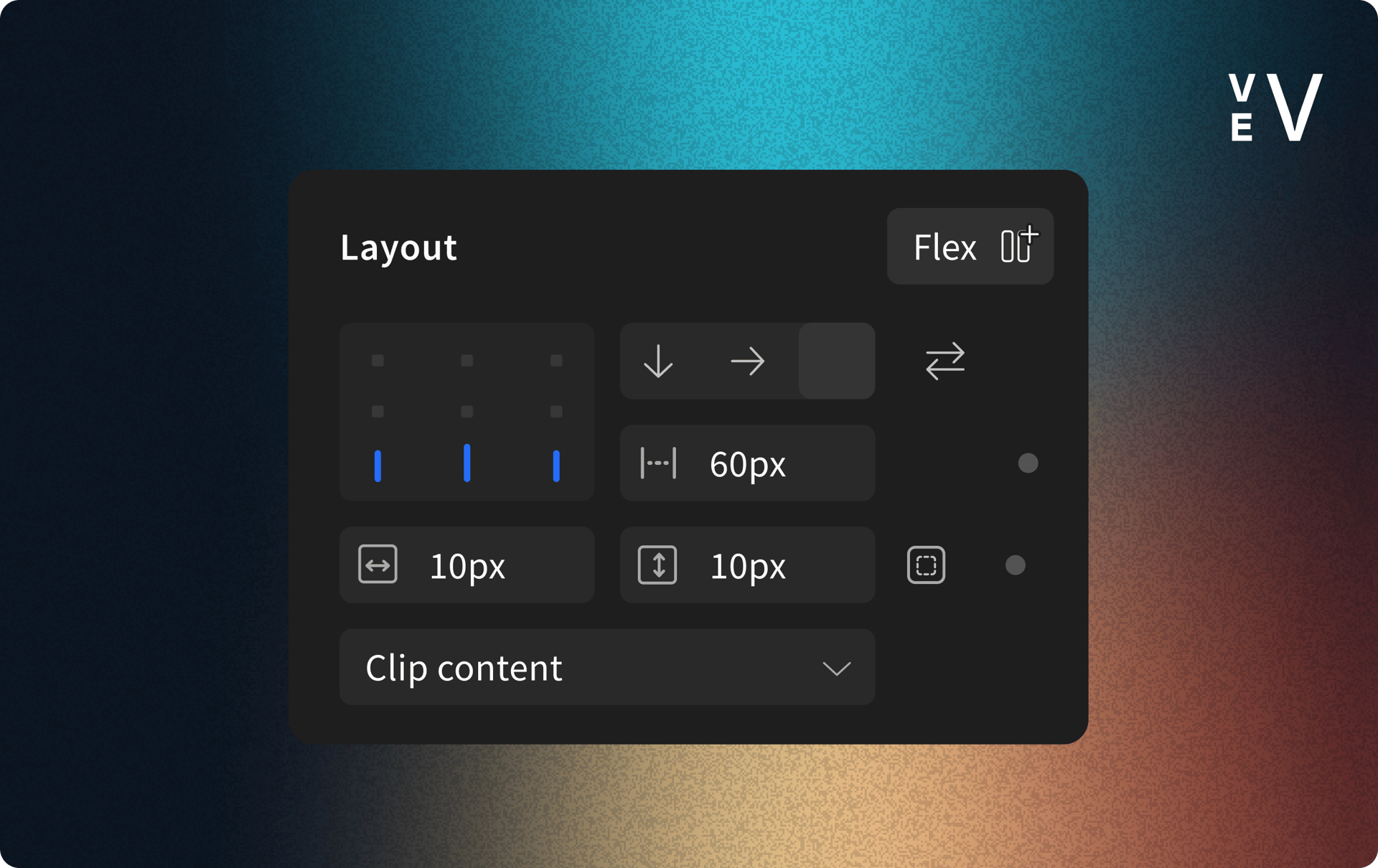
The time has come—Auto Layout feature has officially graduated from beta! Now called Flex Layout, this feature is rolling out with a fresh new name and enhanced functionality. In this post, we’ll cover everything you need to know—from why we renamed it to step-by-step guidance on using Flex Layout, and finally, some practical examples to inspire you.
TUTORIAL VIDEO
Flex Layout Tutorial Video
Ready to master the basics of Flex Layout? Join Lewis in our video tutorial and get up to speed quickly. 🫡
Why the Name, “Flex Layout”?
What used to be called Auto Layout has now been renamed as Flex Layout to reflect its roots in CSS. Flex Layout builds on the principles of CSS flexbox, which has become a staple in responsive design. We believe that the new name captures that technical foundation while giving you a clearer idea of what’s happening behind the scenes—flexible layouts that automatically adapt across devices.
💡In This Guide...
Getting Started with Flex Layout →
Flex Layout Properties Explained →
1. Set the Direction: Vertical, Horizontal, or Wrap
2. Control the Spacing Between Elements
3. Align Elements Within the Frame
4. Customize Sizing for Responsive Layouts
5. Adjust Padding
Bonus Enhancements →
Bonus 1: Refreshed Style Tab Organization
Bonus 2: Introducing the Clipping Option
Try Flex Layouts in Your Designs →
1. Cards
2. Pricing Table
3. Footer
Getting Started with Flex Layout
To access Flex Layout, select more than one element on your canvas. When multiple elements are selected, a new “Layout” option will appear in the Style panel on the right-hand side.
Enabling “Flex” on a frame tells Vev: “Here’s my content—organize it in the best possible way.” From there, you can start customizing properties like direction, spacing, alignment, sizing, and padding to build responsive layouts effortlessly.
Flex Layout Properties Explained
Flex Layout introduces a powerful set of tools to control how your elements behave inside a frame. Below, we’ll break down each property to help you make the most of them.
1. Set the Direction: Vertical, Horizontal, or Wrap
- Vertical: Elements are stacked below each other.
- Horizontal: Elements are arranged side by side.
- Wrap: This option is enabled by default when nested elements are arranged horizontally.t ensures your elements will automatically reorder or 'wrap' to the next line based on the frame width.
2. Control the Spacing Between Elements
Flex Layout introduces a powerful set of tools to control how your elements behave inside a frame. Below, we’ll break down each property to help you make the most of them.
In this release, we’ve simplified spacing options, leaving just Packed and Space Between.
- Packed: Groups elements closely together, recommended for most use cases.
- Space Between: Distributes elements evenly to fill the available space.
3. Align Elements Within the Frame
The alignment property defines the position of elements inside the frame. Choose from nine alignment options, such as Top Left, Center, or Bottom Right, to perfectly position your content.
When using Space Between mode, alignment is automatically adjusted to evenly distribute elements, limiting the alignment options to Top, Center, and Bottom.
4. Customize Sizing for Responsive Layouts
Configuring the sizing properties of nested items allows you to control how they resize, ensuring the responsiveness of the parent frame. Flex Layout supports several sizing options:
- Pixels (px)
- Percentages (%)
- Viewport Width (vw) & Viewport Height (vh)
- Auto
- Fill Space
- Min Width & Height
- (✨New) Max Width & Height
With this update, Min Width is automatically applied to nested elements, ensuring they adjust to the smallest breakpoint (e.g., mobile), making the resizing mechanism smoother.
The new Max Width and Max Height options allow you to set limits for elements, preventing them from becoming too large on wider screens. For example, if an image’s width is set to 100%, it will stretch to fill the container on larger devices. By applying a Max Width, you can ensure it doesn’t exceed a specific size, maintaining a balanced layout across all screen sizes.
5. Adjust Padding
Configuring the sizing properties of nested items allows you to control how they resize, ensuring the responsiveness of the parent frame. Flex Layout supports several sizing options:
Bonus Enhancements
Bonus 1: Refreshed Style Tab Organization
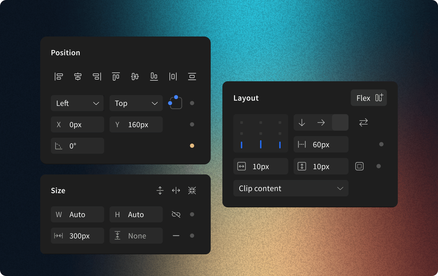
We’ve reorganized the Style Tab to provide dedicated sections for Position, Size, and Layout. This new structure improves readability and streamlines your workflow by grouping related settings together.
Bonus 2: Introducing the Clipping Option
You can now clip framed elements into shapes! Frames are compatible with this feature—so if you want to clip an image, simply frame it first. (Note: Custom clipping shapes are on the roadmap, so stay tuned for even more flexibility.)
2. Pricing Table
Pricing tables rely on vertical layouts to organize details. Flex Layout keeps everything structured and responsive across devices.
Try It in Your Designs 🤓
There are many scenarios where Flex Layout is the ideal choice—and here are three of the most common ones.
1. Cards
Cards often mix images, text, and buttons—Flex Layout helps you arrange them easily.

Sinitta Leunen
Sinitta Leunen is a UI designer who once spent hours debating a button's shade of blue. His Figma files are organized—somewhere.

Dex Harwell
Dex Harwell is a tech lead who writes perfect code but forgets passwords daily. Debugging? His form of meditation.
$0
For the "I’ll just make a new email when the trial ends" crowd.
1 tool, no more.
Get judged silently by paying users.
Security? Lol, no.
$9.99
For folks who buy blue-light glasses but never actually work past 9 PM.
5 tools—now that you’re paying slightly more.
Support that replies faster than your ex ever did.
Security somewhat tight.
$$$
For the “Let’s circle back” crowd who make long powerpoints.
Unlimited tools, because you’re clearly compensating.
Support that replies faster than your crush.
Security so tight even the NSA is impressed.
3. Footer
Since footers typically stack information vertically, Flex Layout ensures everything stays neatly aligned.
Flex Layout introduces a smarter, more intuitive approach to responsive design. With this release, we hope you’ll streamline your workflow even further and craft layouts that adapt seamlessly across devices. 🫶


