July 4, 2022
Words by Yujin Jo
What's New:Floating Top Panel & Faster Responsive Build


We've just released two exciting updates to make your Vev workflows even smoother:
- We've introduced floating top panels across all our editors for a cleaner visual experience.
- We've improved how breakpoints are set, so you can build responsive content faster.
Let's dive into exactly what these changes will mean for your work!
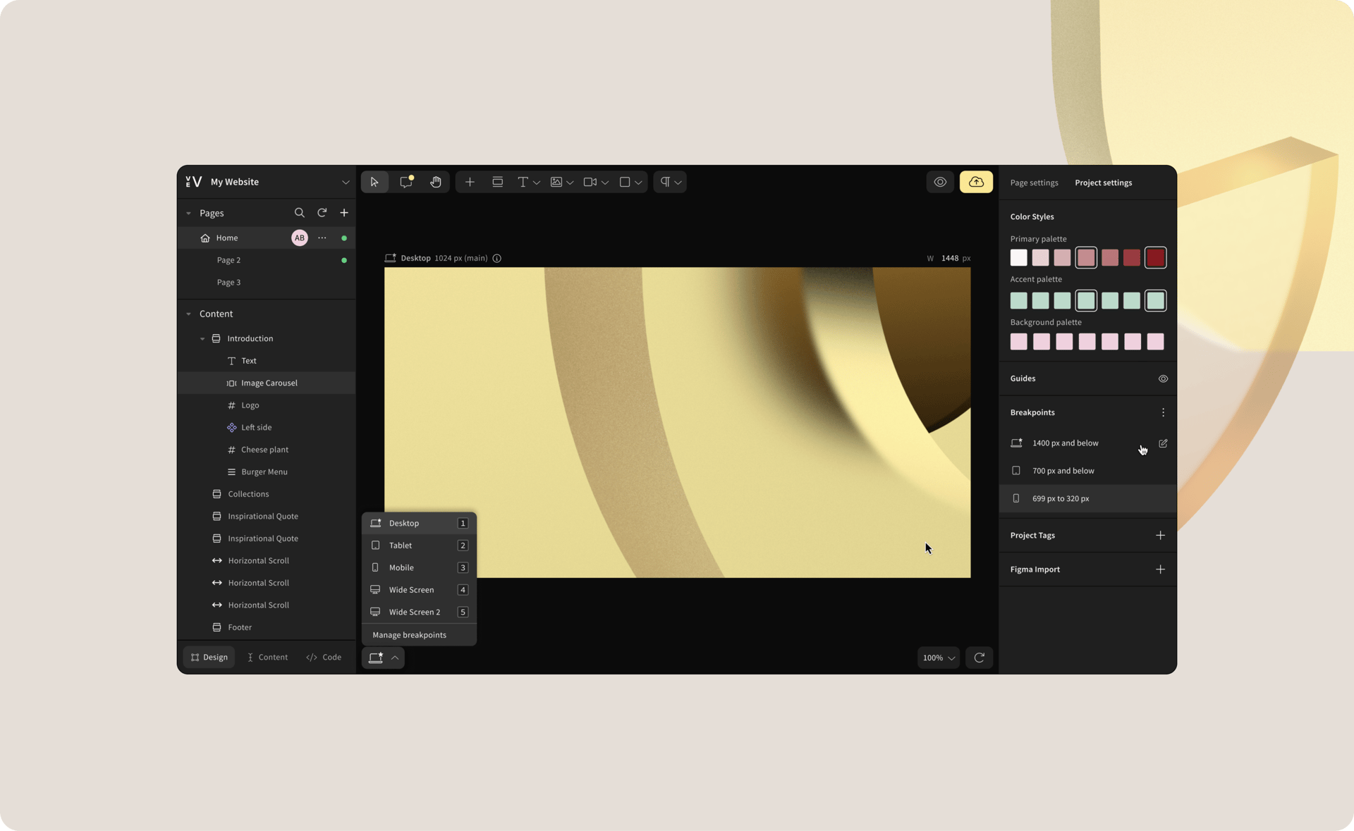
Floating Top Panel
We've added a lot of new tools and features to Vev over the years, which have crowded the top toolbar and limited horizontal space. We've been itching to redesign this for a while to make it cleaner and more intuitive. That's why we've just rolled out a floating top panel across all of our editors.
The result is a more compact user interface which better utilizes space while maintaining current levels of accessibility. Some of you have already tested this feature by turning on an "Experimental feature" toggle and sending us invaluable feedback, which helped us perfect the final result.
We built this together, so once again, thank you Vevers! 😉
You read correctly: Vev has become even more responsive! You can now choose to inherit styles across breakpoints, which will save you time when designing for different device sizes.
Designing responsive web content typically involves modifying styles across at least 3-5 breakpoints. Using inheritance across breakpoints (commonly referred to as "cascading styles" in CSS) allows you to design for one main breakpoint and then inherit that style across all the other breakpoints.
Let's take a look at how this works in practice:
Improved Breakpoints, Faster Responsive Builds
Once you've chosen a default breakpoint, any style alterations will cascade up and down. So, if you select a Desktop-first breakpoint (1440px900px), styles will trickle down to tablet and mobile phone sizes, or upwards to desktop devices that are bigger than your default. This also means that styles defined on tablets will also trickle down to the mobile breakpoints. If you choose a Mobile-first breakpoint, this will work in the opposite direction.
You can still build responsive projects using the old approach, but we highly recommend that you experiment with the new approach by turning on a toggle when you first create the project.
As always, get in touch by clicking the chat bubble in the bottom-right corner of Vev and let us know what you think—we love hearing from you. 😘
Get our monthly newsletter straight to your inbox.
You can always unsubscribe at any time.
Privacy Policy