
Color contrast accessibility basics and 9 essential tools for making better web designs
July 25, 2024
Words by Jeff Cardello
Discover our guide to color contrast accessibility, including definitions, tips and tools.
There are many important aspects to consider when designing `and building content for the web. One of the most important is web accessibility. In this guide, we'll explore the importance of color contrast in creating an accessible website, and the tools you can use in conjunction with Vev to build digital content that doesn't just look great, but is accessible to all.
What is color contrast accessibility?
Have you ever found yourself on a website where the colors were too close together? Trying to scroll through a design with hazy and non distinct features can be tough.
Color contrast accessibility is essential in creating web layouts that clearly distinguish what’s on screen, ensuring that everyone regardless of their visual capabilities, can easily understand and interact with the content. By paying attention to color contrast when it comes to accessibility, our designs are more open and inviting to the many people who visit. Ultimately, this makes sure people do not click off of the page, and therefore there is more chance of them consuming the content.
In the University of Reading's online guide to Digital Accessibility, color contrast accessibility is defined as: "Sufficient color contrast between background and foreground" which is "important to make content visible to everyone." W3C Web Accessibility Initiative (WAI) also delves further into this in their video Web Accessibility Perspectives: Colors with Good Contrast.
Why does color contrast accessibility matter?
While you will find many wonderful possibilities when working with color, there are a few simple rules to keep your websites free from obstructions that could affect their usability. Color contrast accessibility involves setting appropriate ratios between text, background colors, and other graphical elements to ensure a wide range of users, including those with visual impairments, are able to read and interact with a website.
Inclusive design/visual impairments
Not everyone observes the world in the same way. There are a variety of conditions that can impact how someone visually processes what’s on screen, and cause difficulties in discerning between different elements or features.
Color perception
It’s estimated that 1 in 200 women, and 1 in 12 men have some form of color blindness. Color blindness is an eye condition that affects how people perceive colors, often making it hard to distinguish between them. Color contrast accessibility is important in keeping these visitors’ needs in mind.
Color blindness can manifest itself in a few different ways including:
- Tritanopia: Those with this condition have trouble distinguishing colors that contain blue and yellow. Color combinations like green and blue, yellow and pink, as well as purple and red can all be hard to tell apart.
- Deuteranopia: For those who have this form of color blindness, reds and greens are hard to tell apart.
Screen capabilities
While much that we’re going to discuss centers on human physiology, it’s worth noting the limitations of technology in relation to how colors are presented.
How many of us have picked out the perfect blue only to have it appear discolored when viewed on a screen other than what we designed it on? Not every screen display has the same color capabilities. What’s termed the “color gamut” refers to the spectrum of colors that can be accurately generated on a particular display. Devices with smaller color gamuts risk clipping or altering a color when it falls outside of a specific range, which can directly impact its accessibility.
Web Content Accessibility Guidelines (WCAG)
Web Content Accessibility Guidelines (WCAG) represent a formal set of standards with several that directly address color contrast accessibility.
WCAG consists of three tiers with each subsequent level building on what comes before it.
- Level A: This is the minimum requirements a website should meet.
- Level AA: Most websites, unless they have to meet specific government-mandated regulations, should strive to meet the WCAG AA recommendations for accessibility.
- Level AAA: WCAG AAA covers a comprehensive set of guidelines that offers the highest levels of accessibility.
If you’ve ever looked through the WCAG guidelines, there’s a lot to sift through, so let’s cover the most important rules related to color contrast accessibility.
WCAG guidelines designers should know
1.4.1 - Use of color
This guideline declares that color should not be used as the only means of communicating information. Whether it’s visual feedback that occurs after a user takes action, or instructions to click on a specifically colored graphic element, color alone should not be the only signifier. As every website should follow this rule, it is a part of WCAG's Level A compliance
1.4.11 - Non-text contrast
WCAG 1.4.11 is an AA-level guideline covering non-text elements. It states that visual elements like icons, graphs, and graphical user interface components must have a minimum contrast ratio of 3:1 relative to the background or adjacent colors. Choosing the right contrast is essential in making graphic elements stand out.
1.4.3 - Contrast (minimum)
WCAG 1.4.11 is a part of the AA level and suggests appropriate contrast ratios between text, and visuals that contain text, compared to background colors.
Regular text and graphics that include type should have a minimum color contrast of 4.5:1. This applies to text at 18pt or 14pt bold. Larger text above 18pt must have a minimum contrast ratio of 3:1.
9 tools to ensure your website is accessible
1. Color Contrast Checker by WebAIM
WebAIM lets you input foreground and background colors and determines the contrast ratio between them. As an added bonus it also shows you if your color selections pass the AA and AAA WCAG standards for text and graphical elements. All of its findings are presented in a clean and streamlined layout, making it easy to understand the results.
And what if your color combinations fail? Bumping up or down the lightness sliders, or changing up the alpha value of the foreground color can generate variations of your base colors that will meet WCAG’s guidelines. It’s a quick and efficient way to analyze web colors and to adjust them to meet the appropriate color ratios.
Want More Inspo?
Get our monthly newsletter straight to your inbox.
You can always unsubscribe at any time.
Privacy Policy
2. Coolors Color Contrast Checker
If you’ve spent any amount of time in web design, you’re likely already acquainted with CooIors. With its brilliant ready-made palettes and easy-to-use color generator Coolors provides a wealth of creative possibilities. Along with tools for coming up with color schemes, Coolors also has a fantastic color contrast checker.
At first glance, Coolors looks similar to other color contrast accessibility tools, with its input fields for hex colors and screen space dedicated to showing how a color scheme will appear. What makes Coolors’ contrast checker stand out is its 'Click to enhance' feature. Clicking on this option gives you three choices: adjust text color, adjust background color, or adjust both colors.
We took the same color scheme we used for the first screenshot and picked the enhancement option to ‘adjust background color’ and it bumped up the contrast ratio of 5.33 to 10.03. In the screenshot below it’s easy to see the high level of clarity and readability of this more optimized color contrast ratio.
Working with color is at the center of what we do as designers. Coolors has so much to help come up with interesting color schemes, as well as making sure that they’re accessible.
3. Stark
Stark offers a comprehensive collection of color contrast accessibility tools that integrate with apps like Figma, Adobe XD, and in plugin form for Chrome, Firefox, and other browsers. Along with its color analysis tools, Stark also lets you see its feedback in action, temporarily altering the CSS styles on a live website to see how its suggestions change its appearance.
With Stark’s visual impairment simulator, contrast checker, and pre-built color palettes, Stark makes it straightforward to build designs that are inclusive and accessible.
4. Whocanuse
We all want our designs to meet visitors’ needs, but it can be challenging to know what those with eyesight impairments actually experience. Whocanuse helps designers better understand those with eyesight conditions, with a sidebar showing how a color combination will appear to people with conditions like color blindness, cataracts, and glaucoma. Whocanuse takes what are textbook medical terms and turns them into visual simulations, humanizing these conditions. These insights make Whocanuse a powerful tool in building better designs lead with empathy.
5. A11y Color Palette
A11y combines the power of a palette generator with color contrast analysis. Just pop in some hex values you’d like to base a color scheme on and A11y generates a no-nonsense grid of combinations. You not only get a nice set of color options but the results are displayed in ascending order by color ratio, putting those that are more accessible right at the top.
6. Sim Daltonism
Sim Daltonism is a free MacOs plugin that works through a window that you can drag over something like a website, graphic, or other visual media in order to see how specific parts will look to those with different vision capabilities.
Seeing what it’s like to not be able to distinguish yellow and blue based colors through the eyes of someone with tritanopia, the red-green challenges of protanopia, to the total blindness to colors of monochromacy has a big impact in identifying specific issues in a design or graphics that could negatively impact readability.
7. BrowserStack
While BrowserStack has pricier plans for those who need more advanced accessibility and cross-browser testing, there’s so much you can do with its free plan. All you need to do is provide a url and then BrowserStack gets to work in generating a report and notifying you via email once it’s ready.
What’s amazing about BrowserStack is its high level of precision. You not only get a very in-depth list of issues ranked by severity but are also shown the exact HTML elements along with suggestions to make to your CSS. The amount of details and insights BrowserStack provides are very helpful in improving a website’s color contrast accessibility.
8. EightShapes Contrast Grid
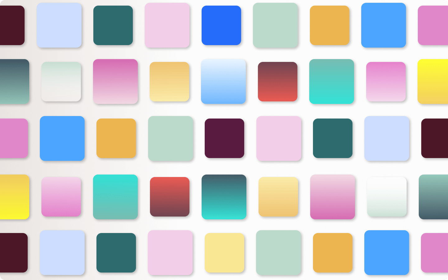
We love the straightforward grid that EightShapes generates. After inputting the hex values you want to explore, each line takes a single color and then shows you how it will look in combination with the others. Each color square has codes representing whether or not they pass various WCAG designations. Though it has a low-tech sensibility, it works so well in coming up with artistic color combinations that still meet the requirements of color contrast accessibility.
9. WAVE web accessibility Tool
WAVE by WebAIM makes evaluating a website’s color contrast accessibility easy. Enter a URL, and it then displays the website in a browser with tags pointing out where there are issues. While Dino's Tomato Pie in our example above is a purposely bad design, it shows how effective WAVE is in isolating problems. We know your web designs are, ahem, much much better, but you should still run them through WAVE to see if there are any color contrast accessibility issues.
Create colorful, accessible web content with Vev
At Vev, we want the web to be a more beautiful and welcoming space. Start creating accessible content for the web with Vev, the interactive content builder that perfectly aligns code and no-code so that anyone can create beautiful content, no matter the skill set. Our open platform allows for integrations and apps that will help you make your content meet accessibility standards, from color contrast to multimedia alternatives.