10 Data Storytelling Examples (And How They’re Made)
May 24, 2022
Words by Jeff Cardello


Enter stage: data storytelling—a creative blend of statistical, fact-driven information and visual narration. Data storytelling is woven throughout the web, and is no longer just the property of reports. Company year-in-reviews, campaign landing pages, presentations, and even editorial journalism all use this powerful technique to tell engrossing, memorable stories.
We’ve pulled together some imaginative data storytelling examples to showcase the sheer breadth of applications out there, and hopefully give you a few ideas for your own data storytelling web project.
Web design makes it possible to tell dynamic stories, but words alone can only go so far.
What Is Data Storytelling?
Data storytelling harnesses the power of data to capture our imagination, without overloading us with dry numbers and statistics. It’s a powerful mixture: data “nuggets” are transformed into imaginative visuals to tell a compelling story, combining the gravitas of fact with the accessibility and engagement of imagery.
Humans have been using visuals to tell stories long before the internet, and even before written language emerged. 30,000 years ago, our ancestors painted animals like bison, and depictions of themselves hunting onto cave walls, as well as carving glyphs to communicate other aspects of their prehistoric lives. While our mediums for expression have come a long way, visual storytelling remains an extremely powerful and universally accessible way of sharing ideas and connecting with others.
Data storytelling on the web borrows this power to elevate statistics, numbers, and other data that can otherwise get lost in lengthy blocks of text. At its simplest, it takes these details and uses visuals to tell us about them.
Used sympathetically, data storytelling can strengthen the hierarchy of a design, bringing attention to details that we don’t want people to miss.
How To Use Data Storytelling
Data storytelling isn’t just a fancy term for “nicer-looking reports”. From big business to journalism, it’s used imaginatively all over the web to illustrate timelines, communicate facts and figures, and display other quantitative information.
Companies use data storytelling for wrap-up annual reports, investor pitches, sustainability and impact reports, awareness campaigns, infographic content, and other marketing materials. It’s a way to differentiate themselves, and to tell brand narratives in a way that holds our attention.
Media publications, like newspapers, frequently use data storytelling to tell stories that go beyond what’s possible in print—or to supplement a live TV broadcast. Data storytelling makes it possible to present facts and statistics in a way that’s more imaginative.
Whether web editorial, sales, or marketing content, data storytelling pushes information in front of us, highlighting its importance, and making us pause to think about it, and to realize its relevance instead of quickly scrolling by.

[image/graphic relating to above]
10 Smart Data Storytelling Examples
Okay, we’ve talked a lot about how visuals work so well to bring data to life. Let’s now take a look at some data storytelling examples to see exactly how web designers weave numbers and other information together to tell powerful, captivating stories.

[image/graphic relating to above]
UNODC
The proliferation of synthetic drugs, like opioids and methamphetamines, has caused a global health crisis. The United Nations Office of Drugs and Crime (UNODC) crafted this awareness page to capture its impact across the world.
We see data storytelling throughout this interactive page, which is made in Vev. Just a short jump down from the main page is a world map. Scrolling down reveals detail after detail about substance abuse and drug manufacturing pointing to the countries they’re associated with. By the end of this page, the entire map is dotted with this information, hammering home the message about how this is a global problem.
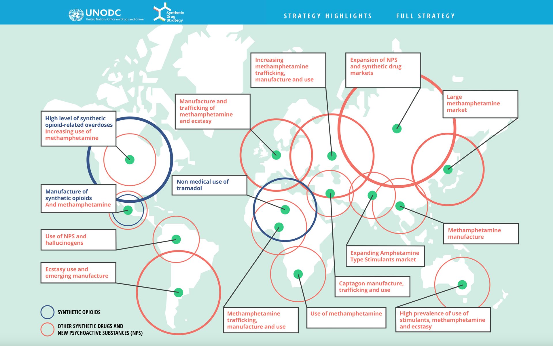
This is one of the best data storytelling examples we found that is able presents a huge list of details in a way that’s not only creative, but makes it easier to see their relevance. One simple way to pull off a map of data like this is to create it in something like Tableau, then embed the code in your Vev layout.
Chit Chart
Chit Chart, might be one of the most fun collections of data charts we’ve come across. From science to food, the whole point of this website is to celebrate the imaginative ways that data can be brought to life.
There are so many amusing and downright weird displays of data here. If you’re looking for inspiration in coming up with unique data visualizations, or just want a laugh make sure to check out the data storytelling examples over at Chit Chart.
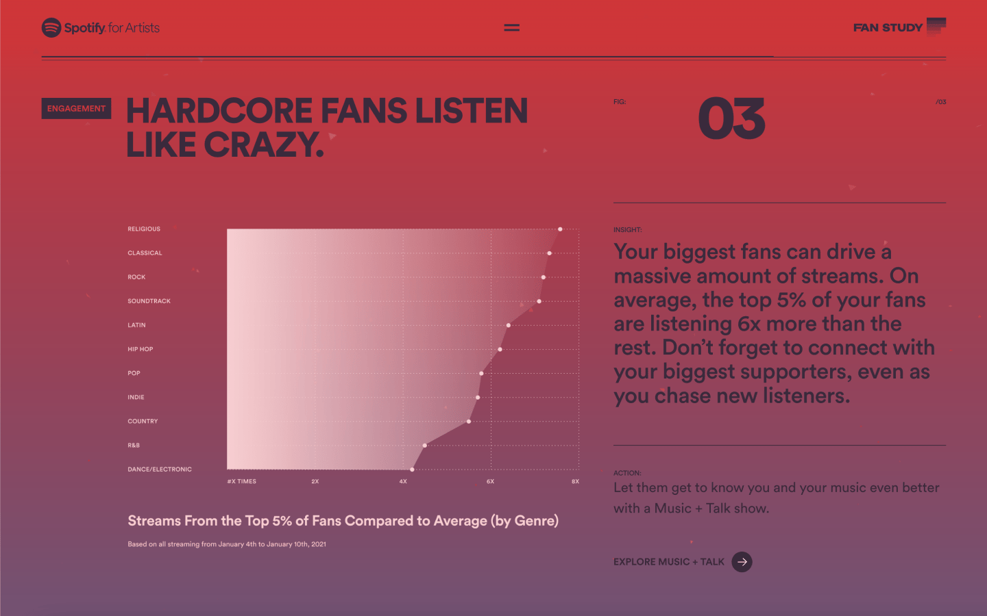
Spotify For Artists 2022 Fan Study
Spotify always impresses us with its data-based storytelling. The Spotify Wrapped that we get at the end of the year, takes the data from our listening habits and spins it into an exciting audio and visual experience. They do a lot to personally connect with their listeners, but also show that they care for their artists. This 2022 Fan Study enlightens musicians about how listeners’ habits and engagements can affect how many followers they have and how often their music gets streamed.
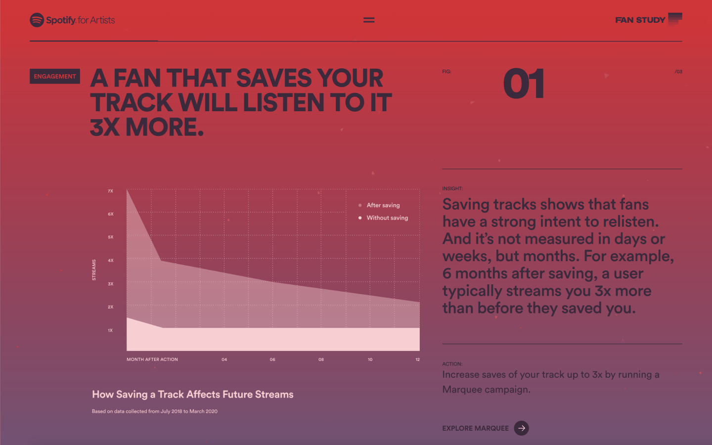
From the main page of this report, it’s broken down into several subsections including engagement, merch, and release, with each section showing Spotify user data, and explaining what it means. They also offer plenty of tips in helping musicians grow their fanbase and get their music out to more people.
With a dark purple background gradient, animated text on scrolling, and a variety of compelling infographics, Spotify for Artists comes through with a user experience full of great information and creative visuals.
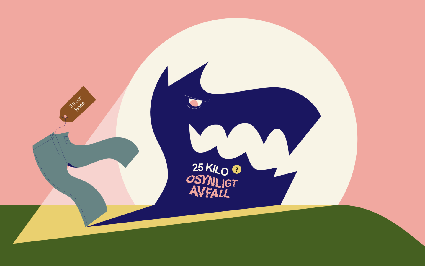
How Much Does Your Mobile Weigh?
Most of us take for granted the products we use in our day-to-day lives. But anything that gets manufactured, also creates invisible waste. This data storytelling example built in Vev shows how products like cell phones, laptops, and even shoes, all generate waste.
They express the impact of this invisible waste through a series of stylized visuals appearing in a horizontal scroll, with a yellow question mark button guiding people to learn more. With colorful illustrations accompanying each panel, this is a far more engaging way to present this information.
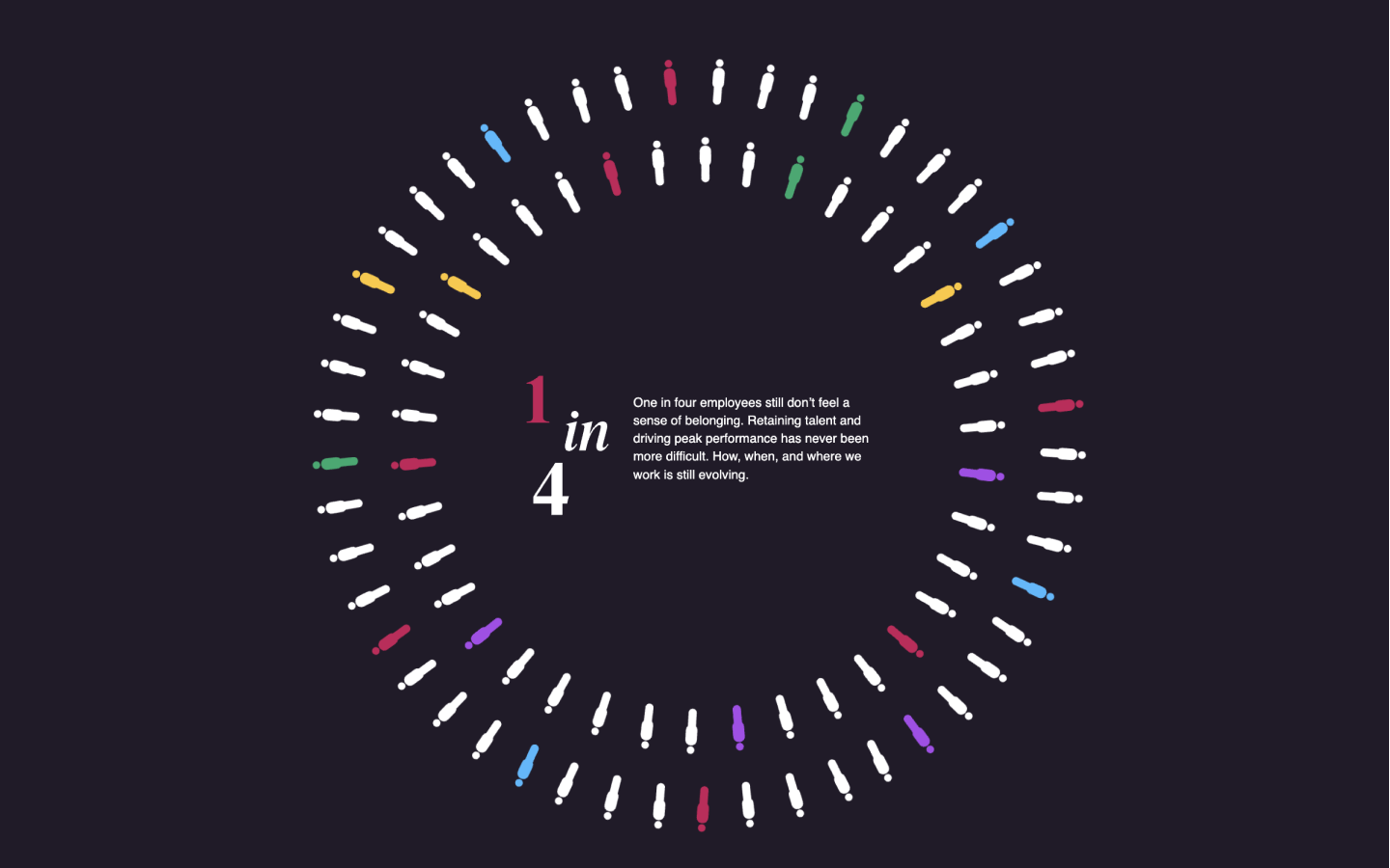
BetterUp 2021 Insight Report
Diversity and inclusivity are so important for forward-thinking companies. This data storytelling example from BetterUp shows how they fill their diversity report with visuals and color, humanizing who they are, and showing their commitment to making their company a more inclusive space.
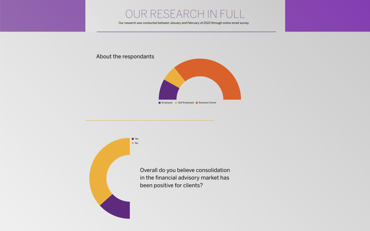
Coalition of the Independent
Companies within finance generally have a lot of dense information that they need to convey. This report, titled A Manifesto to Better Support Independent Financial Advisers, is certainly a lengthy read, but it’s full of engaging data visualizations. The bottom section in particular uses multiple animated graphs to showcase survey research connected to the report.
This lets us digest this weighty qualitative information in a way that’s far less intensive than having to read through it all. We’ve seen quite a few great data storytelling examples built with Vev, and you should definitely check this one for inspiration.
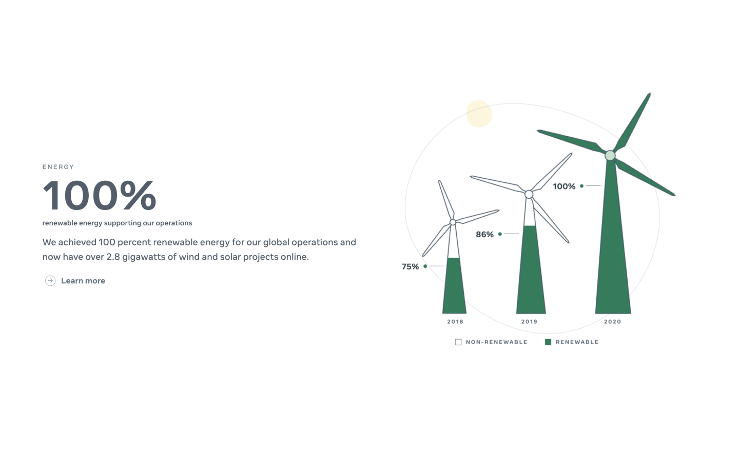
Facebook 2020 Environmental Sustainability Report
So many big companies make it a point to run their operations in a more sustainable way, and reports like Facebook’s are a way to show the public how they’re helping.
Sustainability reports overdo it with a company’s accomplishments, but Facebook only touches on the major points of what they did in 2020, along with illustrated infographics backing these up. Visitors have the option to download the full report, which is more comprehensive.
With a light touch of text and simple illustrations, Facebook expresses its commitment to helping the environment in a report that feels upbeat and straight to the point.
Nordgold Ten Year Anniversary of Gold
This history of gold, put together for Norgold’s ten-year anniversary, begins 4.5 billion years ago with the formation of our planet. This wonderful journey is full of three-dimensional graphics, scroll-triggered animations, and unique visuals communicating details about this precious metal.
We really love the deposit formation section, with scrolling revealing a timeline of how gold is formed. As you move through it, more facts are revealed and the landscape changes, showing the natural forces that must take place for gold to form.
This design shows a high level of artistry in its data storytelling, with intricate details, rich visuals, and interactions making it an immersive journey into this sparkling precious metal.
Impossible Foods Impact Calculator
Impossible has won over many vegetarians as well as meat-eaters with their plant-based products like their popular Impossible Burger. They’re committed to sustainability but never belittle the audience, showing the positive impact you can have by changing your eating habits.
This food impact slider shows the effect meat consumption has on the environment. The more you move the slider—which represents replacing eating meat with plant-based options in terms of weight—the more you see your environmental impact reduce. The landscape comes alive with more plants and animals the more you slide to the right.
It’s a powerful graphic that isn’t about shaming us, but showing all the good that can happen to the environment by changing the way we eat.
2021 DigitalTrend Content Report
This one’s a springboard. We put together this 2021 Digital Content Report sample to give you an easy starting point for creating your own data storytelling designs with Vev, including plenty of ready-made data visualizations.
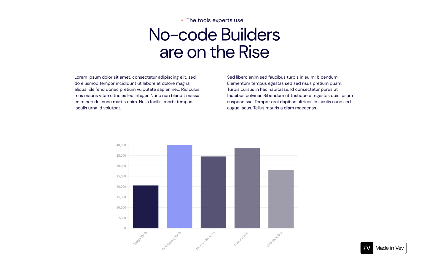
Along with more traditional graphs, you’ll also find more modern ones like this multi axes, comparison line-based visualization. Vev makes it possible to embed data visualizations and scrollytelling elements from Flourish as well as other third-party platforms, making it easy to add whatever data representations you require.
Create Your Own Data Storytelling Examples
Data storytelling no longer requires tons of budget and dev resource to produce. With no-code and low-code web creation platforms like Vev, you can create your own data narratives with drag and drop. We have an extensive library of pre-coded interactive elements, including animated charts and 3D models, to help you get started. Embed data visualizations from any other tool, and publish your work anywhere once you’re ready.

Get our monthly newsletter straight to your inbox.
You can always unsubscribe at any time.
Privacy Policy