
Font Psychology and How it Influences Design
March 18, 2022
Words by Sandra De Grandis
There are plenty of design elements that are used to elicit emotional responses from people. When used correctly, things like colour, shape, layout, texture, space, imagery, etc., can help convey a message while forming a connection with audiences.
Take colour, for example. Thanks to colour psychology, we know that red can evoke feelings of love and passion, while at the opposite end of the spectrum it can also trigger feelings of anger or danger.
Fonts are also an integral part of the design process, but are often overlooked for other ostensibly more important elements. Whether you realize it or not, the fonts we use have the power to influence our feelings, thoughts, even our behaviour. But how can something as seemingly innocuous as a font have such a profound impact on our psyche?
To answer this question, we have to dig a little deeper into the psychology of fonts.
Lorem ipsum this text is missing, so might put in another header to the text right hurr!!


What is Font Psychology?
Font psychology is the study of the various thoughts and emotional reactions people have to particular fonts (officially known as typefaces) and how it impacts their behaviour.
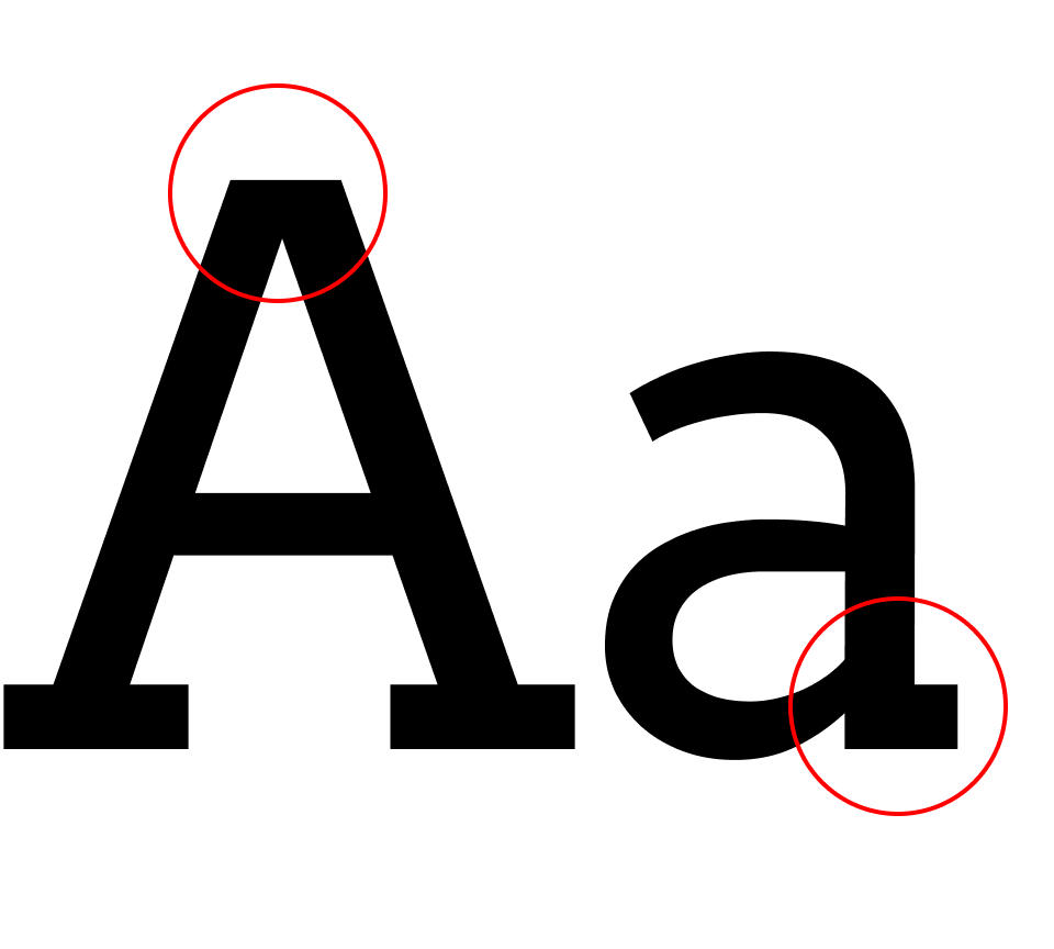
The idea that the shape of a letter could have such an influential effect on the human mind may seem arbitrary, but ask anyone if they’d use comic sans for a wedding invitation or a 5-star restaurant menu. The answer would most likely be a resounding no.
It’s true that comic sans does get a lot of backlash; it’s the bane of many a designer. But the question is why? What causes this visceral reaction to certain fonts? And why do we respond more favourably to others?
The fonts we use are more than just a bunch of letters strung together to make a word or phrase. They have personas and psychological cues attached to them, and these are what trigger our emotions.
Yes it’s true, believe it or not. As humans, we tend to assign personality characteristics to inanimate objects, including handwriting styles and typefaces. In turn, these characteristics influence how we perceive certain texts.
In the study Emotional and Persuasive Perception of Fonts (Juni and Gross, 2008), the authors explored this by showing a satirical passage by the New York Times in two different fonts of the same size: Times New Roman and Arial. This passage was randomly presented to a group of university students who then ranked them based on various descriptors. The results showed that the passage written in Times New Roman was perceived as funnier and angrier (read: more satirical) than the passage in Arial.
Another research study, Psychology of onscreen type: investigations regarding typeface personality, appropriateness, and impact on document perception (Shaikh, 2005), investigated the perception of onscreen typefaces and if participants attribute personality traits to onscreen typefaces. It was divided into 3 individual studies, with some interesting conclusions:
- Typeface personality had a direct effect on document personality.
- Participants believe that typefaces are an important part of document design.
- The author using an appropriate or neutral typeface was perceived more positively than an author using an inappropriate typeface.
The Psychology Behind the 6 Major Font Groups
Knowing that fonts have the capacity to trigger deep emotional responses based on the personas we ascribe them, how do you know which ones to use for your design or brand without striking out with audiences?
Here is a breakdown of the 6 major font groups and their psychological associations.
We’re seeing this play out through the proliferation of low-code and no-code platforms in recent years. They have given non-tech savvy individuals the opportunity to become citizen developers and build apps that resolve business hiccups without spending countless hours learning complex programming languages or relying on costly IT departments. That’s because these tools and platforms employ intuitive “drag-and-drop” elements and visual interfaces which allow users to design and build customized web and mobile solutions that adapt to and solve ever-changing business needs. With a little bit of gumption, imagination and the right tools in hand, the ability to innovate and create in the digital realm is now within reach.
65% of app development is predicted to be low-code by 2024 (paywall) (supplemental source: Forbes)
More than 60% of large companies will use 4 different low-code app building platforms (paywall) (supplemental source: Forbes)
The low-code platform market is estimated to increase to $21.2 billion in 2022, up from $3.8 billion in 2017 (paywall) (supplemental source: Forbes)
- The global low-code platform market revenue is forecast to reach approximately $65 billion U.S. dollars in 2027, up from almost $13 billion in 2020.
- 88% of executives believe technology democratization is becoming critical in their ability to ignite innovation across their organization.
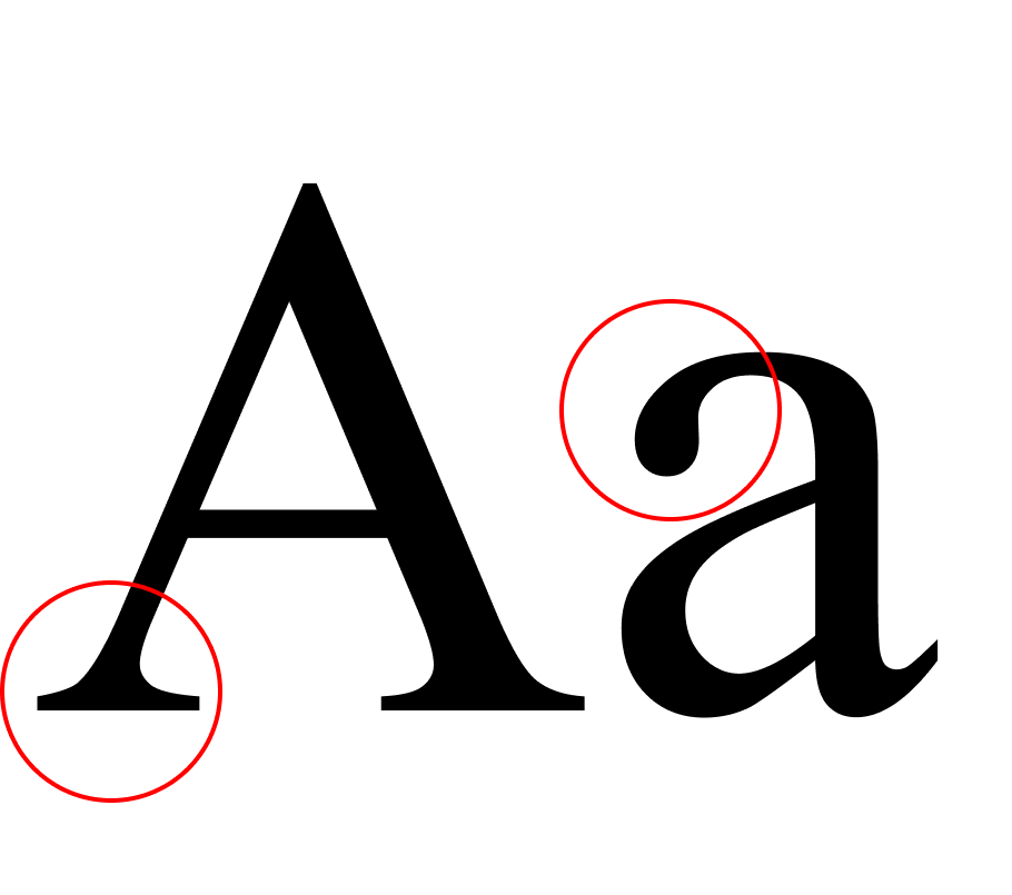
Serif
Association:
tradition, respect, trust, reliable, formal, classic
Fonts:
EB Garamond, Baskerville, Merriweather, Bodoni Moda
This classic font style is one of the oldest out there and has been used for centuries. The long history of the serif font evokes a sense of tradition, respect and stability, especially since they are commonly used in the branding of important, authoritative institutions such as universities, banks, insurance companies, law firms and luxury brands.
When we look at the branding of these types of establishments - from their logos, slogans and communication - we see serif fonts. In our minds, we form a connection between this elegant, classic font and how or when it is used. It’s font psychology in action.
Serif fonts are also used in print or for long texts because they are easier to read. Books, newspapers, magazines, web editorials—many things related to publishing—use serif fonts.
of large companies will use 4 different low-code app building platforms (paywall) (supplemental source: Forbes)
0
%
of executives believe technology democratization is becoming critical in their ability to ignite innovation across their organization.
0
%
of app development is predicted to be low-code by 2024 (paywall) (supplemental source: Forbes)
0
%
"The web belongs to all of us."


Sans Serif
Association:
modern, clean, universal, open, informal, progressive
Fonts:
Merriweather Sans, Abel, Open Sans, Oswald
At the opposite end of the spectrum we have sans serif fonts. Formally invented in the 18th century, this font style really took off in the 20th century thanks to the modernist movement. That break from tradition called for a more contemporary and minimal font style with a progressive personality.
Compared to serif fonts, sans serif fonts display better on the web, making them the go-to for body text or headers on websites. They’re also easier to read at a smaller font size, so you can resize them without distortion or legibility issues.
You’ll find that plenty of tech companies use sans serif fonts in their branding and/or logos, from start-ups, social media platforms, SaaS companies - anything that is considered “forward-thinking.” When we think of tech, we imagine progress and innovation. Many clothing brands use sans serif fonts as well, but they usually aren’t high-end brands. They seem more approachable or welcoming - not encumbered by “stuffy” tradition and formality.


Fun Fact: The Google logo used to be a serif but changed to sans serif in 2015
Slab Serif
Association:
bold, contemporary, confidence, solid, strong, masculine
Fonts:
Arvo, Copse, Roboto Slab, Museo Slab
We can consider slab serif fonts as the slightly more hip cousin of the serif font, one that fuses tradition and modernity. They retain the serif stroke, but it’s thicker and more square instead of curved and delicate. Slab serif fonts tend to be chunkier and bolder than their traditional cousin, which makes them stand out more while giving off a strong, commanding presence.
That in-your-face, assertive style makes slab serif fonts good for turning heads and making a lasting impression. They’re very often used for sports and outdoor lifestyle branding, automotive brands, manufacturing industries, electronic companies - even some tech brands if they’re daring enough.
Avoid using them for longer texts like books, magazines, web articles, or fancy invitations. Improper use of slab serif fonts may come across as aggressive or intimidating - which is the opposite of a positive first experience.


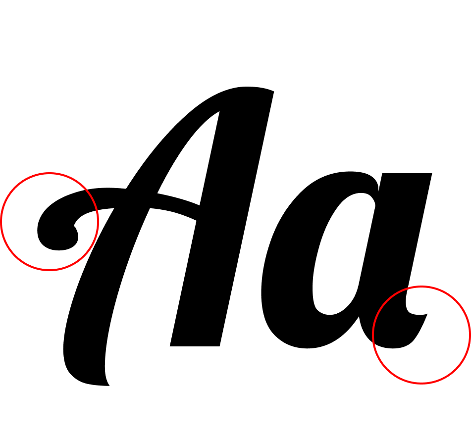
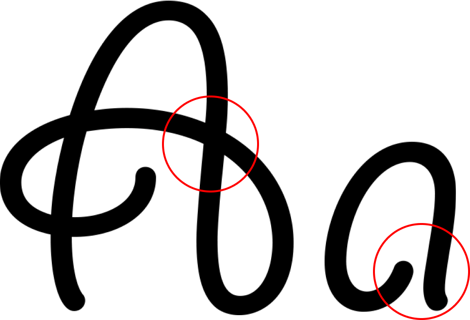
Script
Association:
elegance, affectionate, creativity, personal, feminine, fancy
Fonts:
Lobster, Pacifico, Dancing Script, Caveat Brush
Script fonts are aptly named, considering the fact that they look like handwriting or fancy calligraphy. They are very stylish and detailed, but impractical in most day-to-day and professional settings. They’re good accent fonts and are often paired with other less “unique” fonts. You’ll notice script fonts are commonly used in wedding/formal invitations, holiday cards, high-end restaurants, some luxury brands, creative logos - even university diplomas.
The elaborate and fanciful strokes of the letters makes script fonts harder to read, especially at a smaller size and on screens, so they should be used sparingly. Avoid script fonts for body text, corporate marketing/content or headers/headlines of any sort.
On the other hand, script fonts also give off an air of creativity, especially the more contemporary ones. They look more playful, informal and eclectic, almost as though they mimic modern-day handwriting styles. Believe it or not, the universally panned comic sans is considered a script font. Although not the best choice for a wedding or any other black-tie event, playful and childlike script fonts evoke feelings of nostalgia and youth, which make them a good option for candy packaging, branding for children’s products, food and beverages - perhaps even some outside-the-box fashion brands.


Modern
Association:
stylish, chic, exclusivity, sharp, fashionable, futuristic
Fonts:
Cornerstone, Noir, Uni Sans, Coco Gothic
Modern fonts fall under the sans serif category and despite their name, have been around quite some time. They were quite popular during the peak of modernist design in the early to mid-20th century, but their simple, easy-to-read style lives on to this day.
As a legible, contemporary font style, modern fonts appear open and functional, especially the more geometrically shaped ones. They’re a good option for logos or showcasing your brand, especially if you’re a design-focused business (think fashion/clothing brands, architecture firms and furniture designers).


Display / Decorative
Association:
friendly, unique, expressive, quirky, eclectic, trail-blazing
Fonts:
Kranky, Lacquer, Barrio, Butcherman
As the name suggests, display or decorative fonts are just that. They are fun, casual, unique letter shapes designed to capture your attention, not for functionality. They can be serif or sans serif, while some styles include pictorial or graphic elements (like the Disney or NASA logo).
Display fonts will really set you apart from the crowd, but are only useful in very limited contexts, such as logos, letterheads or in some cases, headlines. Because they don’t strictly fall under a particular category, you can also create your own display font that matches your business or personal branding style. H&M is an example of a company that created its own personal logo font.


Why Use Font Psychology in Your Design?
“It’s not what you say, but how you say it that matters”
Studies have shown that typography not only affects emotional reactions and behaviour, but information retention and memory as well. Backed by all this research, it wouldn’t be prudent to consider fonts as a frilly afterthought. Not only are they a major part of the design process, they also help us tell a better story.
If you take the time to understand font psychology, you will realize that picking fonts isn’t just about choosing the prettiest or boldest one. Understanding how people react to fonts and why they react in that particular way will help guide you on your quest to create a design or brand identity that truly resonates with your audience. Plus, you can use that knowledge to drive your business and control how people see you brand.
Before selecting a font for your design, ask yourself the following questions:
- What is your brand identity?
- Who is the target audience?
- Is the font you’re considering legible? (this is key!)
- What is the purpose or end goal of your design?
- How does the font you choose reflect your brand identity?
- What type of emotional reaction or connection do you want audiences to have when they see your design (or logo)?
- Where will you be communicating most of your messaging and how will the font style translate across different mediums?
Having a clear set of goals will assist in your search for the right font and you’ll be able to make a more informed decision when it comes to anything related to your brand, including logo design, marketing collateral, articles, content creation, etc. By choosing a font that’s best represents your brand, you will create a better overall design that not only meshes well with colour, shapes and all other design elements, but elicits a positive emotional response from audiences in association with your brand.
And a happy audience that feels a connection is one that will keep coming back.