
11 Striking Parallax Website Examples That Play with Perspective
May 31, 2022
Words by Jeff Cardello


Parallax has been used to bring depth to websites for over a decade now—proving it's not just another passing web design trend.
For something so simple—setting background and foreground elements of a web page to move at different speeds—parallax is an extremely flexible web design trick, and continues to capture our attention.
We’ve pulled together a range of striking parallax website examples to showcase just what you can do with this powerful page scroll technique.
What Are Parallax Websites?
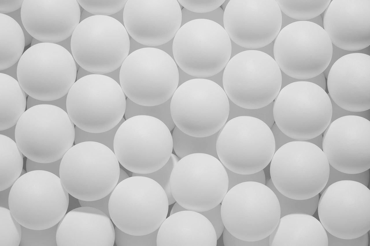
Ready to add some movement and depth to your website? Parallax scrolling sets visuals in motion and evokes a feeling of space, making for more exciting user experiences.
Here’s how it works: page elements like graphics, text, photos, colored sections, and other visuals are set to move at different speeds to one another as you scroll through a website. This creates a sense of perspective and dimensionality, with each piece feeling independent from the background space it’s advancing over.
What we like about parallax is that you're not limited in what you can do with it. Along with having elements move at different rates, they can scale up or down, have their opacity change, rotate, undergo 3D transformations, and have other effects added to them that make them even more eye-catching.
[image/graphic relating to above]
Parallax scrolling adds action, taking what would otherwise be a passive user experience and giving it a boost of energy.
Deconstructing Parallax Websites
There are so many ways you can apply parallax scrolling to websites, depending on the elements you want to set at different speeds relative to one another. Yet, in practise, parallax websites are built around one of two building blocks: section image parallax and multi-image parallax.
Section image parallax
This is the type of parallax scrolling you are probably most familiar with. Simply create a section and add an image, then set the section background to scroll at a different speed to the image. Offsetting design elements like this instantly lends websites gentle motion and subtle depth. It’s a great technique for signaling where one section on your website ends and another begins. You’ll find section image parallax touching many web designs in guiding visitors by revealing content.
Multi-layer parallax
Multi-layer parallax is a bit newer and flashier—it feels like animation, making an image appear as if it’s constantly moving as you navigate a website. Instead of a single element, you add several foreground elements and set each to move at different speeds to the background.
This creates the illusion that the foreground elements are moving relative to one another; each piece may pull apart from the whole image and reassemble together as you scroll. Some parts of the image can be fixed while others are set in motion. They can twist and tumble. Multi-layer parallax is a versatile design technique, and can be used in so many imaginative ways to liven up a design.
Slick Parallax Website Examples
Now that we’ve covered the basics of parallax, let’s take a look at it in motion. We’ve curated a list of striking parallax website examples, breaking down how they were put together and what they add to the designs.
[image/graphic relating to above]
Margrete Den Første
Parallax effects don’t have to be huge and dramatic. We love seeing them used in understated ways. This promotional site for the film Margrete Den Første uses a lighter touch in this header section from this website that was built in Vev.
Both the background image and the layer of text on top of it are set in motion upon scrolling. The hero image moves at a slower rate, while the text that’s being revealed below moves faster. This contrast brings a sense of immediacy to the text that’s being pulled up, with this parallax juxtaposition creating a sense of hierarchy in what we should be looking at.
Climb Wales
This parallax website example from Climb Wales utilizes parallax in the hero section, engaging website visitors from the get-go with a photo of stunning Welsh scenery.
Mo Ibrahim Foundation
Formed in 2006, the Mo Ibrahim Foundation wants to improve the lives of Africans through building stronger government and leadership. COVID-19 continues to have a huge impact on this developing nation, and this website built with Vev shows what’s been going on, and potential ways to deal with the ongoing effects of the pandemic. They tell this important story through compelling writing along with plenty of scroll-triggered effects, infographics, and parallax.
Throughout this design is a repetition of circles. Some are used to highlight statistics, while others are there just for decoration. The two examples above take a circle with low opacity that touches the top of a photo and bleeds into the next section. Scrolling down causes the circle to move at a faster rate over the background image pulling up the next block. It’s a strong visual hook, and its repetition acts as a guide signaling us to keep reading.
Palmdream Coconut Water
With a color palette inspired by fresh fruit and ample white space, Palmdream Coconut Water shows off its beverages in a layout that feels crisp and refreshing.
This is a great multi-layer parallax website example. In the above example three different layers make up the image of their beverage surrounded by fruit, and splashes of water. This is one of the best parallax website examples we’ve found in terms of creating the illusion of three-dimensionality.
Hajk
With a clean layout featuring open space and plenty of photographs of rocky and green landscapes, this page on sustainability built by Hajk feels connected to nature. This is another one of the great parallax website examples we found that was built using Vev.
When scrolling down through this above section, the top block of content moves faster than the photo of the man below it. This creates the impression of it being a window opening up this image of a man tending to a fire. This builds a sense of anticipation, with the unveiling of the image being slower than the content block that comes before it.
Sandland
With a muted color palette, soft drop shadows, and the use of the down-to-earth yet classy typeface Lausanne, Sandland, a natural sleep aid, lulls you into a design that feels as welcoming as a comfy bed.
This design features plenty of depth, scroll-triggered text and graphic effects, and a few nice touches of parallax. This section above, utilizes horizontal parallax, with side-scrolling elements that move at different speeds. Horizontal parallax website examples are uncommon, and we love seeing designers taking something like parallax and spinning it in new ways.
Vev
Pardon us for bringing up some of our own work in this discussion about parallax website examples, but this article—which covers some of the slickest no-code interactive website components in Vev—provides a gorgeous example of multi-layer image parallax, even if we say so ourselves. Each shape in this arc appears to be moving at the same time as you scroll down. Here, several layers are utilized, each containing an individual colored band, with each one moving at a different rate.
If you’re already familiar with Vev, you’ll find this effect, among several others like Scroll Zoom, Scrollytelling Video, and Horizontal Scroll in Vev’s library of pre-coded components, ready to drag and drop to your next web design. If you haven’t used our platform, we hope you check us out soon. Anyways, enough of the self-promotion, and onwards to more parallax website examples!
Blok Watches
Blok Watches opens up with a tumble of gigantic letters. Each character of Blok pulls apart as and rises to the top as you scroll down. We see this parallax effect repeated in a couple of different places in this design but it never wears out its welcome, showing up with a variety of other big visuals and rich colors.
Also worth noting (though it's not exactly parallax) is this horizontally scrolled gallery of watches, with individual timepieces moving up and down while hovering over them. As someone, who obviously loves design (you’ve read this far!) we know that you’ll want to check this out.
Picsart
Creating things like logos, graphics for social media posts, and putting together emails can be tough if you don’t have much design know-how. Picsart offers an easy-to-use tool for businesses to put together the marketing materials they need.
We’re fans of the mesmerizing glow of colors throughout this layout. But what takes this design over the top are the parallax effects. There isn’t a single dull space, with almost every page having animated elements, all moving in interesting ways.
The Gallery
The Gallery, an NFT artspace put together by Ripple, begins with a lovely piece of parallax. When hovering over the screen, all of these colorful tokenized digital art pieces move while the text and enter button remains fixed. Blurring and bumping down the saturation on one of the layers of visuals further adds to the sense of dimensionality.
Though NFTs can be confusing if you haven’t learned much about them, this website does a great job showing off what makes them special in a modern and unique web design.
Create Your Own Parallax Website
Wether you know how to code or are more of a visual creative, Vev makes creating immersive, interactive websites easy. Drag and drop our pre-coded parallax components to your canvas to get started—you can even host with us when you're ready to publish your project to the world.