
What's New: Interactions
and Slider (with tutorial)
October 24, 2023
Words by Yujin Jo
With Vev, "creative freedom" is more than a buzzword—it's embedded in our DNA.
Our users often tell us that they could have never imagined creating designs with intricate components like horizontal scrolling sections, scrollytelling, or 3D carousels without knowing anything about code. Now, we're about to push the envelope further. We're introducing not one but two new features. While it's tempting to label this update a "game changer," we'd rather you try it out and decide for yourself.
✨ Meet the Interactions & Slider (Beta). It's here to challenge your idea of what "creative" truly means in the no-code web building space.
Continue reading for a step-by-step guide on crafting an example component using both of these features — but first, let’s take a look at what exactly these new features are.


Click me!
Sturla
Malin
Yoki
Eli
1. Meet "Interactions" (Beta)
Every digital experience, at its heart, is about interaction. With this guiding principle, we've worked diligently to give you unparalleled creative control. The result? Meet “Interactions”.
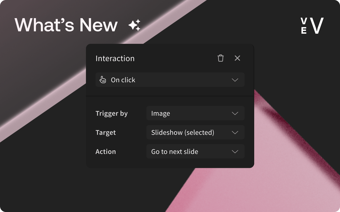
Interactions are fundamental to how users engage with your web content. In Vev, interactions have three essential terms:
- Trigger: A trigger is the activating behavior, such as clicking on a component or scrolling the view.
- Target: The target is defining where the action should take effect when the trigger activates, like in a slideshow.
- Action: The action specifies what should happen when the trigger activates, such as moving to the next slide in a slideshow.
Breaking it down: select an object to add a trigger to—whether it's an image, icon or an entire frame—and determine its activation method (e.g., Click or Mouse Enter). Then, choose the object that will serve as the target for that trigger, and decide if it should “show” or “hide”. For those seasoned creators among you, certain use cases might come to mind, such as custom menus, labeled images, and tooltips. While these are already available as out-of-the-box components in our library, our aim is to offer even greater freedom for deeper customization.
Now, if you're curious about why we paired “Slider” with “Interactions” in this release, the answer is coming up next.
2. Meet "Slider" (Beta)
Slider, slideshow, carousel... there are a few different names, but they all refer to a component that interacts with your audience by presenting a sequence of visuals or content. While we already offer a Slideshow as a pre-built component, we felt the need to exponentially enhance it.
🎉 Introducing Slider: This isn't your ordinary component. Beyond just images, “Slider” lets you drop in anything—be it an entire frame, 3D files or any other design element—into each slide. But here's the twist: it comes without the standard navigation or arrows, giving you absolute freedom to customize entirely to your taste.
Once you've crafted each slide, you dictate how it’s going to interact using the “Interactions” tool. Whether you prefer good old arrow icons, or yearn for something completely unique, the choice is yours.
Fancy an interactive timeline that advances as users hover over key dates? Or perhaps a testimonial slider where user reviews fade in and out? Together with “Interactions”, the possibilities of this new feature are endless.
Step-by-Step: Slider x Interactions in Practice
The playful component you saw at the beginning of this blog post is a testament to the versatility of our new features. Combining both the “Slider” and “Interactions”, you can effortlessly craft dynamic elements without a single line of code. Let's dive into how this component came to life.
Step 1: Add the “Slider” Onto Your Canvas
Click “Add-menu” and add the “Slider” into the canvas. Once added, you can either double-click or click on “Add content” to enter the “Slider” editor. Please keep in mind that the slider container size remains consistent across all slides, so feel free to resize it as needed here.
Step 2: Create the First Slide Component
On the left side panel, you'll notice “Slide 1” has been pre-generated. Let’s start by crafting the initial slide component, which we'll later duplicate for the subsequent slides. In this guide, we're opting for a simple image (Apple Memoji) paired with a text box layout.
Step 3: Copy/Paste the First Slide
Click the “+” icon to produce a “Slide 2” and copy/paste the frame from the initial slide into this one. Repeat this action for “Slide 3” and “Slide 4”.
Step 4: Customize Each Slide
Now that we have four slides ready, let’s go into Slide 2,3,4 to customize each of them to your liking.
If we conclude at this juncture, we'd have a traditional slideshow in place. While this can function as a standalone element with some “Properties” adjustments, like animation, direction and duration, this isn't our final destination.
Step 5: Let’s Add Trigger Frames
Draft four text frames to overlay the Slider. Then, activate “Interactions” from the top right corner. Hit the “plus” icon, opting for “Mouse enter” as the trigger. Next, pinpoint the slider we just crafted as the “Target” element, select “Go to a specific slide” and enter the slider number. Slide 1 corresponds to “1” and so on.
Repeat this process for the rest of the sliders.
Voila! We've now created a bespoke design component that's as engaging as it is playful. 🤩
Feel free to add animations if you’d like to splash some micro-interactions. To give this a whirl, head over to your Vev profile and enable the “Interactions & Slider” toggle under Experimental Features.
As always, we're eager for your feedback at hello@vev.design. Your voice matters to us!
Want More Inspo?
Get our monthly newsletter straight to your inbox.
You can always unsubscribe at any time.
Privacy Policy