
10 Data Journalism Examples to Inspire Your Next Feature
August 30, 2022
Words by Jeff Cardello
If you are aiming to offer deeper understanding on a subject matter, it helps to have data, and even more so to deliver it in an engaging way
Numbers, statistics, and other metrics provide clarity as well as evidence that backs up the ideas or concepts you’re reading about. Through the power of data, you’re able to see the significance of these numbers and connect them to the greater world. The only problem is that when this data is embedded in tables of numbers or is missing any sort of visual context, it can be hard to extract their deeper meaning and see their relevance.
Data journalism makes it easier to understand these numbers. By merging data science and statistics with content, visuals, and interactivity, we can better see patterns and the importance of these metrics. Data journalism humanizes data, showing how it impacts people’s lives in a way that numbers alone can’t.


Why Data Journalism is Popular
Data journalism not only utilizes words in telling stories, but spins statistics and other metrics into brilliant visuals. Animations, interactions, creative typography, data visualizations, and other web design techniques elevate traditional journalism into something that’s far more captivating.
The Rise of Data Journalism
Though we associate digital storytelling and data journalism with modern web design, it’s not a new phenomenon.
According to datajournalism.com, many consider the nascence of data journalism to be 1967 when the Detroit Free Press harnessed the computing power of a mainframe in analyzing survey data about what may have caused riots over that summer. Data journalism would continue to grow and evolve throughout the 70’s, 80’s, 90’s, and 2000’s as computers became more powerful and readily available.
Today, big and small media outlets, companies, and organizations use data tools to discover stories, gather and model data, and craft gorgeous long-form features in a way that’s quick and effective.
Popular Data Journalism Tools
Data mining software makes it possible to collect data, analyze it, and find connections and patterns. There are a number of data mining tools that are popular today including:
- Enigma Public
- Neo4j
- OpenRefine
- Zenodo
- Help Me Investigate
- Timetric
- Buzzdata
Another great resource is ICIJ, who put together this curated list to help you find the right data platform for what you want to accomplish.
Many writers and journalists have learned how to code, with Python offering an easy entryway. Python, which is an accessible and easy-to-read scripting language, makes it simple to create data visualizations through packages like Matplotlib, Plotly, and Seaborn. For those more technically inclined, R is a more advanced statistical programming language for analyzing data and creating visuals. And thankfully there are also no-code options you can that offer a simpler way to generate data visualizations.
Some common of the more popular no-code data visualization apps include:
- Tableau
- Datamatic
- Flourish
- Datawrapper
Rather than lean on a traditional CMS in assembling and publishing data-driven content, there are no-code tools like Vev that offer a simpler alternative. With advanced scrollytelling, animations, interactive design elements, and built-in text and visual effects, Vev makes it possible to build stunning immersive web editorial features. With the power to embed Flourish graphics and animations, as well as pre-coded chart components, Vev makes it easy to weave data into your designs and show it off in imaginative ways.
10 Striking Data Journalism Examples
Now that we’ve seen how data journalism stands at the intersection of statistics and design, let’s take a look at 10 different data journalism examples that tap into the power of metrics in telling their stories.
Covid-19 in Africa
One of the foundations of journalism is to spread awareness about issues that affect people’s lives. Covid-19 in Africa, which was built with Vev, tells the story of how the pandemic has impacted Africa and its continued hold on the region.
There are a lot of sobering statistics in this piece of data journalism, with the most important highlighted through data visualizations. This design takes metrics that would otherwise lose their significance in blocks of text and pushes them to the forefront. Instead of raw numbers without context, visuals connect these metrics with the people whose lives they directly affect. You’ll see across data journalism examples whose numbers are connected to people, an emphasis on capturing their humanity.
Deepdive into the Venezuela Refugee Crisis
Built with Vev, Venezuela Refugee Crisis explores the many facets of this ongoing humanitarian crisis.
This interactive map shows the number of refugees fleeing from Venezuela compared to other countries like Afghanistan. The refugee crisis in Venezuela is not as well known as what’s been happening in other parts of the world, and this data shows that the magnitude of what’s happening in Venezuela is on par with what’s happening elsewhere.
We’re always impressed by data journalism examples that shed light on global problems and this design effectively communicates the enormity and seriousness of the Venezuelan refugee crisis.
Europe’s Record Summer of Heat and Fires
Europe’s record summer of heat and fires – visualised from the Guardian brings together real-world aerial shots of fires along with data visualizations.
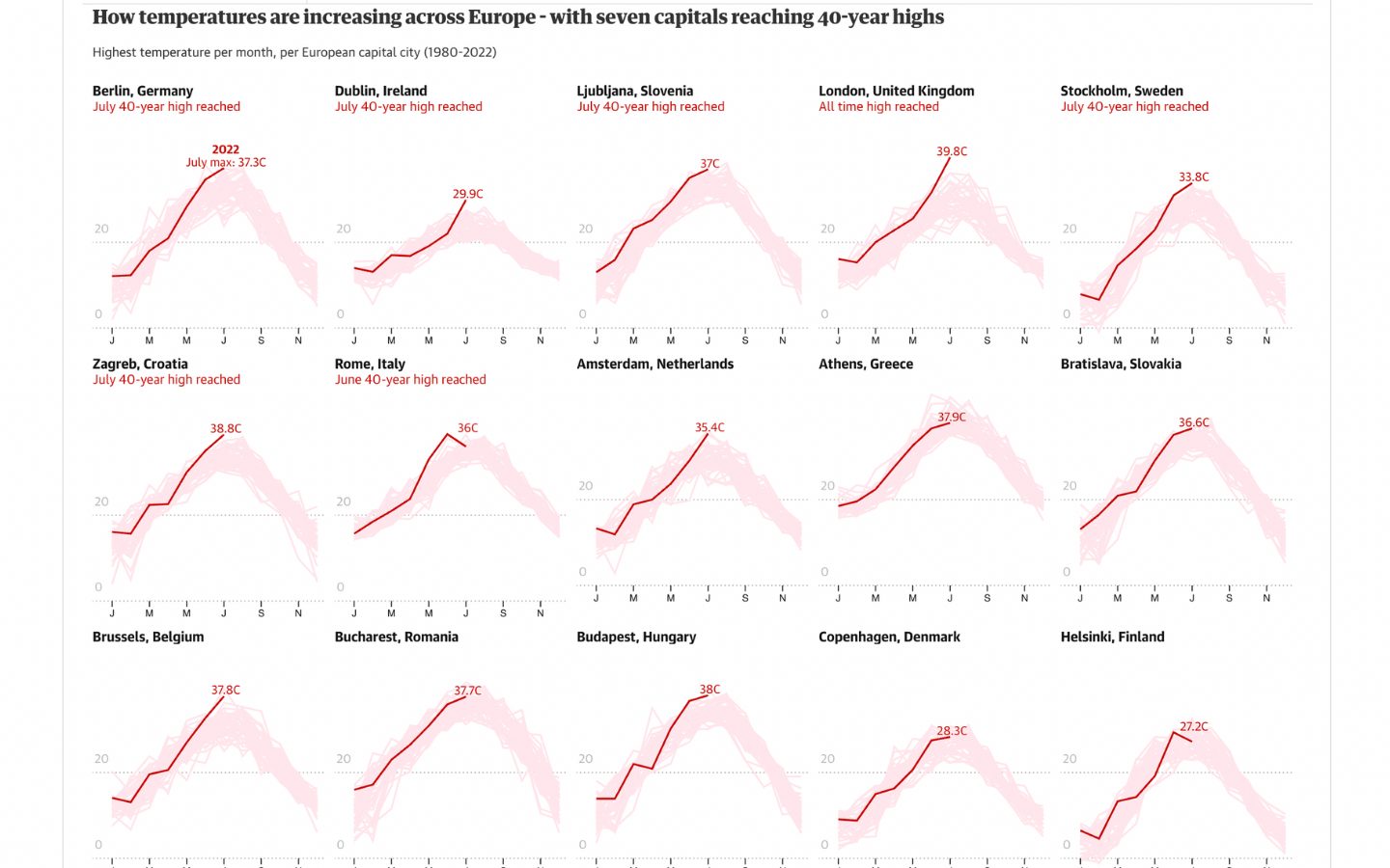
These data visualizations show how the increase in temperatures isn’t just a localized event. You see the widespread reach of this heat wave and the serious implications of rising global temperatures.
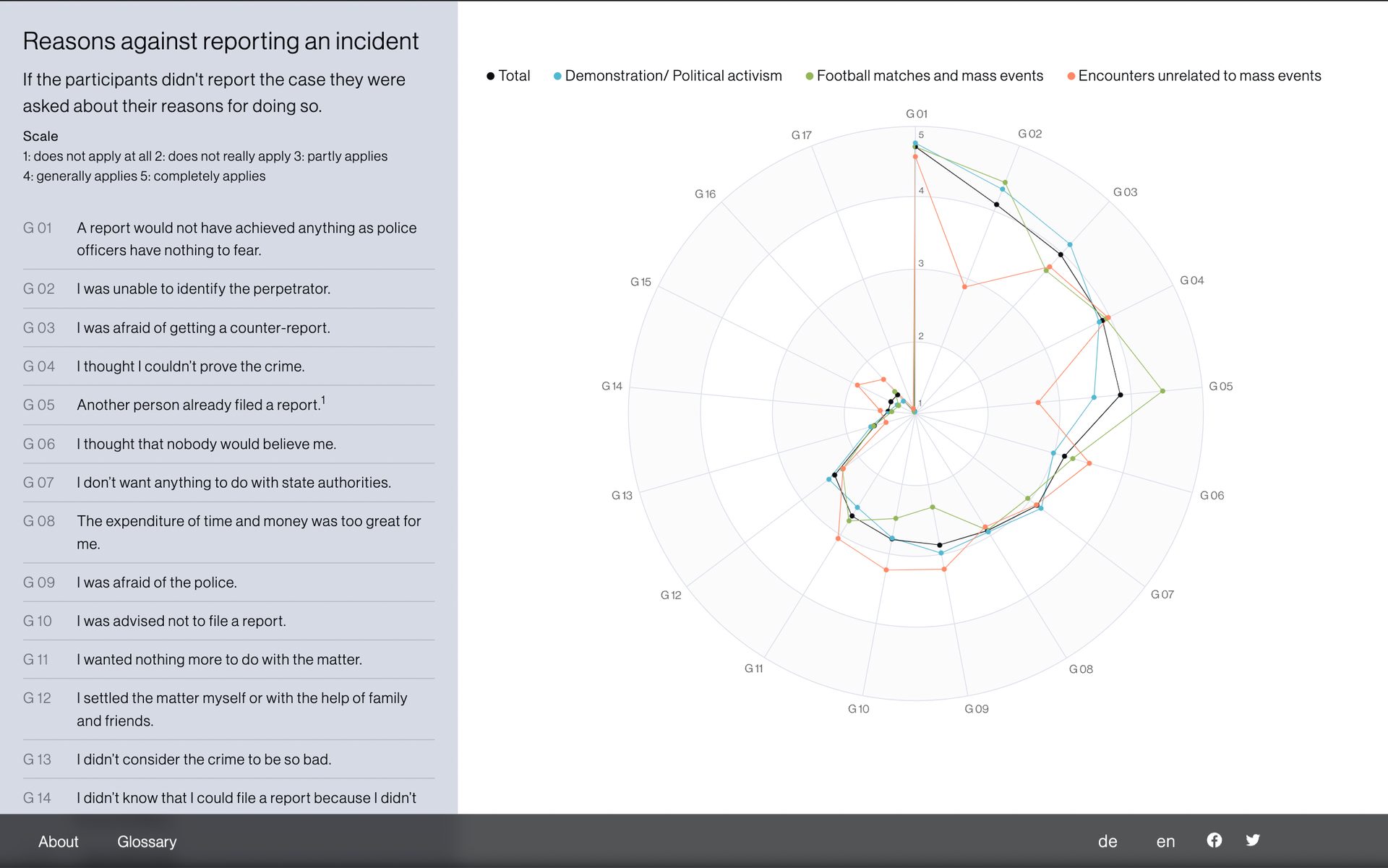
Germany Police Incidents
Data journalism aims to tell the truth and provide accuracy. This website investigates both registered and unregistered instances of police violence in Germany, and the factors that determine whether or not victims report what they’ve been through. As in any legitimate form of journalism, it’s presented in an unbiased format, letting the facts speak for themselves.
This example above of an animated grid of blocks illustrates the percentage of different types of filed reports that lead to indictments. Additional data comes into view as you scroll through the scroll-triggered column on the right. It encapsulates a lot of information in a small amount of screen space.
The below interactive diagram also successfully consolidates data, showing the reasons why incidents don’t get reported, as well as the locations where these incidents happened. Data journalism opens up a variety of creative possibilities in representing statistics and other metrics. This design integrates a number of sharp data visualizations that add to its modern aesthetic.
Pets Prove to be the Pandemic’s Cute, Furry Growth Area
Data journalism isn’t limited to serious societal and global matters. It can also be used for less weighty topics, like this article from the Guardian about pets and the pandemic. Mona Chalabi is well-regarded as a data journalist, merging statistics, writing, and artistry into her work. This playful data visualization of hers showing the increase of cats and dogs during the pandemic is so much more fun than a traditional bar graph.
How Space Debris Threatens Modern Life
Staring at the immensity of the night sky, it’s hard to imagine that orbiting above are thousands of pieces of human-generated debris.
In this data journalism article from the Financial Times, readers are confronted with just how much space debris is hovering overhead, as well as given an understanding of why this is dangerous.
The Waiting Game
The Waiting Game has many accolades for humanizing what asylum seekers go through, with an interactive game that lets you see what this process is like for five individuals of differing backgrounds. Here the data being conveyed is of experience and emotion. Black and white visuals, somber music, and the choices to give up or keep going, captures the difficulty and desperation of those seeking better lives.
The Most Detailed Map of Cancer-causing Industrial Air Pollution in the U.S.
Propublica reports on political and environmental issues that are impacting the planet. This article is a great example of data journalism, taking a comprehensive set of metrics and putting them into a format that makes them easy to make sense of.
This map goes in-depth about the major contributors to cancer-causing industrial air pollution across the United States. Seeing these sources of pollution dotted across a map and the reach of their pollutants really drives home the immensity of this environmental issue.
World-wide Use of Contraception
In this in-depth article, Medicamentalia covers contraceptive practices across the world. This design has a scrollytelling feel, with relevant text moving over graphics as well as numerous data visualizations that show how the availability of contraceptives affects women all over the world.
This is another great example of data journalism that takes what would otherwise be dry statistics and emphasizes their significance through visuals.
How Artists Get Paid from Streaming
It’s well known that it’s hard for artists to make money off of streaming music services. This post from The Pudding, who are all about inventive data visualizations, shows just how hard this is, and the complexities of musicians in getting royalties from their work.
Data journalism makes content more readily accessible, imparting insights and understanding in less space and time than traditional design. Here, all of the complexities of the streaming music business are easy to grasp.
Create data journalism features the easy way
Data journalism is the perfect union between science, writing, and design, taking what would otherwise be esoteric numbers and metrics, and showing them in a way that leaves people with a deeper understanding. Using a no-code app like Vev makes it easy to take the data visualizations you’ve generated and build beautiful web designs around them.
Want More Inspo?
Get our monthly newsletter straight to your inbox.
You can always unsubscribe at any time.
Privacy Policy