Interactive Landing Page Design 101: Tips, Best Practices and Examples
December 2, 2022
Words by Caitriona Burke
In a web space oversaturated with content, an interactive landing page can help you stand out from the crowd.
Interactive websites are all the rage these days, and it’s not hard to see why. When given the choice of watching videos of cats sleeping in weird places and dogs doing cute tricks, a flat landing page won’t cut it. By adding interactivity, you can grab and hold viewer attention, stopping them from closing the tab and returning to their endless scrolling on TikTok.
Luckily, adding interactivity to landing pages—or any web content for that matter—is no longer limited to those with the budget, time, or developer resource. A new breed of web creation platforms now offers pre-coded animations and interactive elements that creatives can simply drop in their designs and customize.
To help you get started, we’ve broken down everything you need to know about interactive landing pages—from ideas and UX best practices, to slick web design techniques.
What is an Interactive Landing Page?
Interactive landing pages are web pages that involve users through micro-interactions and animations towards a specific end. This can be anything from subscribing to a newsletter, downloading a whitepaper, completing a form, consuming further content, or signing up for a free trial.
Often, the term “landing page” is used to refer to the homepage of a website, and these have been kicking around since the conception of the World Wide Web in the late ‘80s. In more recent terms, “landing page” has become shorthand for a single page designed for a specific marketing goal. These first came about in 2003 when Microsoft needed a new way to increase online sales for its product “Office”. These landing pages were pretty basic to say the least—with walls of text and a simple “buy now” button—and delivered a passive user experience that doesn’t really cut it today.
Landing page design has come a long way since then. While completing a form or clicking a button is still an interactive experience in its own right, injecting additional forms of interactivity can help steer users towards them. Interactive landing pages capture attention, convince visitors to stay longer, and visually reinforce the key actions you want them to take.
Interactive Landing Page Design Techniques
Hover Animations
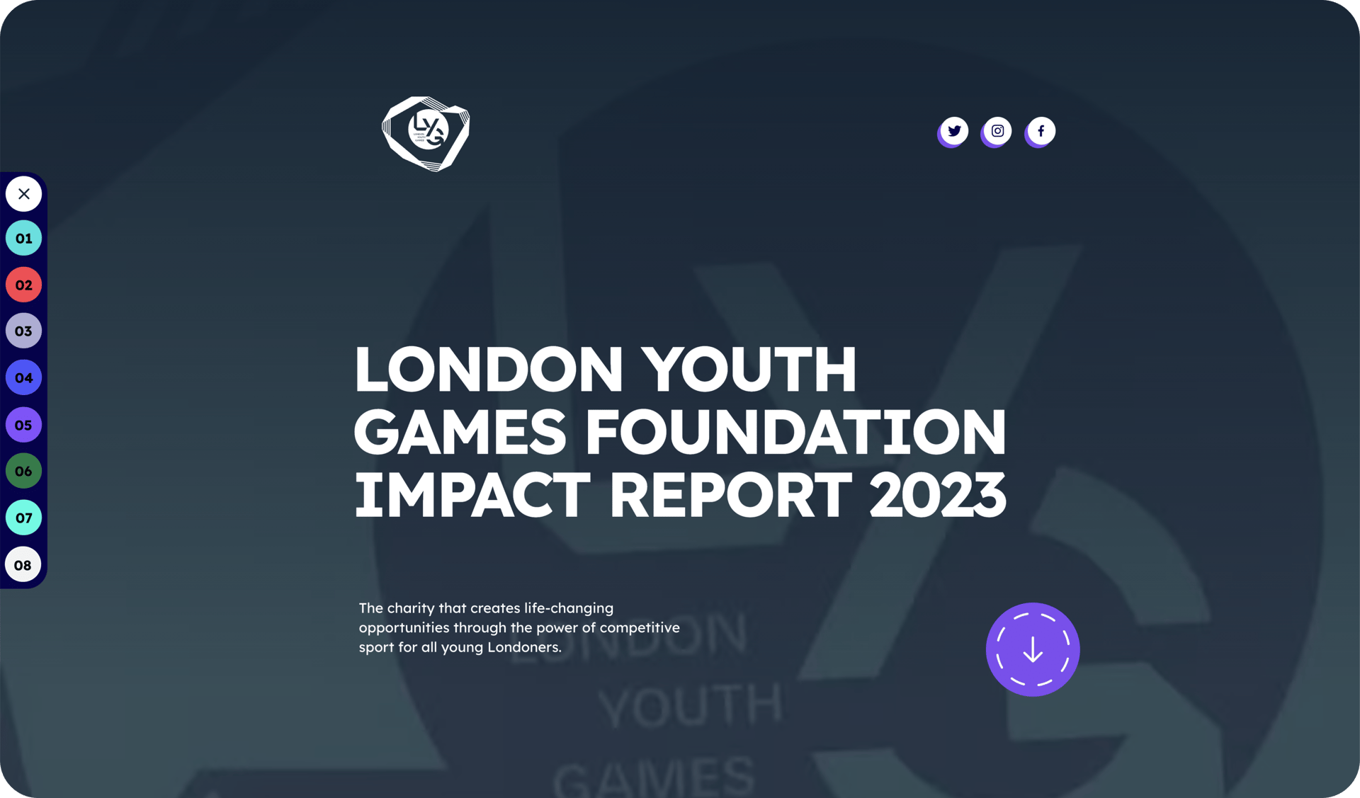
Hover animations work well on interactive landing page designs built for desktop, and are often used to subtly make graphics, typography, and photos feel less static. Animation is initiated when users hover over a target element, triggering a gentle interaction. This interactive design technique also draws attention to parts of the landing page that are most important, so consider using it on your CTA buttons and linked text.
Show/Hide
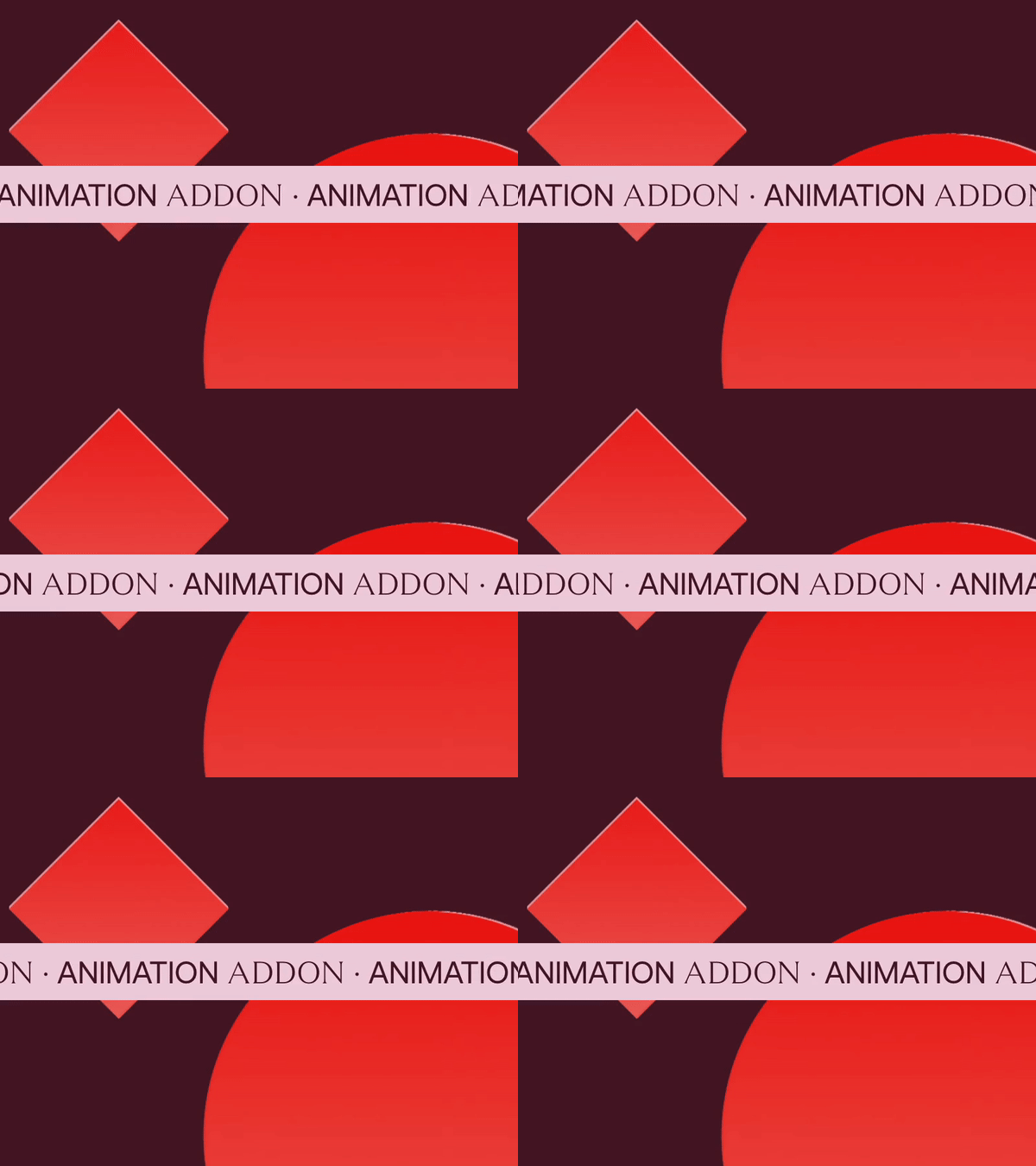
Adding a Show/Hide widget (or two) to your interactive landing page allows users to make a target element visible when clicked, engaging users to plot their own course through your content to learn more about your brand, mission, or product. This interactive element also saves precious space on your landing page, and injects a novel way for users to discover information which they might otherwise scroll past.
3D Elements
You can enhance any interactive landing page design with 3D objects. This is an exciting way to present key graphics and information, and again offers a playful way to make users consume more information. Bringing instant “wow factor” to any design, 3D elements also make your landing page more memorable—when going up against the vast competition out there, this is the goal!
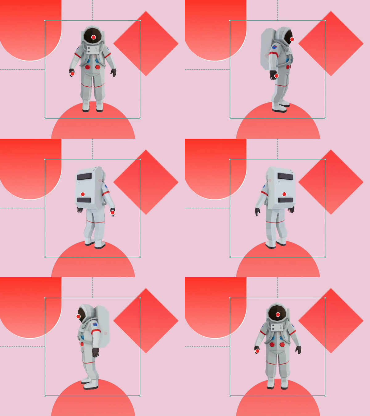
Image Comparison Slider
An image comparison slider allows users to click and drag across an image to discover two different states. This interaction is perfect for any kind of “before/after” storytelling, as well as for showing off how a product or service is different (read: better) to alternatives. Writing isn’t enough these days—you need to help readers experience it for themselves, and this is a great design technique for doing so.
Don't forget to track and test your interactive landing page performance—this can increase conversions by as much as 300%.
Best Practices for Designing your Interactive Landing Page
Putting these interactive design techniques into practice requires some care. It’s important to keep the following best practices in mind to ensure great results for your interactive landing page:
- Every interaction should be logical. Make sure the user understands why they are interacting, and how they should interact with your content. Whether this is through labels, universally understood symbols, or the overall design, interactivity should be part of the user's natural journey.
- Every interaction should add to the user experience. Be mindful not to add pointless interactions, and make sure they play a part in the wider purpose of the landing page.
- Every interaction added should be planned out across devices. Optimize your interactive content for desktop, tablet and mobile so that your interactive landing page is responsive across all screen sizes.
6 of the Best Interactive Landing Page Examples
Perfecting the design of your interactive landing page is easier to do once you have some techniques to use and best practices in mind, but you may also need some inspiration. Here are the best landing pages we have come across recently.
Adobe x Bowie
This interactive landing page design from Adobe is one of the most unique examples we’ve come across. Adobe x Bowie is a marketing tool to promote Adobe’s collaboration with the Bowie brand—or legacy, shall we say—in which people are encouraged to use Adobe CC to unlock their individualism and creativity like Bowie did, as well as promoting their Ziggy graphics add-on pack.
The landing page opens with audio and large text that urges users to “step into Bowie’s dressing room”. Upon entering, it quickly becomes clear that you are in a game. Suddenly, you are inside Bowie’s dressing room and on a treasure hunt to find nine objects before the superstar returns. With interactivity woven into every inch of the screen, users are able to scroll, click, and drag their way around the dressing room, uncovering items and getting lost in this digital world.
If you’re anything like the Vev team, once you start a game, you have to finish it! This ingenious tactic, appealing to the big kid inside of all of us, is exactly what Adobe is betting on in creating an interactive landing page like this. The interactivity is so polished and integral to this site that it becomes an immersive web experience—memorable, full of intrigue, and reinforcing Adobe’s brand association with next-level creativity.
Publicis Norway
Publicis Norway’s interactive landing page, made in Vev, truly embodies the “less is more” mantra, yet manages to be one of the most uniquely creative pages we’ve seen. From the moment the page loads, you are met with large typographic elements which make up the brand name “Publicis”. Upon scroll, these letters scatter in every direction outside of the user’s screen. This use of Vev’s scroll-speed add-on is ingenious in its simplicity and has a huge impact in capturing attention from the get go.
This animated word effect immediately builds an image of the brand, showcasing their creativity, which in turn helps them sell their creative services to potential clients who land on the page. This interactive landing page design technique also encourages users to scroll further, guiding them towards more of Publicis’ content, such as company news, client examples, and CTA buttons.
Design Embraced
Design Embraced is the digital portfolio of freelance designer Anthony Goodwin. A brilliant example of an interactive landing page, users are met with a list of bold, red titles down the center of the page, making the portfolio pieces the focal point of the landing page. As you hover over the central text and images, your cursor appears to push the red typography and corresponding graphic, morphing and distorting them as you glide across the screen. The landing page also makes use of scroll-triggered animations, causing the text to shoot up and various preview images to appear, wrapping themselves around the text in a spiraling motion.
This interactive landing page places the designer’s work front and center with no distractions. Instead, small text in the corners of the page link users to the about page or to Goodwin’s social media accounts. This stunning interactive landing page has one clear purpose: to highlight the designer’s creativity, ability, and originality, all of which are achieved by the attention paid to this design.
Sarn Oliver
Sarn Oliver has created a three-dimensional interactive landing page to promote his collection of “singing paintings”. A violinist in the San Francisco Symphony, Oliver has curated an online gallery housing a collection of paintings which were composed with custom musical scores. Upon visiting the Vev-made website, users are met with an example painting in the background and the head of the 3D violin in the foreground, and are prompted to “scroll”.
Scrolling takes you down the exterior of the violin before being transported inside of it. From here, you are met with the gallery of works with clickable hotspots offering further information on the artwork. This interactive landing page is another immersive web experience, designed to excite and engage users, with the goal of converting them into customers.
Milwaukee Ballet
The interactive landing page of the Milwaukee Ballet takes users on an immersive journey. Upon scroll, the background video and text changes, directing you to click onto different pages to learn more or buy tickets. This full-width interpretation of a web carousel captures attention and highlights the most important sections users should visit on the website, and why.
Another interactive element on this landing page is the unique interpretation of a scroll progress indicator. As you scroll, you are taken around the circle in the center of the page, progressively making it red every time you reach a new section. This encourages users to finish their journey as they can see there is more left to discover. Between this and the changing video, this interactive landing page design succeeds in visually capturing the attention of the audience and being visually explicit about what the company is about.
Mirrows
Made in Vev, Mirrows’ interactive landing page design completely breaks the mold, offering an horizontally scrolled experience that breaks any stigma around applying horizontal scrolling across an entire website.
As well as the unique horizontal scrolling experience, the landing page is full of fun micro-interactions that steer your attention along the way. An example of this can be seen in the button that says “tap to alter”, which then triggers an animation on the page to change from flying birds to swimming fish. You may question why this is relevant, but next to the interaction is a quote from Mirrows’ NFT artist Mihaela Nina which states: “By interacting with the art, we feel that we become part of it as it immerses us in a discovery journey.”
The interactivity of this landing page is intrinsic to the artwork and creative philosophy of the artist being showcased, and offers users a deeper level of understanding of what they are viewing.
Bring Your Landing Pages to Life
We built Vev to make it easy for any creative to build an exciting interactive landing page. Use our pre-coded animations and design elements—from show/hide and 3D objects, to scrollytelling and parallax effects—to easily create gorgeous responsive sites. Publish anywhere on the web when you’re done, including through your existing CMS.
Want More Inspo?
Get our monthly newsletter straight to your inbox.
You can always unsubscribe at any time.
Privacy Policy


