


10 Websites With Carousels That Are Sure To Spark Your Imagination
July 10, 2024
Words by Jeff Cardello
Websites with carousels are often more engaging and eye catching than those without.
The beauty of modern web design is that offers more than just vertical screen space to work with. Breaking out of the boundaries of fixed layouts, websites with carousels integrate side-scrolling, or sometimes go in more novel directions in helping designers maximize screen space and enhance usability.
We’re going to explore a wide range of websites with carousels, from experimental to practical, showcasing what's possible and the different ways they can be used to help people have more interactive website experiences.
Let's dive straight into some examples of websites with carousels...
Pfizer, Let's Outdo Cancer
In this microsite created with Vev, global pharmaceuticals company Pfizer shares its achievements in researching and developing new cancer treatments. With medical imaging, background videos, and a wide variety of colorful graphics and animations, it’s a visually dazzling design that effectively conveys the science and importance of Pfizer’s work.
The first web carousel you'll come across is a timeline of staggered cards representing Pfizer’s breakthroughs in developing medications. Clicking on these cards reveals text detailing these achievements through a quick text fade-in.
Just a short jump down, you’ll come upon another web carousel with three panels representing antibody drug conjugates, bispecific antibodies, and small molecule medicines. Clicking on these selections brings up beautifully rendered 3D videos detailing how these treatments work.
Pfizer’s microsite is a great example showing how websites with carousels offer a more lightweight experience while making additional information accessible to visitors interested in going further and learning more.
Sriracha
With its complex intermingling of heat, tanginess, and garlic, a few drops of Sriracha can liven up the flavor of even the blandest dishes. This gorgeously branded website, filled with vivid red and yellow, appetizing food photos, and scroll-triggered animations, is a celebration all of its sweet and savory goodness.
Sriracha uses web carousels to show off what kinds of appetizing foods you can make with its products. There’s one at the bottom of the main page that lets visitors skim through an arcing display of recipes and horizontally laid out carousels on the Recipes section accessible from the top nav.
Websites with carousels work well in grouping related content, products, or other items. Siracha puts carousels to great use in showing people what culinary creations are possible with its sauces.
Benoît Marzouvanlian
Paris-based art and film director Benoît Marzouvanlian portfolio website is alive with cinematic action. Right at the top a video carousel features short clips of his work. From shots of a runner traversing rocky terrain to race cars skidding around the track, it all feels very high energy, perfectly encapsulating his work.
Whether a hero section contains videos, photos, or other types of visuals, websites with carousels are a great way to grab visitors’ attention right from the start.
Active Theory
Moving through this website for the creative agency Active Theory feels like diving into the ocean of an alien world. Jellyfish float by and bioluminescent flourishes of color flash as one scrolls down through its depths. Moving through its surreal visuals brings you to a spine-like interactive web carousel, with projects that look like they’re embossed on foggy glass clinging to the skeletal structure. With featured projects ranging from Spotify’s Wrapped, to live installation work for IBM, this is a web design on par with the artistic and technology-driven work they do for their clients.
It’s strange, and atmospheric, making it one of the most original websites with carousels we’ve come across.
Theo
We’re fans of parallax scrolling, and the eyewear company Theo puts this to great effect in the horizontally navigated web carousel occupying the hero section. Each slide represents a product category, with hover-triggered animations and artistic product photos adding to its visual impact. The scroll bar at the top is also a nice touch, categorizing each section from minimalistic to extravagant, which is terrific in describing each product category.
Theo’s product-driven website is an excellent example showing how websites with carousels work in the context of retail, allowing visitors to check out products in ways that feel active and engaging.
Muchacha
With a color scheme of muted sunset orange and rich forest green, as well as the elegant yet refined Beatrice typeface, the website for the eatery Mucha Chamon Pellier evokes a sense of welcoming and sophistication. Further adding to its air of fashionability is the motif of a stylized pair of lips, that pops up throughout.
Heading down the opening screen you’ll get to an image carousel featuring some of the food they serve. While it doesn’t offer any additional information a click on any of these culinary offerings makes a kiss appear. This is such a lovely microinteraction communicating that you too, will likely love this food.
Restaurant websites with carousels give those looking to dine interactive ways to see what they cook, helping ignite would-be customers’ appetites and inspiring them to visit.
Adani Group, A-connect
Working in infrastructure, energy, transportation, and the environment, the Adani Group is a huge company that does much to improve the lives of those in India. A-connect, is the Adani Group’s monthly in-house magazine, offering a simple way to check out stories through a web carousel that takes up the entirety of the screen. Built with Vev, it features an interesting animated effect that scrambles the text as one slide transforms into the next.
Often going through long lists of blog articles can be a tedious process. A-connect shows how websites with carousels are great in making skimming through blogs an easier and more efficient experience.
One Day in My World
One Day in My World is a visual storytelling project covering the lives of people suffering from mental illness and other psychological and social challenges. Through emotionally impactful photos and journalistic writing, it humanizes what is often stigmatized, eliciting empathy and understanding, rather than resignation.
These stories are navigated through two small UI arrows, or by clicking and dragging. As one moves through the gallery of blurred images hovering in the background, each one is pushed to the front, bringing the photo into focus. This is such an apt metaphor for mental illness, where so many of us have preconceptions that are removed once we take the time to take a closer look.
One Day in My World shows how websites with carousels help tell stories in new and captivating ways, tapping into the creative possibilities that digital design offers.
We are Bright
With its unique parallax sidebar navigation and the clash between the modern and rounded letterforms of the Youth typeface with the organic/plastic hybrid feel of the Cardinal Nature typeface, it’s easy to see that We Are Bright approaches its work with a unique sense of creativity.
This sense of originality also touches its web carousel of featured projects. Grabbing any of the selections warps the image into a ribbon of grey and prismatic-like colors, transforming it into the next photo. We love seeing websites with carousels that include abstract effects that aren’t entirely necessary, but add a sprinkling of visual magic that makes for a more exciting user experience.
WDNN
The ecommerce design agency WDNN foregoes extravagant visuals, instead opting for a bold yellow and black aesthetic and the well-defined letterforms of Lexend, making text the focus of its website. Free from distractions, it brings visitors' eyes straight to the copy WDNN wants them to read.
WDNN’s featured projects are represented through a web carousel, with each panel listing how they helped clients through lists of bullet points with each selection linked to the websites. This is such a great approach, setting up visitors with all the major information they need before seeing WDNN’s work in action.
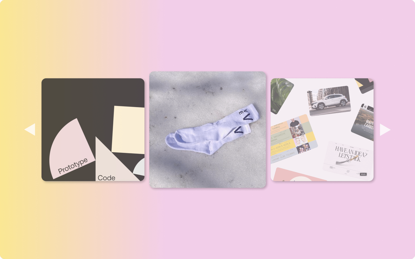
WDNN demonstrates that websites with carousels don’t have to be image driven, and when done right, sometimes all you need is text.
Design websites with carousels in Vev
Whatever type of website you’re creating, Vev empowers you to build interactive and fully responsive without having to code anything. Video carousels, image carousels, 3D image carousels, and card sliders can all be put together through pre-built elements rather than building them from scratch with HTML, CSS, and JavaScript. Whether you want to create a more traditional website, or go wild with experimentation, Vev lets you create, customize, and launch websites all through the power of no-code.
Want More Inspo?
Get our monthly newsletter straight to your inbox.
You can always unsubscribe at any time.
Privacy Policy