
What is Slow Journalism? (With Examples)
June 23, 2023
Words by Selene Nelson
Slowing down this fast-paced world is no mean feat; if you are looking to create content that values complexity and meaning, slow journalism might be your answer.
In today’s hyper-connected yet unfocused world, the need for speed has become our downfall. We’ve become accustomed to instant information and an endless supply of content. It wasn’t so long ago that news was something most people consumed once or twice a day, maybe reading a newspaper in the morning and watching the news on TV in the evening – but today, things are quite different.
Let’s explore what slow journalism is, and some well-designed examples — all of which will inspire you to create your own with no-code tools that are enabling journalists and publishers worldwide to create breath-taking, long-form digital content.


What is Slow Journalism?
Slow journalism, like other movements including slow travel and slow food, exists to offer something different from the often meaningless, unremarkable content that’s churned out at an astonishingly fast rate. In 2023, around 3.7 million new videos are uploaded to YouTube each day, and two to three million news articles hit online and offline platforms every 24 hours.
3699500
new YouTube videos per day
new articles per day
2999500
Slow journalism is a counterpoint to the accelerating speed digital tech has brought into our lives. Rather than producing quick content that’s geared towards clicks rather than clarity, slow journalism is about stepping back from the relentless rush of the modern news cycle. It’s about turning away from mindless content, and carefully and deliberately creating and consuming stories at a slower yet deeper pace.
Slow journalism gives writers the time to really research their stories – to ensure their work isn’t just accurate, but contains depth, context, and analysis too. It isn’t about producing content as fast as you can so your story gets the most clicks when news breaks, but taking the time to publish a story once the dust has settled, and reporting can be clear, calm, and unprejudiced. This lends itself to fully exploring the power of design in telling stories, be it through scrollytelling, visual storytelling, or photo essays.
From a reader’s perspective, there are many perks to slow journalism. By taking time to research, check facts, and offer retrospective analysis and expert opinion, readers can enjoy a deep-dive into stories that are as informative as they are entertaining. Plus, because slow journalism tells you about the long-term effects of a news story, you’re able to gain a far deeper understanding of the ramifications of the event. Using immersive design techniques, you can give readers an experience that makes an impact.
Slow journalism is about turning away from mindless content, and carefully and deliberately creating and consuming stories at a slower pace.
The History of Slow Journalism
While on the surface slow journalism may seem like it sprung up in the wake of instant (and constant!) news, it isn’t really a new phenomenon. In fact, it could just as appropriately be called ‘classic journalism’ or ‘old journalism’ – as it’s a very intentional backstep to a time where speed wasn’t the most important factor involved in getting a story out.
The rise in popularity of long-form content over the past decade suggests that the desire to move away from quick, disposable, and forgettable stories isn’t new, either. However, it’s surged in the past few years. The term ‘news fatigue’ was used a lot during 2020, when the media was dominated by an incessant stream of grim news stories – from pandemic-related catastrophes to climate crises and racial tensions.
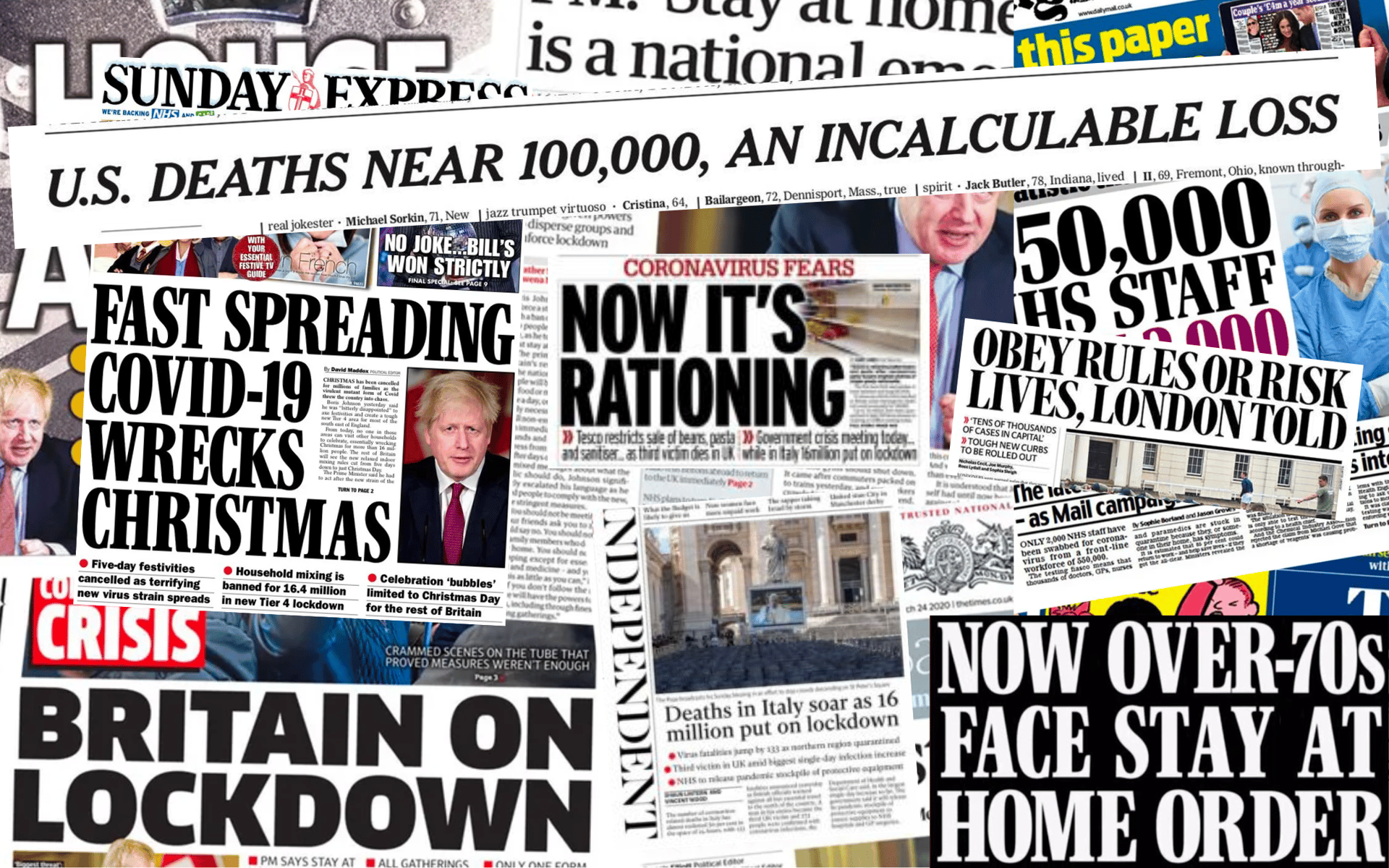
Faced with such a magnitude of depressing and worrying stories – many of which contained entirely opposing data and opinions – it’s no wonder that so many people felt exhausted by the overload of information. Taking a step back, and deciding to consume content more intentionally – and less frequently – may be part of the reason why long-form content has become even more popular recently.
While long-form content tends to be an addition to ‘traditional’ news sites, slow journalism often exists in its own sphere. Delayed Gratification was created in 2011, and is just one example of an organization that’s actually investing in the craft of journalism. While other publications cut costs by firing staff and producing generic click-bait content they can monetize, Delayed Gratification takes its time. They are, as they put it themselves, ‘proud to be last to breaking news’.
The term ‘slow journalism’ may be new, but the concept of unhurried, detailed storytelling is old. From Chaucer’s The Canterbury Tales to the Bible, people have long taken meaning from lengthy stories that contain intricate details – and while these examples may be books rather than news stories, the same concept applies; humans are drawn to narratives that are compelling, moving, and educational, and if you want to produce content like this, it simply can’t be rushed.
No matter how long you spend on a story, words alone can only go so far.
Slow Journalism and Visual Design
Now that we understand what slow journalism is, and why it’s rising in popularity, it’s important to consider the role of visual design within this medium. The truth is, no matter how long you spend on a story — researching the facts and conveying all the essential details — words alone can only go so far.
The best examples of long-from content aren’t only compelling and well-researched, but usually interactive too. If you want to keep audiences engaged, today, you need to think just as much about the visual design and user experience as the words themselves.
So, what are the best examples of design components that are often used in slow journalism? Let’s take a look at some powerful techniques.
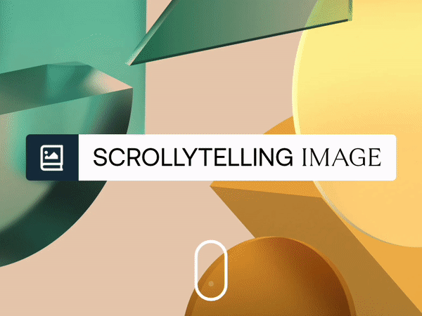
Scrollytelling Images and Videos
Scrollytelling is one of the most popular and striking design techniques used within visual journalism, and it works really well for slow journalism. The word describes the fusion of scrolling and storytelling, and it creates a gripping narrative that unfurls as the reader scrolls, giving your story an attractive visual flow.
Adding a scrollytelling image to your story is an especially effective design technique for slow journalism. Different sections of your story can have different background images based on their content, and as you scroll through each section, the background images fade into that of the subsequent section.
Adding multiple scrollytelling image sections to have a background that always complements the story will keep your reader hooked, and stops particularly long content from looking too samey. You can also use videos instead of images for your scrollytelling background; this can be an even more evocative way to draw the reader into your story.
Scroll Progress Bar
Slow journalism articles tend to be long, due to the amount of detail and research they contain, so it’s understandable that readers want to know exactly where they are in the story. Scroll progress bars are a great way to show the reader how much of the content they’ve read, and how much they have left.
Making your scroll progress bars interactive doesn’t only show your reader precisely how far they’ve traveled on a page, but encourages them to read on, too. Interactive scroll progress bars also improve website UX, and add a fun, visual element as the reader scrolls, keeping them engaged.
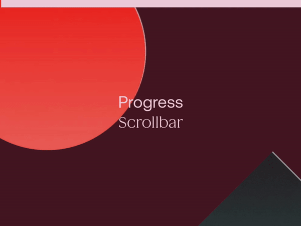
Image Hotspots
Clickable image hotspots are also frequently used within visual journalism, often overlaid on images, diagrams or maps. This is another design technique that works really well in slow journalism, as they allow you to include additional information, whether that’s text, images, or links, without adding to the general length.
Clickable image hotspots also help keep the reader hooked, as knowing there’s further information hidden behind the hotspots adds an element of intrigue. Clickable hotspots allow the reader to choose exactly how much information they want to receive, too, as it’s up to them whether they click through or not.
As slow journalism articles can be lengthy, clickable image hotspots are also a way to present more details without bogging down the feature, or making the length seem overwhelming. The reader can chart their own course through the story, deciding for themselves how much extra details they want to know.
Three Examples of Slow Journalism that Visually Wow their Readers
Below, we’ve compiled a few of our favorite slow journalism articles to show how this form of storytelling isn’t only informative, detailed, and meticulously researched, but visually captivating too.
Hakai: The Big Slide
Canadian environmental organization Hakai Institute are no strangers to compelling long-form content, and they’ve used Vev to create a number of pieces of powerful interactive content. Their 2022 feature The Big Slide, also created in Vev, tells the story of a catastrophic landslide in British Columbia, and it utilizes some of the visual design techniques featured above.
First, it showcases how visually stunning – and informative – adding scrollytelling images can be. The events of the story take place in British Columbia’s Coast Mountains and Elliot Lake, and using beautiful background images of these places doesn’t only draw the reader into the story, allowing them to actually see what’s being described, but it also evokes the sheer scale and magnitude of the event.
A clickable image hotspot is also used to great effect. While this article is enormously informative, the hotspot allows especially curious readers to learn even more. The importance of using satellite imagery to detect upcoming geographical hazards is talked about within the main story content, and clicking the hotspot reveals more information about a new NISAR satellite that will help detect global geohazards.
The Guardian: Firestorm
One of the most visually spectacular forms of slow journalism can be seen in Firestorm, which was The Guardian’s report on the impact of a bushfire in Tasmania. Published in 2013, this groundbreaking project won global praise, and a decade on, it remains a uniquely ambitious digital storytelling feature that uses multiple forms of multimedia to tell its story.
The story is broken up into six chapters, and each chapter contains many different scrollytelling images. In chapter one alone, there are seven different backgrounds: six images of the region the fire occurred in, and a map diagram showing which parts of Tasmania were most affected. The images allow the reader to precisely picture the place they’re reading about, pulling them into the story.
Videos as well as photos are used as backgrounds, and seeing the movement within them – the rustling of dry grass, cars driving along roads – is incredibly evocative. Audio is used throughout the feature, from background noises like birdsong to narrative audio of bushfire victims describing their experiences. This humanizes the people involved, raising the stakes of the story and keeping the reader hooked.
Al Jazeera: Canada's Highway of Tears
Another example of exceptional slow journalism is Al Jazeera’s The Stench of Death: Canada’s Highway of Tears, a feature that won multiple awards including a top prize for digital feature reporting. This six-part series tells the stories of the more than 50 missing or murdered women and girls, mostly Indigenous, who have been going missing since the early 1970s.
The setting of this story is a stretch of highway in British Columbia, which has become so infamous it’s now called “Canada’s Highway of Tears.” The series begins with a scrollytelling image of the highway, and the dark trees, gloomy sky, and thick snow immediately set the scene. Powerful photography is studded throughout the series, putting faces to names, and bringing a sense of realism.
An image carousel is also used; depicting a grieving ceremony, it adds more visual context and depth to the series without increasing the length. Like hotspots, this also allows readers to choose whether they want to see more. Video testimonials from family members and rich graphics further add to this sad yet sensational feature, which digs deep into the years of pain felt by Canada’s indigenous community.
Create Slow Journalism That Wows
It’s easier than you think to elevate the design and UX of your long-form content. Many of the best visual storytelling tools, from clickable hotspots to scrollytelling images and videos, can be created without a single piece of code. Just check out the ready-made components in Vev’s add-on library. Then, publish your content whenever and wherever you want.
Want More Inspo?
Get our monthly newsletter straight to your inbox.
You can always unsubscribe at any time.
Privacy Policy