
Web Editorial Design: Tips, Techniques and Examples
September 27, 2022
Words by Caitriona Burke
Attention spans aren't as short as you think; good web editorial design allows long-form content to be just as effective.
When we speak of web editorial design, we are focusing on the design of long-form editorial content built on the web. Be it data journalism, an article about current affairs, or a narrative built around your brand, these important pieces of content deserve more than black type on a blank white page.
“Content is king” couldn’t be truer when it comes to upping your brand’s marketing, and long-form editorial content is having a resurgence. Developments in web design—especially with no-code and low-code platforms—have unlocked further creative freedom for storytellers working on a digital canvas.
Well-designed editorial content will have a much greater chance of thriving and reaching the desired goals. So, let's take a closer look at what makes great web editorial design.
Why Brands Should Pay Attention to Web Editorial Design
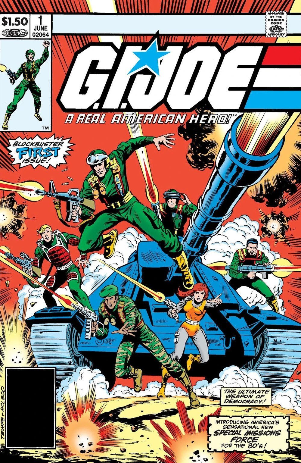
G.I. Joe, A Real American Hero #1
Good web editorial design doesn’t just attract people to your content; it keeps them immersed in it. From current affairs to reports, brand stories to Q&As, your long-form content may be well written, but without a considered design which keeps people scrolling, it can get lost on the web.
Content marketing was around long before the internet. Just look at Marvel and Hasbro’s collaboration with “G.I. Joe - A Real American Hero!” in which Hasbro created a story with Marvel surrounding their action figures in order to hook customers and boost sales. Storytelling is just as invaluable to brand success today, as it creates a sense of authenticity and brand loyalty that cannot be reached through hard sells.
In a digital age in which everyone is trying the same tactics, paying attention to your web editorial design is key to getting ahead. Visual and interactive elements help to convey the story in a way that is more believable, relatable and engaging.
Web Editorial Design Techniques
So, what makes stand-out web editorial design? Let’s take a look at some of the techniques that we see some of the world's most revered publishers using over and over again.
Scrollytelling
You may have already guessed it, but yes, scrollytelling is “scrolling” and “storytelling” squished together. Made famous by The New York Times, this powerful technique can be used to tell immersive visual stories on the web. A number of scrolling effects can be used to engage visitors and guide them through your content, such as parallax scroll, horizontal scroll, and video scroll. It's a technique which can elevate your own web editorial design, as we will see in the examples below.
Interactivity
From images with hotspots to show-and-hide content, getting visitors who land on your content to engage with it on an interactive level will immerse them in the story. Weaving interactive content throughout your web editorial design will be sure to hook people in, and used well it can guide them to an end CTA and improve your conversion rate.
Charts
If your long-form content contains data, such as annual reports, then charts can help draw attention to the stats and engage your audience. Data visualization is a technique that makes numbers fun. You can easily create these with our pre-coded animated charts element in Vev, drawing attention to your most important information and providing a visual narrative for what may otherwise be overlooked or misunderstood.
Web Editorial Design Best Practices
As we have seen, there are a number of reasons why you should invest more into your web editorial design process, as well as a variety of techniques to create amazing editorial content online. With all that in mind, let’s take a look at what you should keep in mind when designing your web editorial:
- Make your web editorial design responsive: Over 50% of your audience will be reading on their phones, so even though your design may work amazingly on desktop, make sure it works as well on mobile devices, adjusting any elements that do not transfer as well, and making sure interactions are swipe-friendly.
- Keep things simple: Even though we are covering a lot of amazing techniques and elements that can elevate your web editorial design, if you throw everything at one piece of content it will be an overwhelming and messy user experience.
- Give direction: Make it as easy as possible for your visitors to get from A-Z and keep them focused on your page—animations in particular shouldn't distract from key calls to action. When including interactive elements, make sure you provide UI elements that spell out functionality so users understand how to interact with your content.
- Keep it fresh: Break up your content into sections that offer something new as your audience scrolls to keep them wanting more.
Impressive Web Editorial Design Examples Made in Vev
Now that we’ve explored how good web editorial design is key to creating engaging long-form content, let’s take a look at how all these moving parts fit together with a few examples crafted in Vev.
Message Lab for Service Now
The first web editorial design example on our list is a report from Service Now created by Message Lab. Focused on sustainability in the tech industry, the report contains a mountain of information. However, it's not overwhelming. By using a number of techniques, each nugget of information is given the attention it deserves. An example here is the use of animated charts which reveal data as they scroll into view and offer a visual aid as they grow.
Animations are also beautifully used in this web editorial design example. From the swinging acrobats to the geese flying across your screen, these subtle yet highly engaging animations encourage viewers to continue scrolling as they hook us into wanting to see more.
This piece of content also uses Vev’s sticky position add-on to draw attention to the Q&A section, differentiating this section from the rest of the page to draw attention and also creating a unique layout for their guest expert speaker to stand out.
Zero
A simple yet effective example of good web editorial design can be seen in this piece of content by Zero. Through using parallax scrolling, key messaging is delivered over eye-catching photos and visuals which do not only demand attention but also visually illustrate the information at hand. Quotes are also pulled out of the main text and given space to stand out as well as demarcated by large, colorful speech marks to distinguish the content format from the rest of the page.
WWF
Horizontal scrolling is one of our favorite techniques here at Vev, and a perfect way to elevate your web editorial design. Agency HLabs incorporated this into WWF’s editorial on Priority Threat Management which focuses on ways to recover species at risk of extinction in Canada. Horizontal scrolling is used sparingly here to give greater impact to a key message within this piece of content, asking for greater concentration from the user whose normal vertical scrolling has been interrupted.
This web editorial design also uses Vev’s number counter element to emphasize key data placed towards the end of the article, ensuring that from start to finish the page is animated and interactive in order to retain visitors.
Mercedes
This advertorial from Mercedes is a narrative of one family using their new car for a day trip. Testimonials have long been a winning marketing technique, so creating a long-form, testimonial-like piece of content to market their new model of car is ingenious. As previously touched on, a web editorial design technique that is hugely effective and popular is scrollytelling. Here, a parallax scrolling video effect is used so that visitors to the page are immediately prompted to keep scrolling whilst key copy and headlines float past.
Created in Vev, the page also uses clickable hotspots on a photo of the car to show off the various features of the product, engaging their audience with an interactive element.
Economist
Advertorials are traditionally found in well-established newspapers and magazines, and made to look like any other article. This example of web editorial design in the Economist is an advertorial on behalf of BT. The design techniques employed here are subtle but effective. In keeping with the unsponsored content you would find on the same site, there are just a few animations included to help grab the attention of readers.
One of these is a number counter, a pre-coded Vev element, which draws attention to a key piece of data attempting to convince readers to implement AI-assisted tools for basic tasks with BT. This is done in a subtle way, as it appears to be part of an unbiased article. A simple yet effective web editorial design such as this showcases the power that just a few extra moments spent adding an element like this on Vev could do for your marketing efforts.
Create Your Own Web Editorial
From scrollytelling to animated charts, Vev makes it easy to craft a stunning web editorial design. With pre-coded elements, the ability to embed anything into your project, and the option to expand anything through our code editor and CLI, you have all the tools you need to be original. Publish your long-form content anywhere on the web when you're ready—including to an existing CMS.
Want More Inspo?
Get our monthly newsletter straight to your inbox.
You can always unsubscribe at any time.
Privacy Policy