
Design systems are essential in creating websites that feel whole. By standardizing components, elements, and other features, these formalized frameworks lead to a better sense of flow and harmony.
In the early days of the internet, websites were simple arrangements of text, images, and hyperlinks, held together by basic HTML. There weren’t many options in what designers could do as every style had to be directly coded into the markup. Creating complex websites, with multiple styles and features, wasn’t feasible with what designers had to work with.
In the mid-1990s the internet became a much more interesting place. This was in part, due to the development of Cascading Style Sheets (CSS). With repeatable selectors and unified style sheets, it was now possible to build websites with complex styling and the capabilities to make global changes. This gave designers much in terms of creativity and flexibility.
Fast-forward to now, and citizen developers and marketing designers are using no-code tools like Vev to drag-and-drop design components onto a visual canvas with freedom to create whatever they imagine.
The freedom that CSS and no-code drag-and-drop builders afford isn’t always a good thing. Things can get messy very quickly if there aren’t any rules or conventions for structuring components, defining UI patterns, and establishing consistent styles that elements should follow.
Enter: design systems. "What is a design system?", you may be wondering. In this article, we'll guide you through an understanding of design systems, example, and how to create your own.


What is a design system?
“Design systems exist to help others — real people trying to build something fast, with confidence, and on-brand.”
-Tycee Clee, 5 Things I Wish I’d Known Before Starting a Design System at Spotify
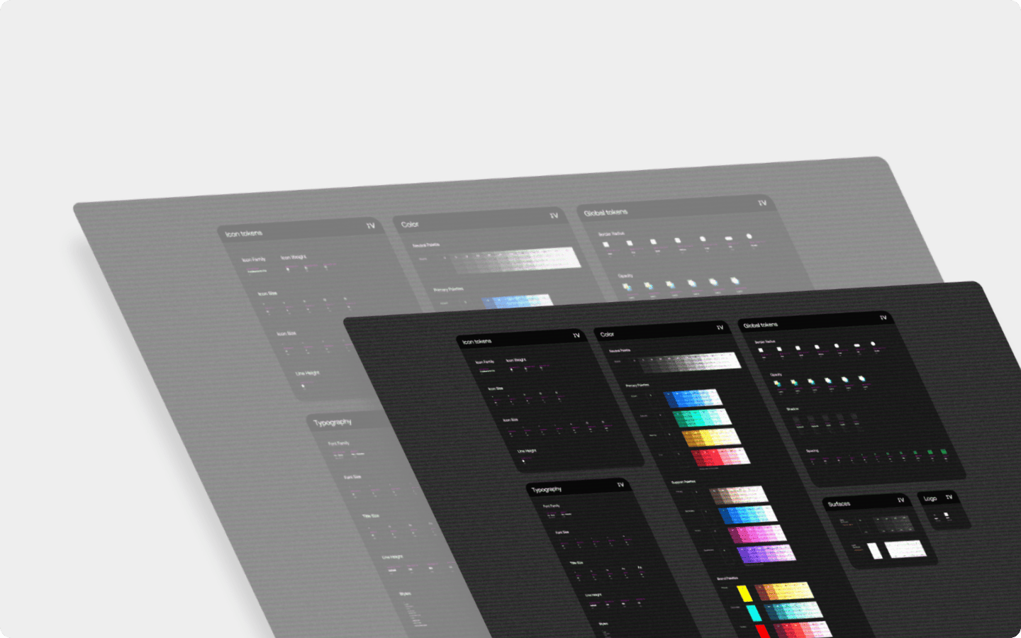
If you’ve ever built furniture from someplace like Ikea, you’re familiar with the documentation that neatly shows the various proportioned brackets, screws, and other pieces that are included in a given set. A design system is similar, visualizing all of the specialized parts that go into building a web app.
While a design system isn’t a step-by-step set of instructions, it offers guidance as well as rules in how its different elements should be used. A design system is a library of components and other visual assets all thematically linked, that can be duplicated throughout a website leading to more consistent user experiences.
The elements of a design system
At a high level, the elements that make up what is a design system include:
- Layout guidelines: Design systems define the larger components and pieces of a website and how they’re arranged, positioned, and sized. Standardizing these various pieces makes it easier to maintain a sense of uniformity when they’re put together by designers.
- Styles: Color swatches, typography, UI buttons, and other important styling information give designers a common visual syntax to draw from. For those wondering what is a design system is and why they’re essential, it’s these inherent styles that make them so important in crafting cohesive user experiences.
- Components: Components are the primary building blocks and elements that repeat throughout a website or app.
- Documentation: What is a design system without proper guidelines? Along with being a thorough list of thematically linked visual assets, design systems often explain the philosophies behind their design and instructions on how they should be used. Anyone looking through a design system will have the information they need to utilize its various elements properly in a given web app.
Design systems vs style guides
Let’s take a step back for a moment from exploring "what is a design system?", and explain style guides. Style guides, much like design systems, document every part of a web app. They generally stick to visual and brand guidelines, touching on typography, use of logos, color schemes, and visuals. Much like design systems, they’re used to safeguard consistency.
Design systems get into more details than style guides. Along with collecting all of the visual styles and components they go deeper in showing UI patterns, formalizing responsive design guidelines and accessibility, visualizing UI variations, as well as discussing the rules for using them. Style guides generally are free from code, with design systems sometimes having code snippets, or links to the code for developers to have easy access to. Design systems can even be synced with live websites, making it possible to make site-wide changes, directly through their dashboards.
Why design systems matter
Design systems provide a head start
Whether building a new page, developing a mobile app, or expanding or editing existing content, there's no need for reverse engineering. One of the major benefits of a design system is having everything ready to go when it’s time to create.
Better collaboration
Design systems represent a centralized resource providing the same exact elements, components, styles, and guidelines that anyone can put into action. This decreases the amount of back and forth between team members or waiting for assets that can bog timelines down.
Improved consistency
“The ultimate goal of our design platform is to make every designer a little better at thinking of everything in terms of systems — grids, typography, language, motion, accessibility, and so on. This allows everyone to design together, to learn from a common source, and to have a shared understanding of product quality across the company.”
- Marco Paglia, Uber Design Platform
Design systems are both holistic and granular. They reveal every piece that goes into constructing a web app, and when zoomed out, they highlight the commonalities and themes that tie everything together. What is a design system encompasses both the bigger picture as well as the specific details that underlie it.
Examples of design systems
Before we dive deeper into how to create a design system, let’s first go over several real-world examples that show why they’re so helpful in building smoother user experiences.
Material Design
Introduced by Google in 2014, Material Design is most often associated with Android devices, but its simple and user-friendly aesthetic has a far-reaching influence. Google’s design system is well thought out, with everything a developer would need to assemble an app, with clear explanations about each component.
Looking through Material Design, it’s easy to recognize its lightweight aesthetic. Its elements have easy-going rounded corners, soft drop shadows, and straightforward user interfaces. Nothing feels jarring or looks like it shouldn’t be there.
No matter what combinations, or which parts are used from this library, the resulting web app will unmistakably be Material Design.
SalesForce Lightning Design System

Just as Google has a distinct design system, SalesForce offers its developers its proprietary Salesforce Lightning Design System (SLDS).
Like any effective design system, SLDS acts as a centralized repository of elements that align with Salesforce’s UX guidelines. Design patterns, color schemes, typefaces, components, and other assets are all there to help developers build something with Salesforce’s distinct flat design and clean lines, no matter what type of app they’re putting together.
Design systems are super handy for those building apps within specialized development platforms, but they are also essential tools for organizations in maintaining consistency, adhering to brand guidelines, and scaling up or building out new things like landing pages or mobile pages a more efficient process.
Mailchimp’s Pattern Library
While design systems and pattern libraries are different, there is much overlap. MailChimp’s pattern library with its inclusion of code, and detailed guidelines certainly falls within the definition of design system.
Grids, color palettes, buttons, tables, data visualizations, and all of the other essential pieces that go into MailChimp’s mobile app are all easy to find. Any designer working on it has access to all of the digital assets, their specifications, and documentation describing how to use them.

Vev Silke Design System
Inspired by IBM’s Carbon Design system, Vev has its own Silke design system that touches all of the various parts of our visual web design platform. Icons, text fields, components, modals, progress indicators, and every other important piece are all found in an easy to navigate centralized space. If Vev were to be translated into its own design language Silke would be its vocabulary.

How to build a design system
Utilize naming conventions
“Develop a common language so everyone refers to components in the same way. It can be challenging to consistently name components, icons, etc across the various platforms, but doing so is crucial for communication.”
- Jeremy Dizzon, 5 tips from an Airbnb design on maintaining a design system
Having a common design language with logical naming conventions helps those even in non-design roles in understanding the intricacies of a web app. When everyone has the same understanding of what is a design system, and shares the same vocabulary, communicating with each other about the various facets of a web project becomes much easier.
Naming conventions don’t have to be boring either. In the case of Yelp, they go with the culinary theme of being a cookbook that ties in with their history as a restaurant review app.

While Yelp does have a bit of fun with their design system, one mustn’t forget the more practical implications of naming. In any design system components should have names that describe what they do and follow consistent rules in how they’re defined.
In a case study from Storyblocks, the table pictured below documents the line spacing and sizing of text, along with the token names, which reflect how they’re referred to in the code. Each follows the same format, with the word “text” followed by a sizing designation.

Even if one just takes a quick glance at this table, it’s obvious right away how these text styles are named.
Formalize typography
Type can take a variety of forms in a web app. Design systems compile all of the relevant typefaces and fonts, how they’re used, as well as the different styles that may be applied to them. One of the most important aspects of figuring out what is a design system for a particular web app is coming up with a typography scheme.

In the above example, the BBC describes the guidelines for its custom typeface BBC Reith, along with its variations. The right-hand nav has options for going deeper in understanding how to use it and its applications.
Create components

Components are the foundational elements of a web app. They can range from smaller building blocks like UI buttons, sliders, and icons, to larger pieces like modals, sign-up forms, and dashboards. They’re designed to be used in multiple spots, and make it possible to maintain a sense of visual consistency and functionality across a web app. They can be more general, in the case of something like a radio button, to something more specialized like a card for an ecommerce website that shows product information.
A big part of what is a design system involves the details of how components should be utilized:
- Styling directions: This can include specifications like size, colors, alignment, padding, and other visual characteristics.
- UI patterns: Show the different states like hover, or click, showing how components will respond.
- Code: HTML, JavaScript and CSS snippets representing a component may be directly embedded in a design system or linked to an external repository like GitHub.
- Rules: Documentation describes how components should be used.
Write design system documentation
Design systems are useful in compiling the various parts used in constructing a web app but require instructions that lay out the purpose of each piece, how they should be used, as well as a bit of the philosophy that went into their creation.
This example from REI’s Cedar design system, does a thorough job in describing how cards should be designed and implemented.
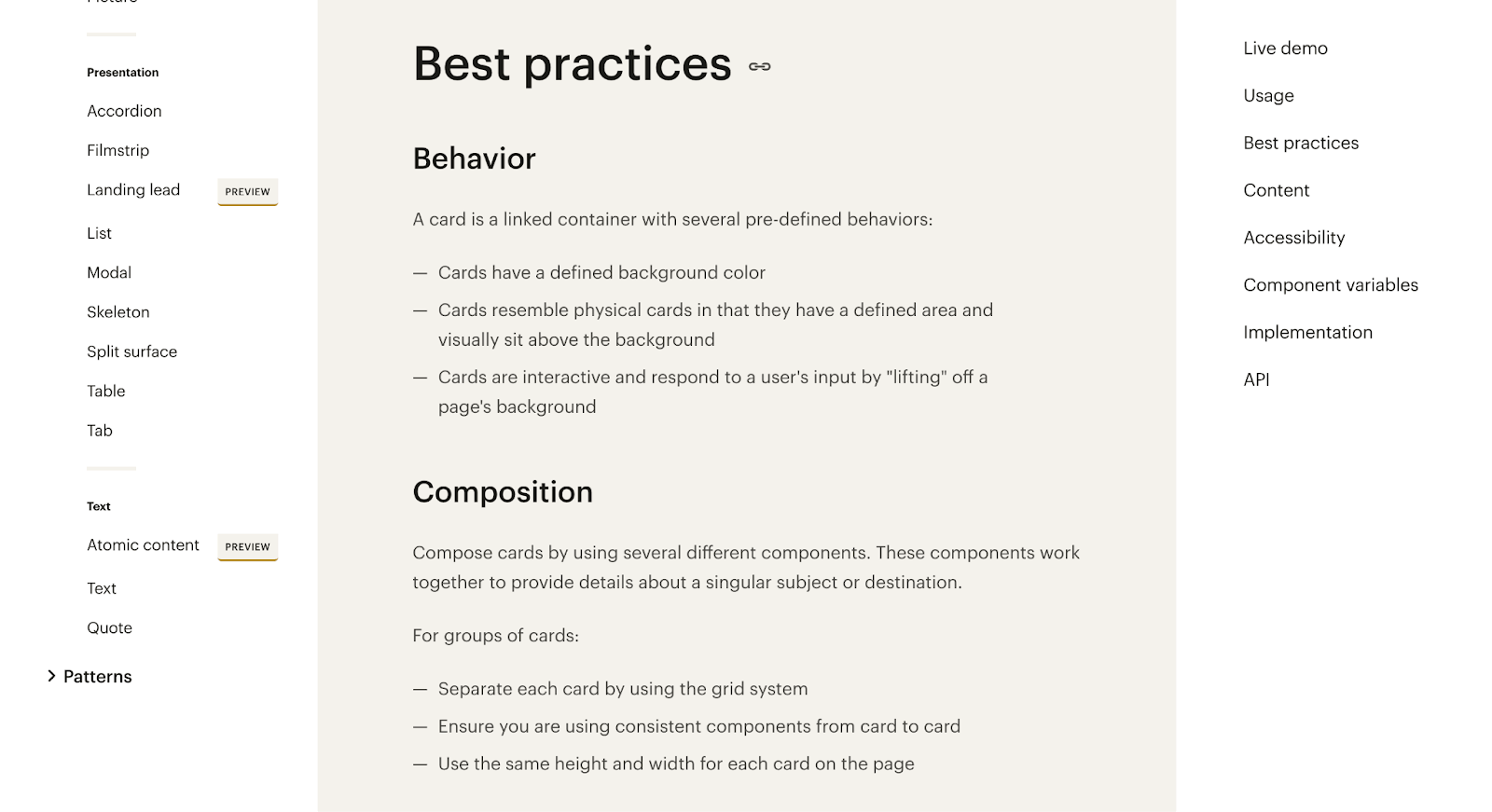
Sharing equal importance as the elements and components that make up what is a design system, is the writing that provides insights into how best to implement them.
Tools for creating design systems
The best design system tools enable developers to create reusable libraries of elements and components, define styles, add documentation, as well as facilitate collaboration.
Let’s take a look at some of the more popular design tools out there.
Figma

While Figma often comes up in discussions about prototyping, it’s also quite effective in building design systems. Putting together shared libraries of reusable assets, setting up permissions for multiple team members, synchronization with Figma’s REST API, and analytics about the use of elements, are all some of the major benefits of using Figma.
Zeroheight

With its integrations with tools like Adobe XD and Figma, a handy library of templates, and a simple and a no-nonsense editor, Zeroheight is another great option for building design systems outside of an active web project. Its ease of use in adding UI patterns, code snippets, and components as well as version control, makes it a great option in creating and managing design systems as they change over the course of development.
Storybook

We’re always fans of open source tools, and Storybook offers a free suite of tools for building and testing front-end components, compiling them into a design system, as well as getting feedback and fostering collaboration.
The power of design systems
A design system is like a big box hardware store. Just as you can find exactly what you need to fix or update something for a home within its categorized aisles, a design system offers you the specialized parts and tools required to build a website in a well-organized digital space.
While we’ve covered multiple forms that they may take in answering the question, “What is a design system?” they all have a common goal, and that’s to give designers all that they need to create consistent user experiences, even as a website may grow or evolve. They reign in the haphazardness that can occur when there aren’t clear guidelines, resulting in websites that have a stronger sense of purpose. They keep visitors in the present moment, rather than becoming distracted by what doesn’t seem to fit in.
Creative freedom and consistency combined
While design systems aren’t necessary for beginners and freelancers, they are a must for larger organizations and growing brands. Vev makes it easy to implement consistency in your designs. If you have created your design system in Figma, you can use our Figma integration to implement this in your Vev designs. Create branded templates and a library of shared design components to keep everyone on the same page. Vev enables you and your collaborators to stick to your design system, whilst always pushing the limits of your digital contents' creative potential.
Want More Inspo?
Get our monthly newsletter straight to your inbox.
You can always unsubscribe at any time.
Privacy Policy