
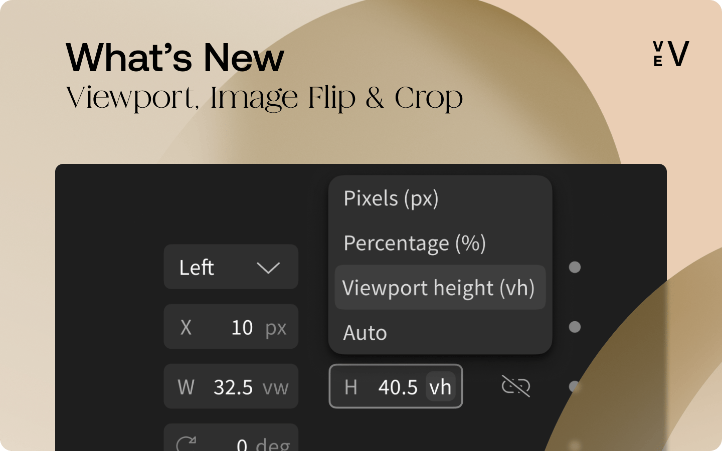
Our design editor has gotten a few small but mighty updates! This month, we’re introducing "Viewport," along with the handy "Image Flip" and "Image Crop" features. Let’s explore these together.
Viewport
You can now use vh and vw — otherwise known as CSS viewport units — in the style panel to size your components. 🎉In the world of Vev, "viewport" is just another term for your canvas or the visible area within a web browser. With this update, you can:
- Maintain the size that's proportional to the viewport.
- Create full-width or full-height components for impactful, screen-filling designs.
- Ensure typography is responsive.
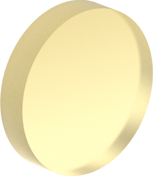
Image Flip
You can now flip your images — either horizontally or vertically. This nifty feature is available within the Object fit editor on the right-side style tab. Simply select your image, double-click to reveal the editor, and start flipping images to give it a fresh spin.
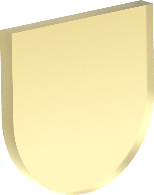
Image Crop
The brand-new Image Crop tool is housed within the Object fit editor in the right-side style tab. Here you can select whether your image 'covers', 'contains', or 'stretches' to fill the dimension of its container. After setting the behavior, you’re free to fine-tune the cropping to achieve that perfect crop.
As always, we're all ears for your thoughts. Give these new tools a spin and share your experiences at hello@vev.design. Happy designing with Vev! 🙌
Want More Inspo?
Get our monthly newsletter straight to your inbox.
You can always unsubscribe at any time.
Privacy Policy