
Tips For Creating a Year-End Review Like Spotify
November 1, 2022
Words by Jeff Cardello

It’s hard to find a year-end review more well-known than Spotify Wrapped.
Spotify’s year-end review has achieved viral success due to its artistic retelling of the music and podcasts that its users listened to throughout the year. Whether you spent your time grooving to smooth jazz or banging your head to doom metal, Spotify takes your listening data and turns it into imaginative data storytelling that can be shared with your friends on social media.
What made it so successful? A savvy combination of shareability and focusing on the customer is at the heart of this year-end review’s success. Let’s deconstruct the winning formula, and figure out what design elements you should include in your annual report.
“But we don’t have Spotify’s budget”, you say? Thankfully, you don’t need an expensive web development agency to create an engaging year-end review. All the techniques we cover below can easily be applied to your own annual report using a no-code web creation platform.


What is a Year-End Review?
Whether you call it an annual report, a year in review, or a year-end review, this piece of content brings together accomplishments, data, and stories with striking visuals and interactivity to present a summary of your year.
In our very own 2021 Year in Review we covered how our user base grew, as well as new features that we added to our web design platform. We touched on all of our major achievements in a single-page design full of colorful visuals and scroll-triggered animations.
What Makes Spotify’s Year-End Review Successful?
Year-end reviews aren’t just a space for brands to show off what they’ve been working on, they can also be used to reward end users. Spotify Wrapped, which drops every December, is a holiday gift to fans, giving them a fun and insightful look into the music and podcasts they listened to throughout the year, and providing stats which place them within the larger sphere of Spotify’s entire user-base.
Whilst involving the end-user to this extent may not be ideal for most businesses, either due to business model or resource, you can easily learn from this technique. Centering your year-end review around end-users and other stakeholders can be achieved by everyone by simply gearing the data you showcase towards them. Here are a few ways to do this:
- Include stats about your customer behavior. At Vev, we love to highlight our community’s most-used design elements and features.
- Include data on their impact on your business. For a non-profit focused on environmental change, this could include data on how many new trees were planted.
- Involve these people and any prospects in your mission for next year. If you have a roadmap, get them to contribute. If you have a mailing list (who doesn’t?!), ask them to sign up. Encourage them to invest in your community.
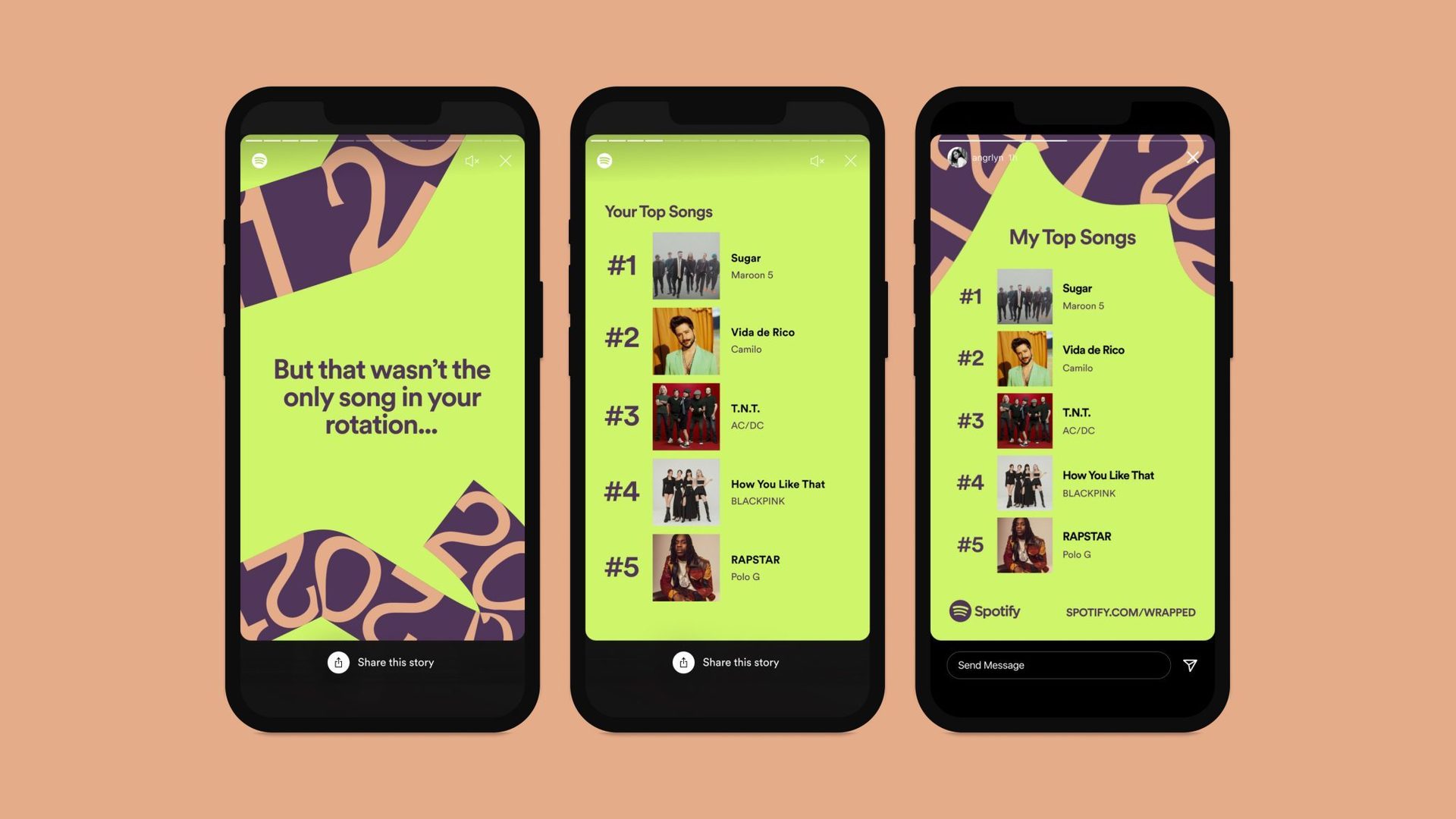
In Spotify Wrapped, there’s plenty of data like top genres, artists, and podcasts, as well as the total minutes spent listening. Along with this listening information, there’s a rich and immersive multi-media user experience built around it that’s filled with creative visuals and sound. Between the interesting data and the striking visuals, Spotify has nailed creating shareable content when it comes to this year-end review.
Spotify has even designed it to be shared across social media, making it easy for users to do so. This shareable year-end review not only provides a way for people to connect with others through their tastes in music, but increases brand awareness about Spotify. In all seriousness, when was the last year you didn’t see it plastered across your Instagram feed?
Creating a shareable year-end review doesn’t have to be a daunting task. At the core of it, you need to:
- Make your annual report visually appealing. If the design is unique and on-trend, people will be proud to share it.
- Make your year-end review for the web. Static PDFs and Powerpoint presentations won’t cut it. Whether it’s a single-page web design or a microsite, keep it web-based for maximum shareability, even offering specially made social media templated posts for your loyal teams, super-users, and stakeholders to share.
Year-end reviews give brands the power to connect with their customers in ways that feel more personal. Instead of something like a boring PDF full of facts and figures, this information can be expressed through a brand’s unique voice along with visuals that are in line with their identity. Year-end reviews not only relate key information but capture a company’s personality.
Best Practices for Creating Your Year-End Review
Get Creative with Visuals
Year-end reviews will often be text-heavy, so make sure that the design around this information is visually alive. Bold color schemes, snappy animations, creative typography, brilliant photos, eye-catching graphics, and other visual storytelling elements will fill your design with things for people to see and experience. Showing of trends in data? Use animated charts. Every moment of Spotify Wrapped has something visually exciting as it shows you what you listened to throughout the year.
Higlight Important Information
A year-end review communicates facts, figures, and other relevant data. Animations, micro-interactions, sizing, and styling choices make these main points stand out. Spotify Wrapped uses huge text, as well as fade-in effects that bring attention to the details about your listening habits.
Follow a Sense of Structure
Spotify Wrapped works well because it is concise and follows a logical flow. A year-end review should lead visitors from one idea to the next in a manner that feels natural. Think of a year-end review as a form of storytelling, guiding visitors step by step through it.
Year-end reviews give brands the power to connect with their customers in ways that feel more personal.
Year-End Review Design Techniques
The goal of any year-end review website is to keep people engaged and ensure they read everything you want them to see. Let’s take a leaf out of Spotify’s book and ensure your year-end review is visually stunning with the following design techniques.
Number Counters
Seeing numbers tick upwards immediately captures attention and creates a sense of anticipation. Most annual reports include data, and counters are an effective way to bring key statistics to life.
In this design built with Vev, The Human Rights House applies an animated counter effect that shows off some of their most important accomplishments of 2021.
Lottie Animation
Spotify Wrapped is filled with dazzling animations that keep audiences gripped, as well as promote shareability. When you create your year-end review website, don’t miss the opportunity to wow your audience with similar visuals.
Lottie animations are one way to add motion, making it possible to embed After Effects files without any hassle. Since Lottie Animations are vector based they’re easy to scale up or down without distorting them, and their small file sizes make them an ideal format for designers to work with.
In this Year in Review example that we put together with Vev, you’ll find a dazzling assortment of animations. Vev's web creation platform allows you to easily add these JSON-based animations to add some motion, realism, and personality to your year-end review.
Horizontal Scrolling
Horizontal scrolling maximizes screen space and adds a bit of variety to layouts—which is extremely important for any piece of long-form content.
In addition to video embeds, brilliant photography, scroll-triggered effects, and a bright and colorful layout, the summer camp Pine Cove utilizes a horizontal scrolling section to communicate important information about their camp. Pine Cove chose Vev to create this design, and a horizontally scrolled section like the one featured below can be pulled off through a few simple steps.
We also used horizontal scrolling in our 2021 report. Much in the same way that Pine Cove used horizontal scrolling in presenting data, we used it to highlight key behavioral stats across our global community.
Animated Charts
Animated charts ensure data trends and important numbers can rise above the noise of other content. Data visualization has moved on from static graphs, and now animated pie charts and bar charts are proven to be much more impactful in keeping people engaged.
This horizontal section from environmental engineering firm ARUP’s year-end review includes several performance charts and graphs. There’s quite a bit of data, but animated effects make these numbers leap from the screen and keep readers focused as they move through it.
Our Year in Review example also has a nice mix of animated charts and graphs, that break down a few different ways to use data visualizations in Vev.
Carousels
Carousels are generally a horizontally scrolled series of slides or panels that introduce information. These tend to include an image, brief text, and call-to-action linking to a page with more detail. This is another space-saving technique to use in your year-end review, that also injects gentle interactivity into your content—as demonstrated by Swire Properties here in its sustainability report.
Custom Illustrations
Whether the illustrations are directly tied to what’s being discussed or are just there to add a bit of creative flair, custom illustrations can add so much to a year-end review. Spotify Wrapped has quite a few custom background illustrations that add to its sense of personality.
In this 2022 Retail Tech Report by Deloitte Digital, the illustrations and animations give this report a sense of warmth and humanity.
Scroll-Triggered Animations
Year-end reviews need to maintain momentum to keep people moving through. Scroll-triggered animations not only guide visitors but also function in revealing content at a comfortable pace. This year-end review from the agency Refokus is a celebration of scroll-triggered animations, rewarding visitors for every step they take through it.
Create Your Own Stunning Year-End Review With Vev
Whether you want to tell the story about what you accomplished last year, or you’re creating a year-end review for a client, Vev has you covered. Drag and drop our pre-coded design components—including number counters, text animations, horizontal scrolling sections, and animated charts—to your canvas to start making your masterpiece. Publish anywhere on the web when you’re done.
Vev's 2022 in Review
Explore the moments, people, and ideas that made our year.
Want More Inspo?
Get our monthly newsletter straight to your inbox.
You can always unsubscribe at any time.
Privacy Policy