
Features / Developer tools
Build powerful React components
Create and maintain custom React components with Vev’s CLI, and seamlessly hand them off to designers for styling and reuse, without sacrificing control or quality.
> vev dev
✔ Compiled successfully
Component: HeroBanner
Props: [title, image, accentColor]
Preview available at http://localhost:3000
Build with React, your way
Use the Vev CLI to build React components in your local environment, just like any standard React project. See real-time previews directly in the Vev Design Editor.
import { registerVevComponent } from '@vev/react';
type Props = { text?: string };
const MyComponent = ({ text = 'Hello, Vev' }:
Props) => <>{text}</>;
registerVevComponent(MyComponent, { name: 'My awesome component' });
export default MyComponent;
<p style="color: Vev;"> [input] </p>
1
2
3
4
5
6
7
8
9
10
Hello,
Hello,
Hello,
Hello,
Seamless collaboration between devs and designers
Vev makes it easy to divide and conquer. Developers build functional components, while designers handle layout, styling, and content. Drop components into the canvas, ready to use.

import React, { useMemo } from "react";
export type ImageAddonProps = {
src: string;
alt: string;
className?: string;
aspectRatio?: "auto" | "1:1" | "4:3" | "16:9" | "3:2" | "21:9" | `${number}:${number}`; objectFit?: "cover" | "contain" | "fill" | "none" | "scale-down";
radius?: number;
shadow?: boolean;
hoverZoom?: boolean;
linkUrl?: string;
linkTarget?: "_self" | "_blank";
caption?: string;
priority?: boolean;
lazy?: boolean;
decoding?: "auto" | "async" | "sync";
widths?: number[];
sizes?: string;
};
Developer
Designer
Flexible props. Total control.
Create advanced prop fields that enable designers and content editors to add images, text, or even tweak the functionality of your component without touching the code.
import { registerVevComponent } from '@vev/react';
registerVevComponent(MyComponent, {
name: "My component",
props: [
{
name: "header",
type: "object",
fields: [
{ name: "title", type: "string" },
{ name: "subtitle", type: "string" },
{ name: "image", type: "image" },
],
},
],
});
1
2
3
4
5
6
7
8
9
10
11
12
13
14
15
16
17
18
19
20
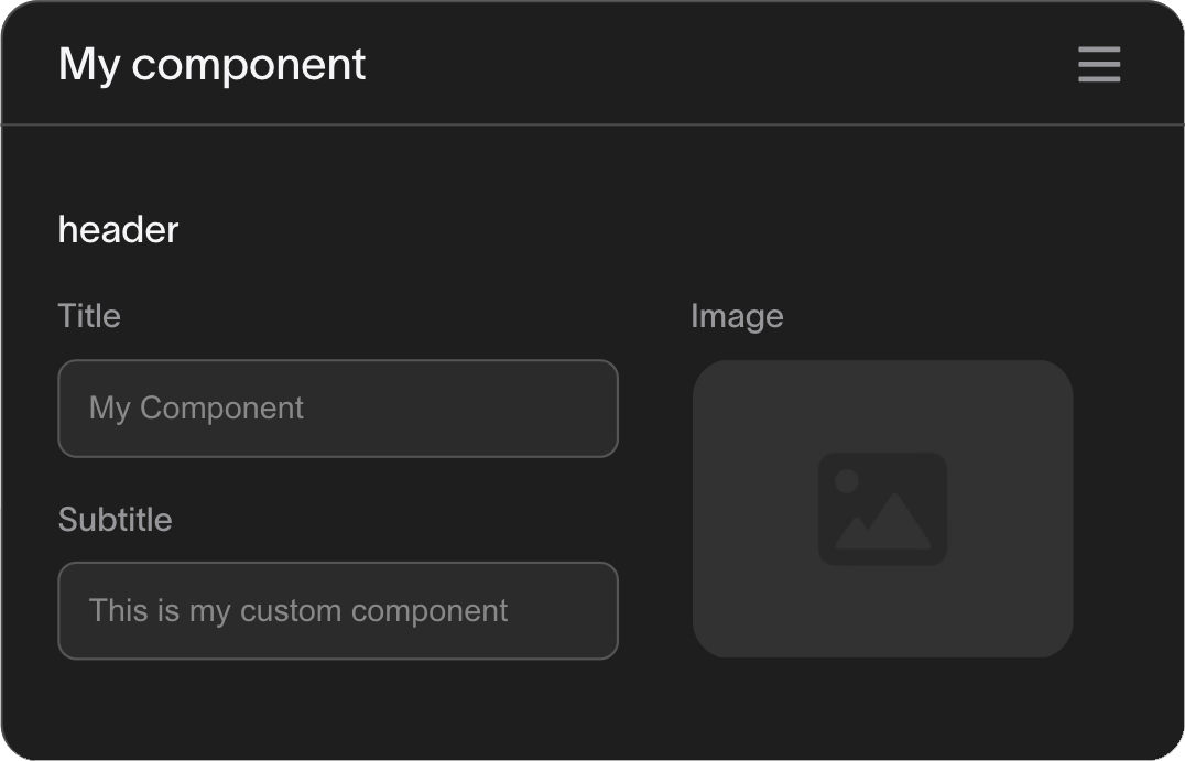
My component
header
Title
Subtitle
Image

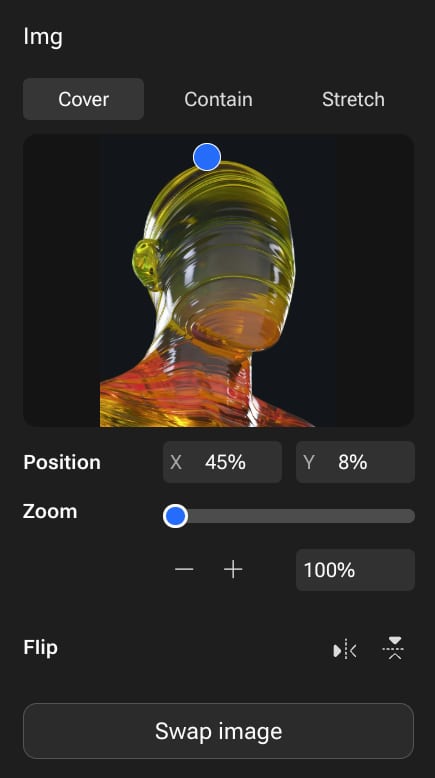
Flexible props. Total control.
Create advanced prop fields that enable designers and content editors to add images, text, or even tweak the functionality of your component without touching the code.
import { registerVevComponent } from '@vev/react';
const MyComponent = ({ header }) => (
<div>
{header?.title && <h3>{header.title}</h3>}
{header?.subtitle && <p>{header.subtitle}</p>}
{header?.image && <img src={header.image} alt={header?.title || ''} />}
</div>
);
registerVevComponent(MyComponent, {
name: 'My component',
props: [
{
name: 'header',
type: 'object',
fields: [
{ name: 'title', type: 'string' },
{ name: 'subtitle', type: 'string' },
{ name: 'image', type: 'image' },
],
},
],
});
export default MyComponent;
1
2
3
4
5
6
7
8
9
10
11
12
13
14
15
16
17
18
19
20
21
22
23
24
25
26
27
28
29
My component
header
Title
Subtitle
Image

Build once.
Use everywhere.
Create components once and share them across your organization. Perfect for design systems, product templates, and brand consistency.
/ expandable section

/ hover-gallery
/ fan menu

/ video scroll

/ basic slideshow
/ link button

/ image-card

/ labeled-image
Open-source ready
Want to jump-start development or contribute to the community? Browse our growing library of open-source components, ready to customize and extend.
widget-deploy-action
public
shell
4
GitHub Action to deploy Vev widgets
vev-components
public
TypeScript
4
Contains all official Vev components
2
create-vev-app
public
TypeScript
1
Template for Vev CLI
webhook-receiver
public
Listen and handle Vev webhooks
TypeScript
1
image-path-element
public
Image path
TypeScript
customer-components
public
Components created for customers
TypeScript
Want to explore more?
Developers build, designers style — perfect harmony
Start using the platform built for freedom of customization and cross-team collaboration.