
Arial is said to be the most widely used font on the web, although other sources would name Helvetica. Arial was actually created for those who wanted to use the popular Helvetica font without the fees, hence the extreme similarities in look and feel.
Choosing the best font for your web design is vital for ensuring a good user experience on your website.
Every designer is guilty of spending way too long looking at fonts. With the mountain of typographic choices available to designers, choosing the best fonts for websites can be a tiresome job. From bold and minimal to experimental and decorative, there are options for any vibe. However, it's not all about style—we also need to consider the user experience when it comes to readability, and how all of this comes together to make your Vev content engaging.
Why is choosing a website font so important?
The gravity of this decision should not be underestimated. Here's why...
- Accessibility: Accessibility should always be at the top of your list when choosing fonts for your website. According to WHO, 15% of the world's population live with a disability. A large portion of these individuals access the internet on a daily basis; if you skip out on making your website accessible, you will be losing a large potential audience.
Make sure your fonts do not impact the comprehensibility and consumption of your content. Use clear and uncluttered fonts, and check the kerning (spacing between characters). Learn more about creating accessible web designs in Vev. - Readability: Whilst getting creative is always encouraged around here, it's important to know where the line is—especially when it comes to typography. The best fonts for websites will always be readable, because if your audience cannot read the text on your site, they can't consume your content. If you want high engagement rates, make sure users can read the content!
- Branding: Let's not forget the visual impact font choices make when it comes to presenting your brand. Branding isn't just a logo, or a color palette—it is every element combined. Colors, shapes, graphics, tone of voice, and fonts are all components of a brand that should compliment one another.
Keep this in mind when choosing fonts for your website. Your font(s) must live in cohesion with every other element of your visual branding. It will not just be for your website, but for other channels such as email and social media. Finally, on branding, make sure your font aligns with your brand story and purpose. Choosing a fun and quirky font for a children's toy brand might work, but if you're a corporate institution you may consider a more minimal font that conveys the serious nature of your business. - Page speed: Lastly, it's important to keep in mind your website speed when it comes to choosing fonts. Font files, especially those that are third-party fonts and not web-safe, can impact page loading speeds due to the size of files. To avoid users having to wait to the page to load (and risk them clicking off the site altogether), you should:
• Choose no more than 2-3 fonts for your website.
• Set a web-safe font as a fallback font so that if a font is unavailable for a user, a generic and easy-to-read font will load.
• Enable cookies on your website so that when users revisit the site, their browser has the font files saved already.
10 of the best fonts for websites
Poppins
This rounded, clean sans serif font glides seamlessly and is a great option for minimal designs without the harshness of more rigid fonts.
Designed by Indian Type Foundry, Poppins is a popular font available via Google Fonts. Check out our guide to Google Font pairings.
Lato
This sans serif typeface family was designed in the Summer of 2010 by Warsaw-based designer Łukasz Dziedzic; in fact, Lato actually means "Summer" in Polish.
The font was initially designed as part of Dxiedzic's client work, and became available for public release when the client decided to go in different stylistic direction.
The font is sleek and modern, without being too trendy, making it a good font to choose if you are looking for something timeless — a font that will likely never feel dated.
From Google Fonts, Lato's "semi-rounded details feel warm, while the underlying structure provides stability and seriousness."
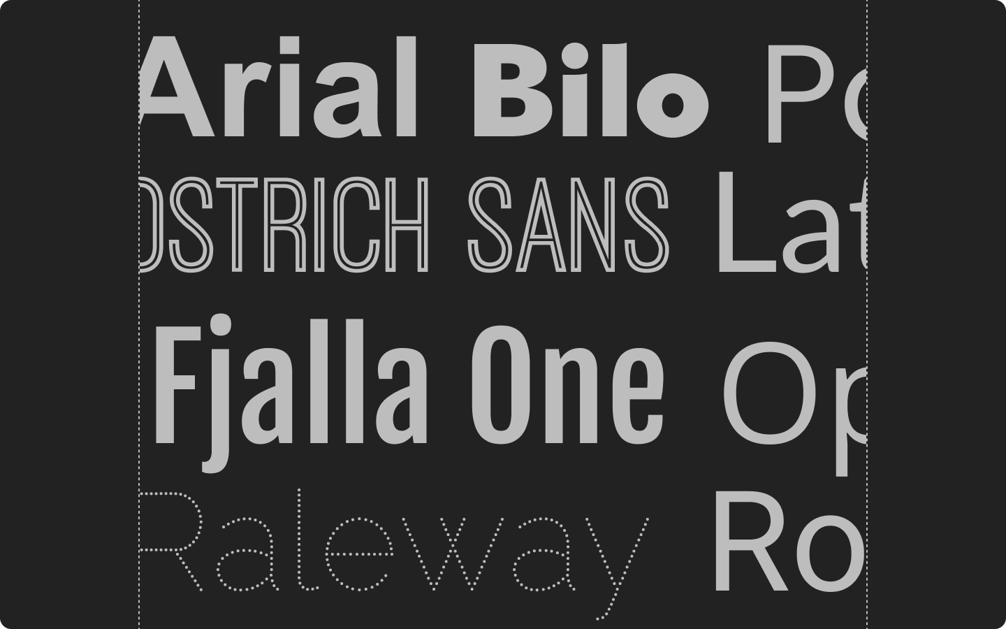
Fjalla One
On the look-out for something a bit bolder? Fjalla One was designed by Sorkin Type and has been carefully adjusted to the restrictions of the screen. This font is a brilliant choice for display, but also adjusts well to a range of sizes.
Open Sans
Designed by Steve Matteson, Type Director of Ascender Corp, Open Sans is a sans serif typeface known for its open forms and a neutral, yet warm, appearance.
This is a safe font for branding as it has been optimized for print, web, and mobile interfaces, and letterforms that meet and surpass accessibility requirements.
Roboto
Like that geometric vibe? Roboto might be the website font for you! Whilst this typeface is rigidly structured at the frame, this is softened by open curves throughout, and is a great choice for designers looking to evoke a modern and approachable brand feel.
Arial
One of the most popular fonts for websites, Arial was designed by Robin Nicholas and Patricia Saunders for Monotype Typography. Robin Nicholas said, "It was designed as a generic sans serif; almost a bland sans serif."
Yes, Arial has been around for a while. But, if simple is the aim then Arial may be the answer.
Raleway
Raleway is one of the best fonts for websites as it is minimal with a hint of flair. This elegant sans serif typeface was designed by Matt McInerney as a single thin weight, before being grown into a 9 weight family by Pablo Impallari and Rodrigo Fuenzalida, and has since been expanded further.
Want to be a bit more experimental? Check out Raleway's sister family, Raleway Dots.
Ostrich Sans
Ostrich Sans is a gorgeous modern sans-serif — with a very long neck. This font comes in a variety of styles and weights which makes it extremely versatile, and can be used in a variety of contexts from corporate to jovial.
Soleil
Described as "tranquil and fresh", Soleil is a geometric typeface that is perfect for clear text and headlines. Designed by Wolfgang Homola, Soleil is available in a variety of weights and styles.
Bilo
For those of you looking for a font that makes a statement but is still readable, look no further. Bilo is a bold typeface designed by Pieter van Rosmalen for Bold Monday.
From Type Network: "Some grotesques are a little more grotesque than others. Born of an attempt at a serifless Bodoni, Bilo’s organic shapes lend the nine-weight family a strong personality. Faint references to vintage sans serifs from the late 1800s can be toned down thanks to stylistic sets; an alternate single-storey ‘a’ gives Bilo the appearance of a geometric sans."
FAQ: Best fonts for websites
This is a larger discussion, but put simply, a typeface is a font family, whereas a font belongs to a typeface (a family of fonts). For example, Arial is a typeface, and Arial Regular 10px is a font.
Check out this cool explanation on Creative Bloq.Again, Arial gets top marks here from industry surveys.
Technically, you can use as many as you want to. However, using too many fonts can lead to issues with page speed and readability. We recommend using 2 fonts on your website, and no more than 3 fonts.
Create content that wows 🤩
Typefaces and fonts are powerful design elements. They can completely elevate your content—emphasizing key messages, communicating your brand personality, conveying action and emotion, and much more. Vev offers Google, Adobe, and custom font options, so you can express the full power of your brand and creative vision.
Want More Inspo?
Get our monthly newsletter straight to your inbox.
You can always unsubscribe at any time.
Privacy Policy