
5 Examples that Prove an Interactive Report Beats a Static PDF
April 28, 2023
Words by Selene Nelson
The noughties are calling, and they want their static PDFs back for good — it’s time to make the switch to interactive reports.
Whether they’re annual reports, industry reports, news reports, or marketing reports, creating long-form content that chronicles key activities, operations, industry trends, or finances isn’t something that can be skipped. The current issue is that they are being skipped — by their target audience. This is because of their format: the outdated PDF. In 2014, The World Bank disclosed that almost a third of their reports were never even downloaded, meaning that a ton of essential information would never have reached shareholders, potential investors, or other stakeholders.
How can you stop that happening, and ensure your target audience doesn’t only read your reports, but is actually engaged and interested in them? The answer is simple: make them interactive. With no-code web creation tools, this doesn’t require developer resources or massive budgets. Creating content for the web that is keeping up with (and even inspiring) current tech and design trends, such as interactive reports, is easier than ever. Let’s explore what makes an interactive report so special, and take a look at some examples.


What is an Interactive Report?
An interactive report is a long-form piece of content that uses various elements of interactivity to turn static, bland reports into beautiful and interesting digital stories. Using videos, animations, scrollytelling, data visualization, color, typography, and clickable hotspots, you can turn even the driest reports into compelling experiences that don’t only convey your message, but highlight your innovation and artistic flair.
One of the best ways to understand just how effective interactive reports can be is to look at how they’ve transformed annual reports. When made interactive, annual reports can go from dry documents pretty much no-one wants to read to anticipated brand events. They’ve become ways to not only show off your achievements, but to build connections and humanize your brand, too.
Interactive reports don’t only help your brand stand out and drive engagement – they’re also more memorable. A study by content creation platform Turtl found that audiences spent 73% more time viewing interactive reports than static PDFs, which is a stat not to be sniffed at. With design tools like Vev that come loaded with a library of pre-made interactive design elements, it’s never been easier to turn copy and numbers into imaginative, engaging, and immersive digital stories.
Design Techniques for Creating an Interactive Report
There are many different design techniques you can use to create an interactive report, and which ones are best for your report will depend on the story you want to tell, as well as the brand personality you want to convey. Here are some of the best interactive report design techniques to experiment with.
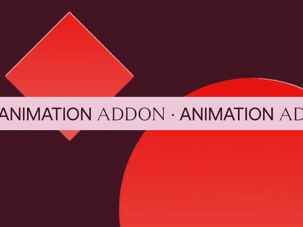
Scroll Animations
Scroll animations are one of the most popular design techniques for interactive reports, as they add movement to static content and bring your reports to life. Scroll-triggered animated charts are particularly effective, as they can also make complicated information easier to understand.
Many reports contain complex data, and data visualizations like charts and graphs have long been seen as good ways to make it more digestible. But adding an element of interactivity to your data goes one step further. Scroll-animated charts allow readers to set their own pace for reviewing the data, and draw their eyes to key take-aways that can deepen their understanding of the content.
Scrollytelling
Scrollytelling is one of the most popular techniques used within digital storytelling and visual journalism, and it’s just as effective when used in interactive reports. Used to describe the fusion of scrolling and storytelling, scrollytelling creates a captivating narrative that unfolds as the reader scrolls.
There are several types of scrollytelling techniques — from parallax image and text scroll to horizontal scroll and video scroll — but all can be used to turn readers into active participants as they navigate through your content.

Scroll Progress Bar
When looking at a website or reading an article, many people like to know precisely how much of the page they’ve read, and scroll progress bars provide a great visual representation of reader progress. Making scroll progress bars interactive can add a fun, visual element as a user scrolls up or down a page, and they’re good examples of how interactivity can create better website UX.
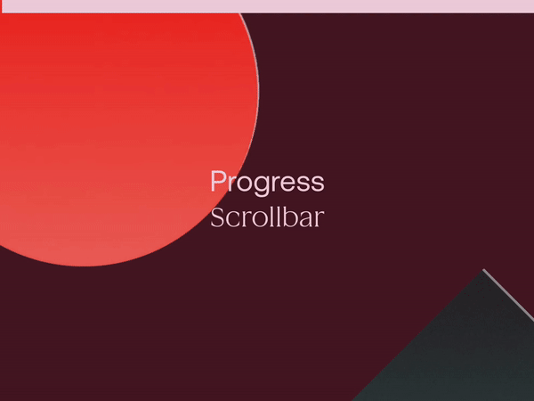
Image Comparison Slider
If your interactive report contains comparison images, one of the best ways to add interactivity is to include image comparison sliders. When two images are placed side by side, the human eye is naturally drawn to the second image, which means we can skip over details in the first image.
Image comparison sliders allow the reader to slide the arrow, slowly revealing the second image. Aside from adding a slick interaction to what would have been a static image, this technique means both images receive equal attention, and the message you’re trying to communicate is better conveyed.

Clickable Image Hotspots
Clickable image hotspots are frequently used within maps, diagrams, and product photos, and they’re great ways to include additional information, like text, images, or links, without cluttering up the imagery. But they also work well in interactive reports.
If you’re looking to add some simple interactive content to your report, clickable image hotspots are a good bet, allowing the reader to chart their own course through your content and choose the level of detail they want to receive.

Carousel
If you have large sections of text in your interactive report, a great way to break up all that copy is with an image carousel. Not only are they good ways to display multiple images without using up bandwidth, they’re also smart ways to inject subtle interactivity into your report, and let readers click, scroll, and explore in their own time.

Great Interactive Report Examples
Now that we’re familiar with some of the best design techniques to use in interactive reports, let's look at some of them in action.
ServiceNow
American software company ServiceNow used several different interactive design techniques within their report, "The Sustainability Advantage". This is an exceptional example of how corporate reports can be transformed into visually-appealing and dynamic digital stories with the addition of some creative design and interactive elements.
Created in Vev by Message Lab, this report is about the importance of environmental, social, and corporate frameworks, and the use of some truly innovative scrollytelling techniques turns what could potentially be a somewhat dry report into a compelling narrative.
As the reader scrolls, interactive design elements leap to life in numerous different ways. The report is kicked off by animated illustrations, showing the reader from the word go that this isn't your ordinary business report. The readers’ eyes are drawn to key data via interactive charts and graphs, helping them better understand facts and figures, and keeping them engaged.
To avoid overwhelming the reader with walls of text or data, the content is continually broken up with colorful images, animated illustrations, and interactive text boxes, all of which keeps the reader occupied and ensures no vital facts are missed.
World Heart Federation
Cardiovascular health organization the World Heart Federation (WHF) also used Vev to create their report, World Heart Vision 2030. Like ServiceNow, this interactive report uses a variety of digital design techniques to underscore the importance of their work and keep the reader engaged.
The report kicks off with a video of WHF members, which instantly humanizes the organization, and reminds the viewer that the subject matter – heart health – affects just about everyone. Scrollytelling is then used to great effect, with simple yet powerful statements and questions highlighted by bold typography.
Early on in the report, there’s an abrupt shift to horizontal scrolling, which the reader doesn’t expect. This keeps them on their toes and gets them interested to see where the report goes next. Areas of text are broken up with colorful, interesting images and illustrated text boxes, ensuring this long-form report feels both accessible and digestible.
The shift back and forth from vertical and horizontal scrolling is a standout feature of this interactive report, and provides the reader with a unique experience. While it's an in-depth report about serious issues, thanks to its innovative interactive design and visually pleasing aesthetics, it’s a pleasure to read.
The Unsustainability Report
Scandinavian agency Geelmuyden Kiese teamed up with Deloitte to create The Unsustainability Report in Vev. The report is about the problems preventing us from minimizing our climate footprint, and while this is clearly a critical issue, the report is a great example of how adding interactivity can elevate serious content, and not minimize the subject matter.
This is a long report that’s packed with data, and just like the previous examples, it uses several types of interactive content to stop large volumes of text from becoming overwhelming. Scrollytelling is used to great effect, and the repeated addition of colorful videos adds a movie-like element to what otherwise could feel like a dry, data-heavy report.
Like the best examples of data-heavy content, this interactive report also contains many animated charts, which don’t only break up the text, but help highlight some of the most significant research. By putting the most important data into animated charts, the reader is able to digest the most critical information without getting lost in unnecessary facts and figures.
As this is such a text and data-heavy report, accordions are also used. Accordions allow larger amounts of content to be hidden under clickable headings. Once clicked, the additional text is revealed. This is a great way to condense content while adding interactivity - and it also allows non-essential information to be included in the report without making it look too long.
Boston University Annual Report
While interactive reports have rocketed in popularity over the last couple of years, some organizations wised up earlier than others. Boston University is one such organization, and their annual report – from 2016 – is an excellent example of how interactive reports can be beautiful, slick, and intriguing.
The report kicks off by asking a big question: “Why isn’t a billion dollars enough?”. The question itself uses bold, vibrant font, and behind it, colorful images switch and rotate. As the reader scrolls down, other issues the report is tackling arise in the form of interesting questions – e.g. “Why should we break bread with terrorists?”, and “Why can’t we get a straight answer on prostate cancer?”.
However, rather than answer the questions directly below, the report uses clickable hotspots, which are titled “Read the answer”, or “Find out why”. Not only does this intrigue the reader while adding an element of interactivity, clicking the hotspot allows you to download a file containing more detailed answers. Just like accordions, this is a great way to give the reader lots of information without bogging down the report.
Videos are also used–but again, they’re hidden behind clickable hotspots, allowing the reader to choose whether they want to watch. By presenting their annual report as a series of fascinating questions, this interactive report highlights Boston University’s reputation as a center of learning, and a place to get answers. Their use of interactivity only cements their position as a thought-leader.
Spotify
Music streaming platform Spotify got seriously colorful and creative in their 2021 advertising roundup. This interactive report is an exploration of how Gen Z and millennials are influencing audio streaming and culture, and when you land on the page, you’re offered the chance to either download the report or click “explore”, which kicks off this immersive digital experience.
Immediately, electronic music starts playing in the background, creating a dreamy ambience, and this is further amplified by the visuals: animated cubes, containing illustrations of people listening to music, spin and whirl in pastel-colored geometric space. As you scroll, the cubes continue to spin, depicting new scenes, with different music playing each time.
Each scene has its own “explore” clickable hotspot, which, when hit, brings up new colorful geometric scenes that contain yet more ‘explore’ buttons. Clicking these reveals detailed information about consumers and music, and encourages people to download the full report to find out more. These hidden details free up space for creative design and allow the viewer to focus on the visuals.
Overall, this is a really impressive piece of multi-sensory media. It’s full of color, motion, animations, and audio, and because the viewer controls the process by scrolling, they can have as much time as they like to take it all in.
Ready to Design a Memorable Interactive Report?
Whether you want to create an immersive marketing report or an annual report that’s a genuine joy to read, making your report interactive will bring it to life. Use Vev’s library of pre-coded interactive design components, then host your interactive report anywhere on the web (including embedded into your existing CMS) when you’re ready.