
14 Tips to Make Your Presentations Interactive
February 19, 2026
Words by Jeff Cardello
When we think of interactive presentations, most of us imagine standing in front of our colleagues and clicking through carefully prepared slides. Each piece, with its accompanying text, visuals, and our own narration, supports a bigger message or idea.
Presentations also work outside of the glass and shine of company meeting rooms. On the web they turn information into experiences, offering both form and function as visitors navigate through.
We’re going to cover what goes into creating interactive presentations, best practices, and the type of content they’re best suited for.


The elements of interactive presentations
Let’s think of an interactive presentation as a hierarchy of information. At the top is the broad idea or concept that you want someone to learn or understand. Beneath it are the key points or messaging that support it.
- Content sections: Websites with interactive presentations segment content into a series of interconnected scenes or slides. Each piece generally has a small amount of text, accompanied by a graphic or image.
- Interactions: Scrolling, clicking, hovering, or swiping on mobile are used to advance through each stage and make additional content appear.
- Multi-media: Interactive presentations often have additional features like audio, videos, 3D animations, data visualizations, and other elements that add depth or context.
- Visual indicators: UI elements like buttons or arrows that change states, progress bars, and other design features signal to users when they’ve advanced or completed an action.
- Animated transitions: Visual effects like fade-ins, scaling transformations, slide-ins, and parallax scrolling indicate the change from one section to the next.
Best practices of interactive presentation design
- Tell a clear story: Each frame must fit within a larger narrative and have a sense of cohesion.
- Make navigation simple: Moving from one section to the next should occur through a single action or movement.
- Vary the user experience: Because content gets spread out across multiple screens you don’t want to lose people’s interest. Visual effects like text and image fade-ins, motion graphics, and other dynamic effects keep up the momentum and prevent the user experience from getting monotonous.
- Make sure the design is responsive: When creating an interactive presentation or slide deck, we’re afforded the luxury of space that is our desktop screens. Keep in mind that a design needs to translate to mobile devices and tablets. Text sizing, padding, and the placement and scaling of clickable elements should all be appropriate even at smaller breakpoints.
How to use interactive presentations in web design
Product pages
We tend to pay attention more to information that’s put into narrative form. That’s why interactive presentations work so well for product pages. If you’d like to give potential customers a curated experience showing how a product works, highlighting key features, and the reasons to make a purchase, interactive presentations can help. They make it possible to organize complex information into an easier-to-understand and more impactful format.
In this interactive presentation example, Zoom (not to be confused with the virtual meeting company) takes visitors through its H6Studio digital recorder. From the quality of its preamps to accessibility features for those with visual impairments, each section explains important details about the H6Studio recorder.
Along with covering the technical details that anyone into audio gear would want to know, there’s a nice balance of visuals. Scroll-triggered effects, staggered parallax animations, and split-screens brighten the design with action and act as visual guides that lead visitors through. When putting together your own interactive presentations, use animations and dynamic interactions to break up the content and to prevent it from getting too dense.
Marketing campaigns and brand storytelling
While product pages are an in-depth look at an item or service, marketing campaigns take a broader approach. They’re not product demonstrations nor tutorials. Rather, they’re used to build excitement and help brands connect with their audiences. Digital spaces like company home pages, product launch websites, and promotional landing pages transform marketing messaging into fully immersive digital experiences.
While most of us without a degree in the life sciences likely will never have to think about recombinant proteins, Brighton Biotech tells all about what they do in a visually exciting design, rather than verbose scientific jargon. The progress bar at the left is another nice touch, showing where people are as well as the option to flip between different sections. If you’re creating marketing websites, make sure to put together user experiences that reflect a brand’s identity and personalizes who they are.
Company reports
There are documents that are about transparency. Annual reports, investor decks, and earnings statements, are all necessities for companies in disclosing how they’re doing. Then there are those that are less formal. Think of Spotify Wrapped, which shows its users their listening habits for the year. While these have very different purposes and audiences, both feel more lively and interesting when they take the form of interactive presentations.
You’ve likely used WeTransfer to share giant files with clients or team members. WeTransfer knows its audience, and has put out several IDEAS reports over the years, covering subjects like career growth, new technologies, and surveying those in creative creative about relevant questions.
This 2022 report, with its monochromatic minimalism, splashes of purples, blues, reds, and greens, and big interactive elements, not only has a modern design aesthetic, but has plenty of insightful information and statistics. If you’d like to turn company reports into interactive presentations focus on combining information with elements like clickable modals that open up more details, interactive data visualizations, and UI elements that point visitors where you want them to go.
Tutorials
Interactive presentations split up content into a series of snapshots, making them well-suited for educational materials like tutorials, lessons, or customer/employee onboarding.
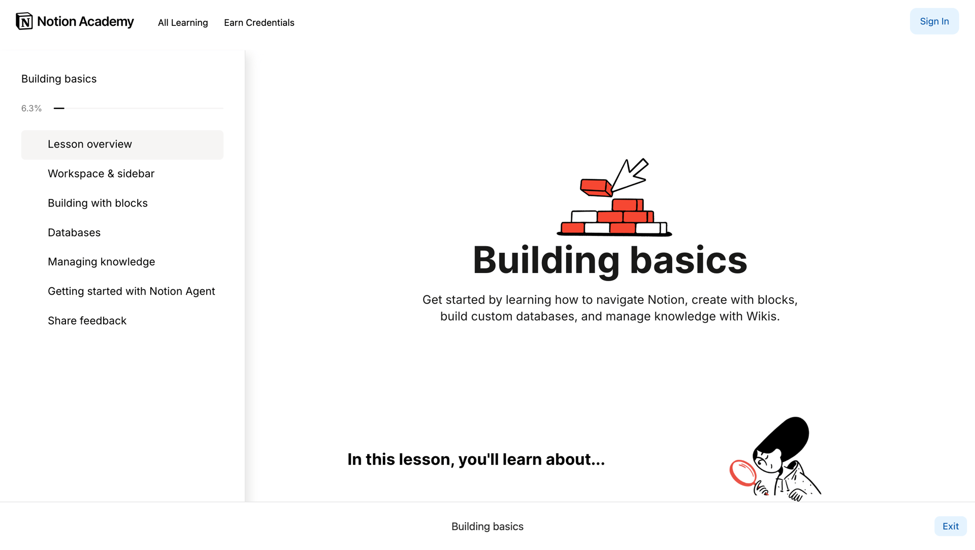
In this interactive slide deck example from Notion, new users are taken through the basics of its collaborative workspace. You’ll see in the left-hand navigation a list of topics, as well as a progress bar at the top. Each section is easy to follow, with text and videos explaining the core concepts, as well as interactive exercises that let users try out Notion for themselves. When developing tutorials and other educational content, break content into manageable and logical steps and use interactive exercises to reinforce what’s being taught.
Case studies and portfolio pieces
Think of any project you’ve ever worked on. You start with an idea or goal, come up with a plan, go to work, and deal with any challenges that pop up. There’s a clear timeline of what you did, what challenges you solved, and the final results. Writing a case study lets you tell a story with a clear beginning and end.
If you’ve ever had a job interview where you have to do a portfolio project presentation, you’ll appreciate how Luca Orio has set up his digital case studies. He keeps things tight, with a first slide that tells who the client was, followed by challenges, his process, and the outcome. Each colored slide has a title, tells about this step of the project, and there are flows and screenshots showing his process. When turning a case study into an interactive presentation, you’ll want to keep the text concise and give visitors a linear pathway so they don’t miss anything.
Use Vev in creating your own engaging interactive presentations
Want to turn regular content into something far more imaginative and interesting? Whether you want to create a product pitch deck, teach people how to do something, or go through a portfolio project, interactive presentations are effective in taking people through a series of related information.
And if you use Vev, it’s easy to add animated transitions, including parallax effects, and other touches of motion that will elevate it from static and conventional content into visual storytelling that’s far more captivating.