
9 Editorial Websites Bringing Long-Form to Life
August 12, 2022
Words by Jeff Cardello
In a web dominated by clickbait content, more brands are choosing long-form editorial.
The web is an exceptionally creative medium for telling stories. Through animations, illustrations, audio, video, infographics, typography, and more, it’s possible to craft narrative websites that go beyond a standard arrangement of text boxes and images. What’s more, these effects are extremely effective at capturing and engaging reader interest, making them ideal for long-form content.
In addition to media publishers, more brand marketing strategies are experimenting with premium editorial—choosing intentionally “slow” content in the face of modern attention spans, and designing experiences for humans instead of algorithms. We’ve pulled together a selection of editorial websites that demonstrate the power of telling a long-form story on the web.
The Rise of Immersive Web Editorials
Editorial content on the web first grew as the natural evolution from print to digital. As the internet became the most widely utlized platform for consuming information, designers took advantage of its creative possibilities to craft richer stories and articles. Liberated from the limitations of print media, many publishers started experimenting with more immersive journalism, creating long-form editorial that felt more like a cinematic experience.
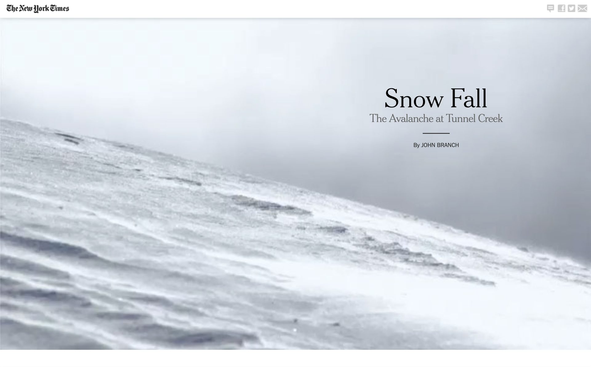
The New York Times, in particular, were one of the frontrunners of this trend. Their watershed piece Snowfall: The Avalanche at Tunnel Creek made its mark in showing the inventive ways that text, visuals, and audio could be interwoven to tell stories in more captivating and compelling ways.
Yet, long-form storytelling on the web isn’t only the domain for journalism or other types of non-fiction. Increasingly, brands are taking advantage of web editorial to offer informative and helpful content that also act as subtle marketing.
The internet is littered with clickbait headlines, memes, and other content that’s tailored for search algorithms and satisfies our short attention spans. Long-form editorial content offers something different with depth and value, rooted in the idealism of the web as a place for the ceaseless exchange of information and ideas.
Popular Editorial Website Design Techniques
There are so many different ways to put long-form content together, but most editorial websites often boil down to the same handful of popular design styles and techniques. These include:
Scrollytelling
Text slides over a fixed background image or video to create an immersive cinematic effect. Learn more about scrollytelling techniques.
Interactivity
Micro-interactions, animations, dynamic scrolling, and sub-plots invite readers into the story as active participants. Learn more about creating interactive websites.
Audio and background music
Subtle touches of sound and sound effects that compliment images add another layer of depth to web editorial.
Infographics
Data storytelling pieces let quantitative data take the spotlight with animated numbers, charts, and infographic elements.
9 Striking Editorial Websites
Give your visitors visually compelling experiences that break free from the conventions of traditional web design. Long-form content not only engages with visitors in a way that short-form can’t, but opens up a realm of possibilities in how you present it. Let’s take a look at nine editorial websites that combine visuals, text, and interactivity in different ways to connect with their readers.
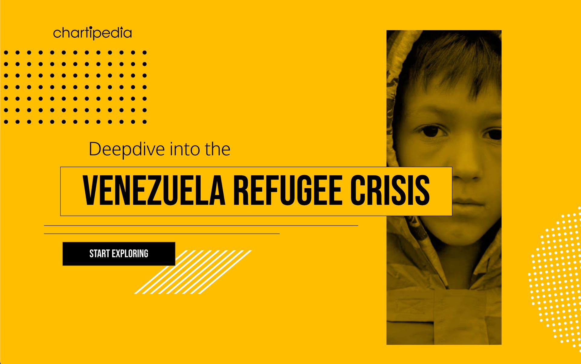
Venezuela Refugee Crisis
Venezuela Refugee Crisis brings attention to the plight of Venezuelans who have been displaced due to hyperinflation, food shortages, lack of medicine, and political upheaval. This design goes deep in exploring the different factors that have contributed to this exodus.
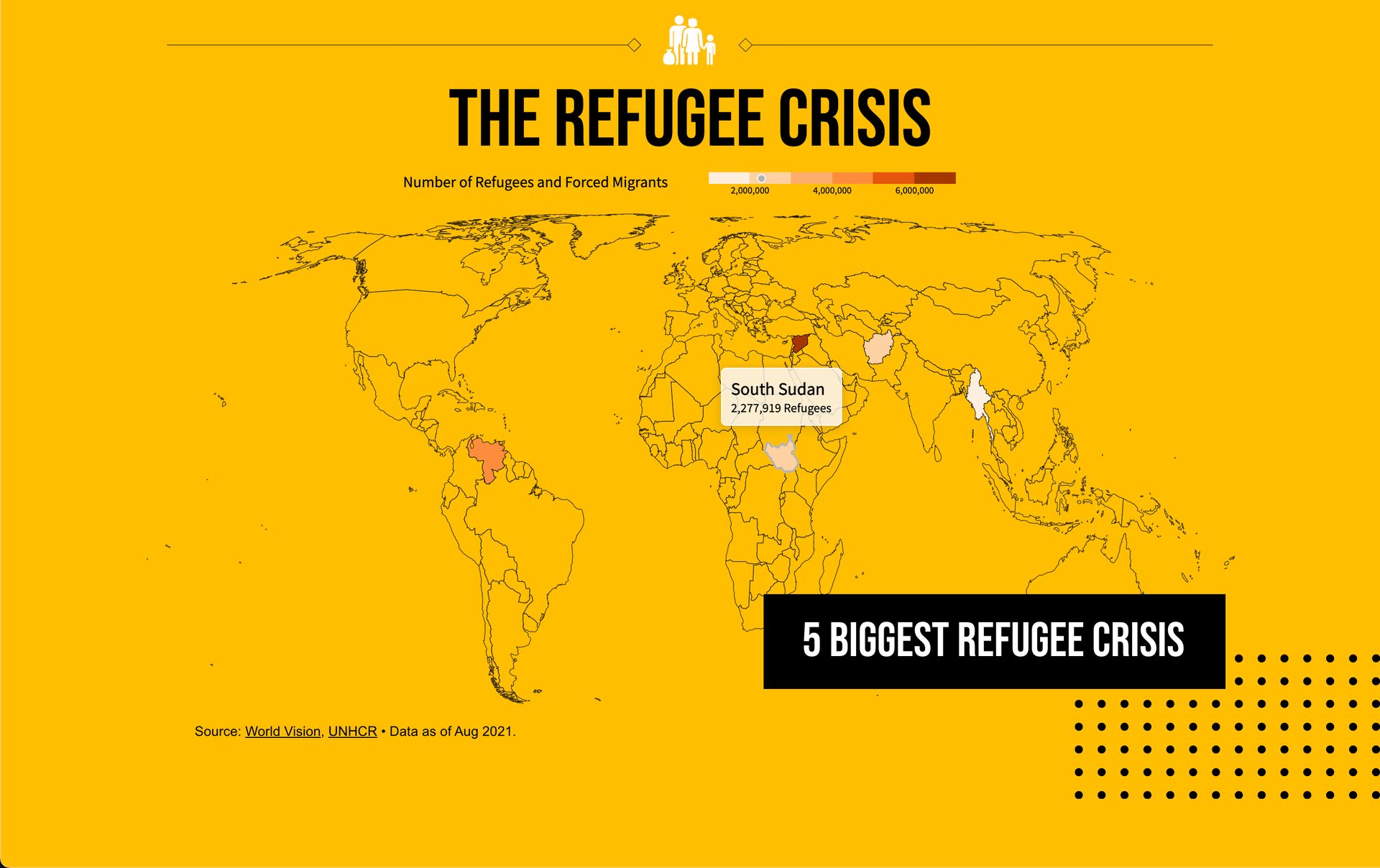
Built with Vev, it features time-delayed text and visuals that highlight different aspects of this crisis. There are also text boxes that move over static images, interactive maps, and other dynamic elements that help guide you in learning more.
This humanitarian crisis is full of complexities and this scrollytelling-inspired design weaves together writing and visuals to make it easier to comprehend the causes and impact of this situation. This is another great example of how editorial websites can contribute to the greater good and help bring attention to issues which otherwise might not get enough attention.
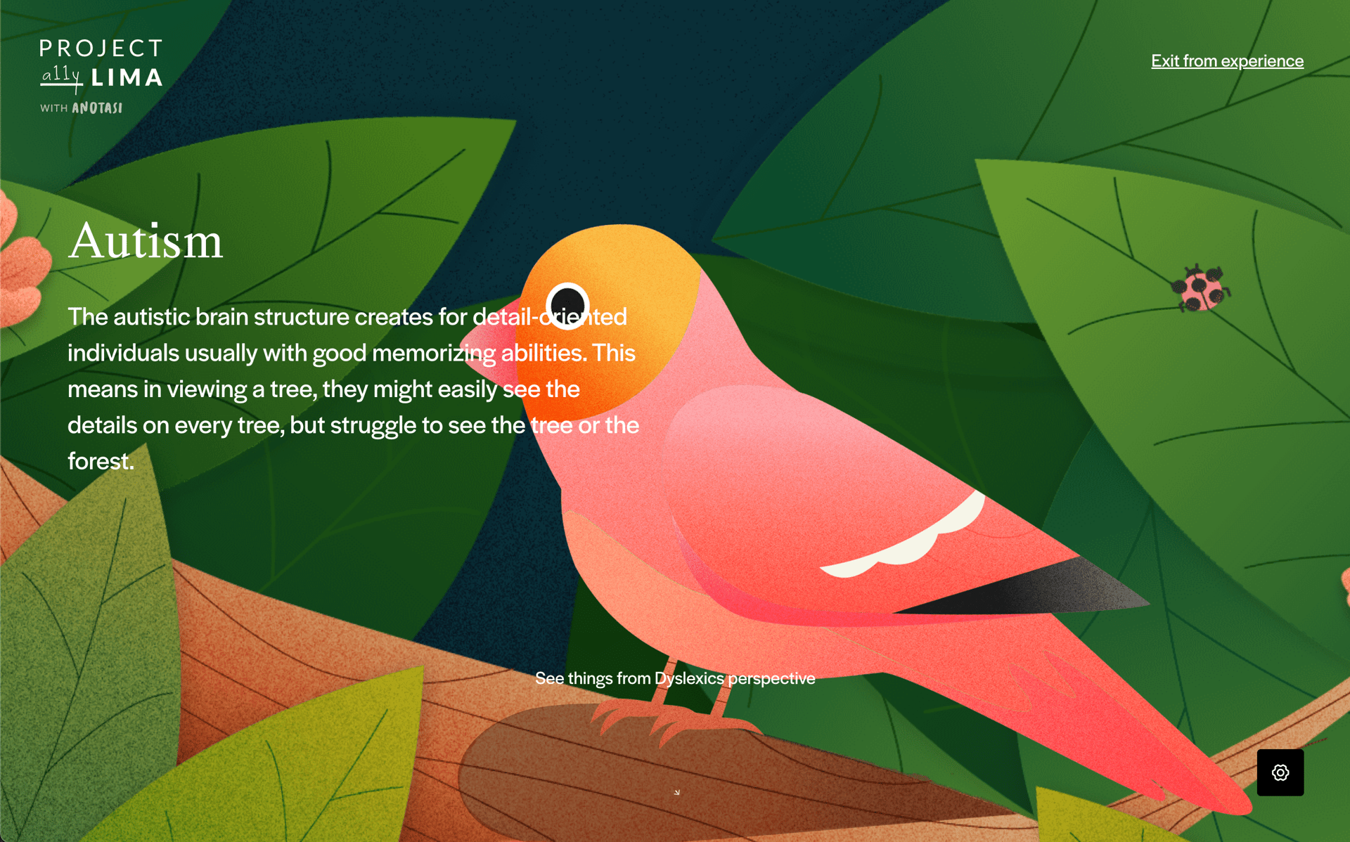
Project Lima
Project Lima's goal is to spread awareness about neurodiversity, as well as to celebrate what makes neurodivergent people unique. Through colorful illustrations, animations, a soundtrack of calming electronic music, and writing that explains how the minds of neurodivergent people work, this website builds understanding and empathy.
The most effective editorial websites usually have a higher purpose, and Project Lima succeeds with a sensitive and gorgeous design that demystifies neurodiversity and how these individuals perceive the world.
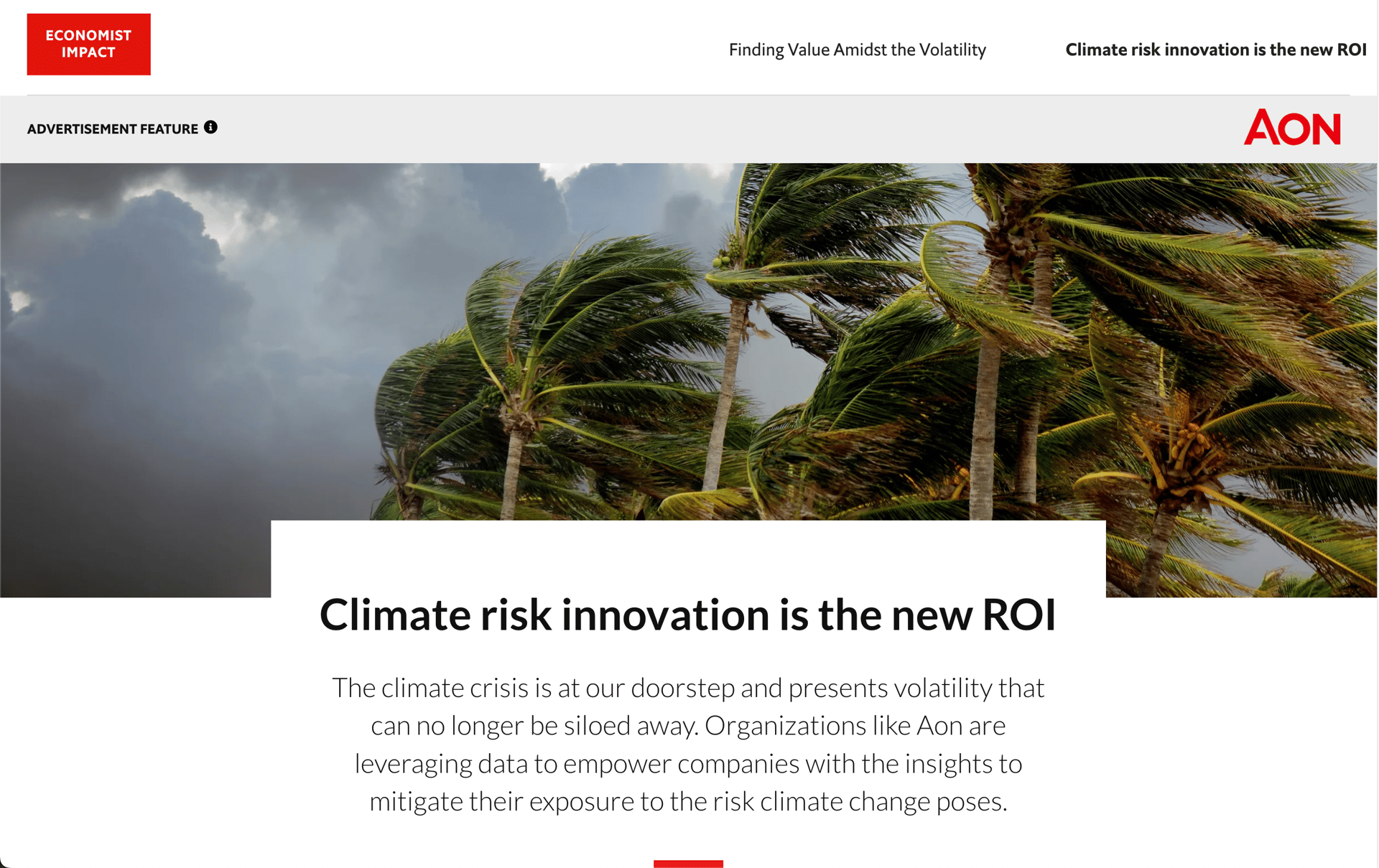
Climate Risk Innovation
This editorial website from the Economist discusses the potential problems companies may face due to climate change. Built with Vev, its smart layout utilizes guides and grids to organize elements, and reusable building blocks help to distinguish between different content sections.
This layout takes a straightforward approach in delivering all of its important information in a way that’s clear and easy to understand. It’s a great demonstration of how simple editorial websites are so effective at communicating ideas in a way that’s quick and direct.
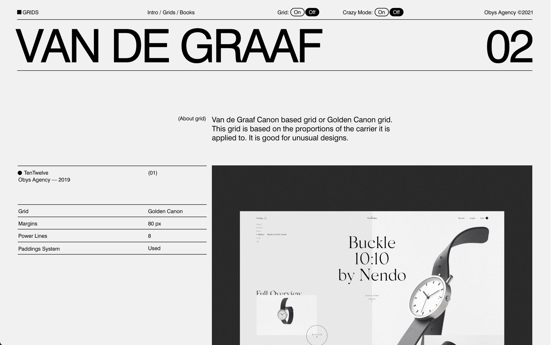
Grids
Grids, created by the agency Obys, not only educates readers about the beauty of linear frameworks, but also demonstrates their own design expertise in working with them. There are four different sections, exploring column, Vandergraff, rectangular, and other grid styles. With a strong sense of geometry, horizontal scrolling sections, animated blocks, and lively scroll-triggered effects, this site shows the multitude of ways that grids can be used in web design.
We’ve all heard the writing maxim of, “show don’t tell” and Obys shows how editorial websites can lean on visuals in communicating ideas and information.
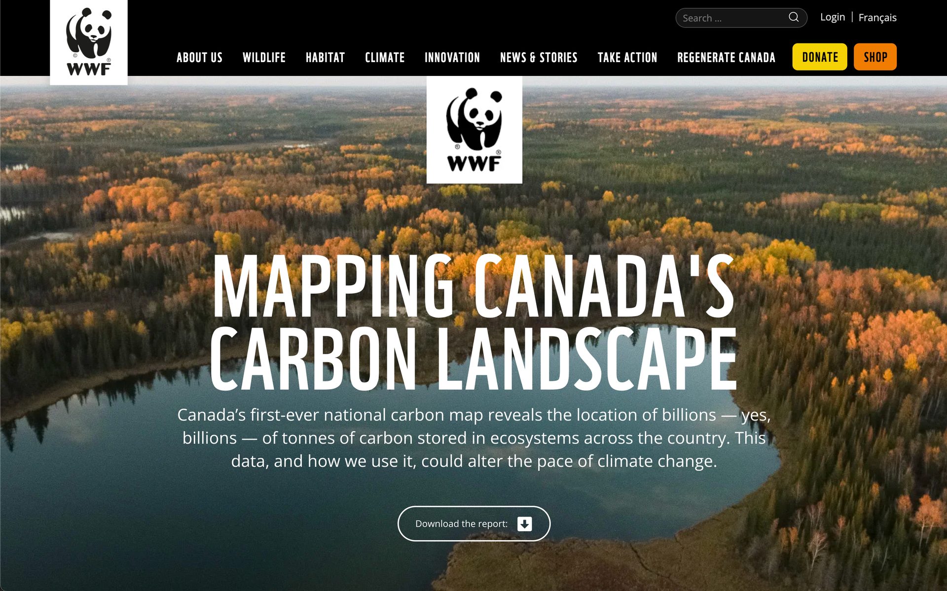
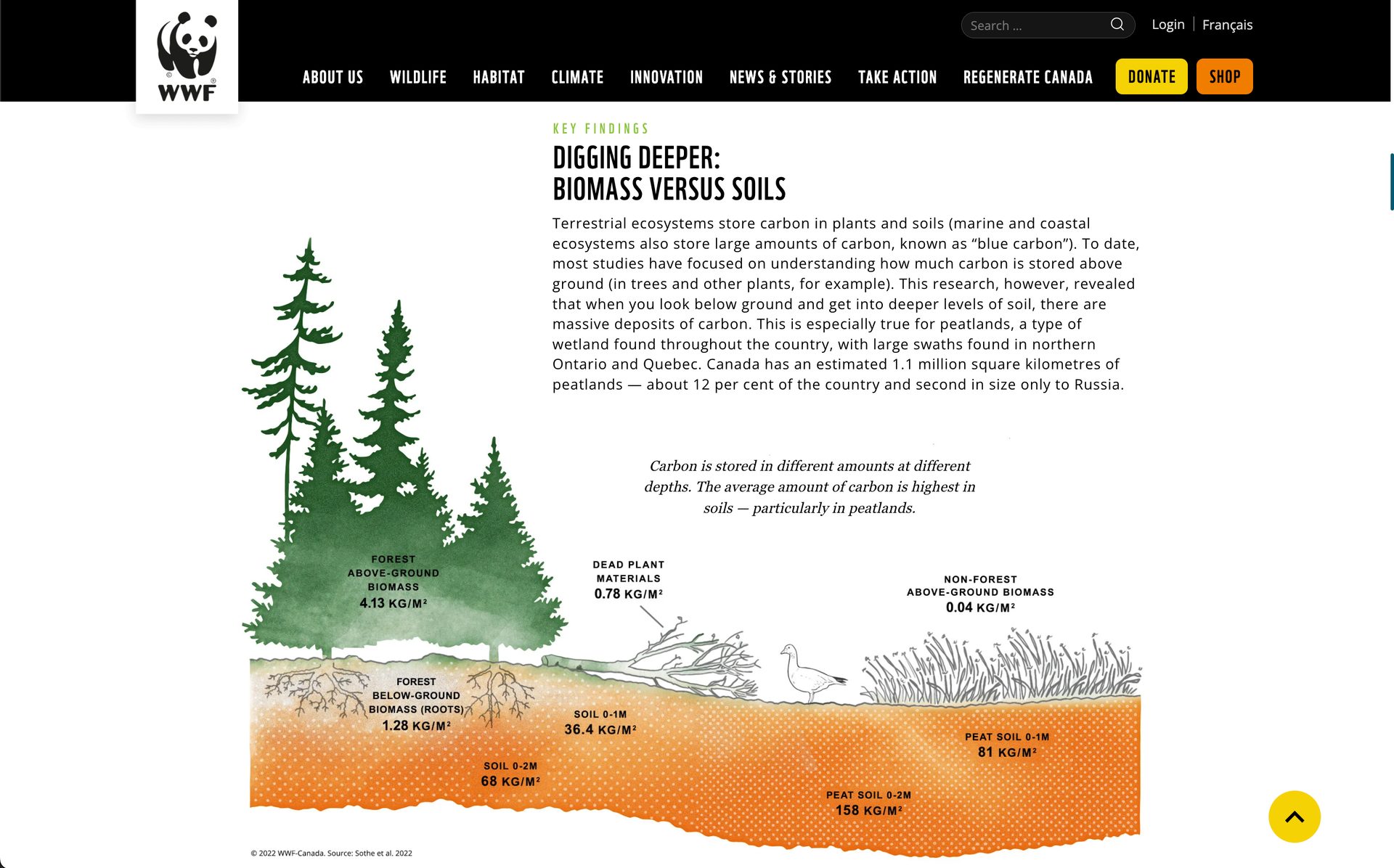
Mapping Canada's Carbon Landscape
This editorial website, put together by the World Wildlife Foundation (WWF), details natural stores of carbon found throughout Canda. It clearly communicates the importance of the carbon that’s held in ecosystems, soil, and other biomass, and how disturbing it can contribute to climate change.
This Vev-built design has a layout filled with text, maps, diagrams, and statistics. This report could have taken the form of something more traditional and dense like a white paper. But through imaginative web design, it offers a more accessible user experience, making the importance of these carbon stores understandable for those even without science backgrounds.
The Empathy Experiment
Let’s face it—we could all benefit from having a bit more empathy. Instead of explaining why this form of emotional intelligence is important, The Empathy Project does this through an interactive three-dimensional journey. It all starts with a coworker cracking a joke that makes someone uncomfortable. You’re given three different choices in addressing this situation, each having a different outcome.
Using gameplay to teach empathy is so much more effective than traditional media like a blog post or video. The Empathy Project offers a moving and beautifully illustrated user experience that works so well in showing why keeping other people’s feelings in mind matters.
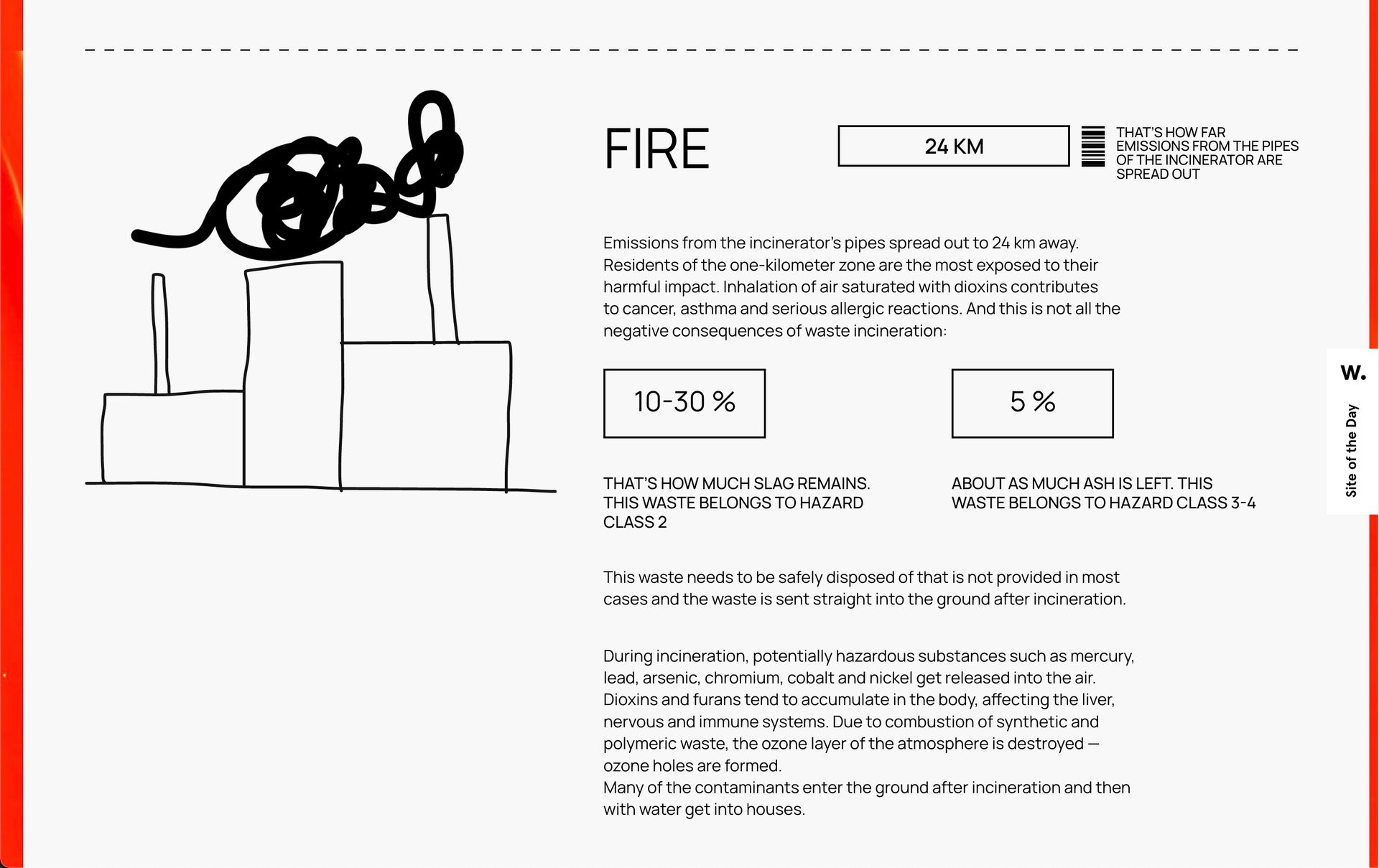
Garbage
With hand-drawn illustrations, animations, clashing text sizes, and a striking color palette of red, black, and white, Garbage explores the impact of the items we throw away without even giving them a second thought.
This design merges artistry with science in bringing attention to the environmental issue of trash and where it ends up. Along with a modern and stylized layout there are statistics, infographics, and other detailed content. This design shows how editorial websites can tackle serious topics, and explain them in ways that are both informative and imaginative.
Zero
Zero covers the significance of curtailing carbon dioxide emissions in fighting global climate change. This design takes many elements of scrollytelling in communicating ways in removing carbon dioxide and the positive impact this would have. Built with Vev, this design features quotes and facts scrolling over background images, wide-angle shots and video embeds, and text that explains why carbon emissions need to come down and solutions for making this happen.
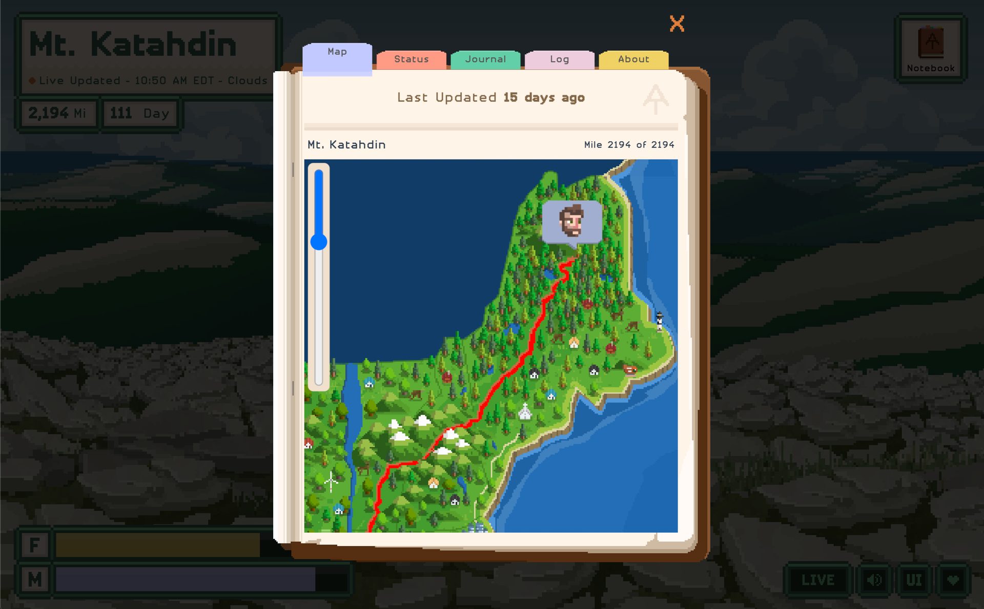
A Trail Tale
Built with the Unity gaming engine, A Trail Tale tells the true story of Andy as he journeys along the Appalachian trail. We see him portrayed as a character walking through the woods and along the way, there are icons that appear floating above him with observations and things that happened to him that you can click on.
With this web design Andy invents a new form of travel blogging. This is a fun and original concept that makes you want to adventure right along with Andy, and learn all about his experiences on the Appalachian Trail.
Create Your Own Editorial Website
From scrollytelling videos and scroll-triggered animations, to dynamic text and sound, Vev makes it easy to craft captivating editorial websites. With pre-coded elements, the ability to embed anything, and the option to expand anything through our code editor and CLI tool, you have all tools you need to be original. Publish your story anywhere on the web when you're ready.